10  Complex Diff-in-Diff Designs

In this chapter, we are going to build on the more complex situations where the parallel trends assumption does not hold, but that can be “fixed” while still retaining a design approach to the problem. We will also cover sensitivity tests we can review if we think that parallel trends is maybe violated, but we want to see how bad it has to be before we probably cannot say much. And finally, we will discuss a popular situation in which the treatment hits groups of units at different points in time called “differential timing.” I will conclude the chapter with a data exercise and a series of steps to consider when undertaking your own analysis. As always, we will accompany the discussion with applications and code in the hopes that it makes the ideas concrete, and provides some programming blueprints for your own work.

10.2 Triple Difference

Gruber and Maternity Benefits

Given my preoccupation with the intellectual lineage of causal inference through Princeton and Cambridge, notably attached to labor economics as its breathing apparatus, it is very hard for me not to share the following academic family tree related to our next method, triple differences. Henry Farber, a now prominent labor economist, graduated from Princeton University in 1977. His dissertation advisor had been Orley Ashenfelter and his intellectual home the Industrial Relations Section. Farber took a job as a professor at MIT, and in 1985, he advised a young man named Lawrence Katz who is now also an eminent labor economist. Katz took a job at Harvard and in 1992 advised a young economist working at the intersection of health economics and labor economics named Jonathan Gruber, himself now a widely regarded health economist. And in 1994, Gruber published an article extending the diff-in-diff framework into a methodology now called triple differences.4

Gruber (1994) is an evaluation of state laws mandating that firms cover maternity benefits. The outcome is, once again, a labor market outcome (e.g., earnings). It’s an interesting paper to me partly because the effect of such a mandate could backfire. Why? Because firms could discriminate based on sex to avoid paying maternity benefits. That is, so as to reduce their costs to cover maternity benefits, firms in these experimental states might hire more male workers since males are less likely at this time to be affected by the law. Listen to Gruber (1994) explain this more perverse backfiring of the policy.

If employers are able to lower each worker’s wages by the lump-sum cost of the mandate, then neither hours nor employment should change. However, if employers are not able to implement a percentage reduction in pay that is inversely proportional to hours worked, then part-time workers will become more expensive. Employers may thus react by increasing hours and lowering employment, reducing the cost per hour of the mandate while leaving total labor input unchanged. (Gruber (1994))

In my mind, Gruber did two things in his study. First, he produced evidence that mandated maternity benefits did, in fact, reduce female wages. This alone is an important finding and becomes a major question in public policy going forward (Rossin 2011; Rossin-Slater, Ruhm, and Waldfogel 2013; Bartel et al. 2018). But secondly, and for the purpose of this chapter, Gruber (1994) introduced the triple diff to empirically answer the question, so for the purpose of this section we are going to go through the results as well as the method he used to get them.

Triple Differences Is a Research Design, Not a Falsification

Historically, many people conceived of triple differences as a type of “same outcome, alternative group” falsification exercise. But it is not, as I will show. If you want to do a “same outcome, alternative group” falsification exercise, it is recommended that you do so directly using diff-in-diff, not layered into a triple diff. You will gain nothing from the triple difference approach and will more than likely make your study less convincing, given that literacy around the subtleties of triple diff is not particularly high compared to diff-in-diff.

Triple diff is not a “same outcome, alternative group” falsification, even though it uses the same outcome and an alternative group for estimation. The reason for that is because triple diff is a design, not a falsification, with its own unique set of assumptions. Specifically, triple diff is used when the parallel trends assumption is thought not to hold. To help illustrate this, I will go through a series of steps starting with a table illustrating the calculation of triple diff, then a discussion of the “parallel bias” assumption in triple diff, then discuss the “eight averages and seven subtractions” triple diff calculation, show the OLS regression specification for a triple diff regression, and conclude with a description of the event study regression and a graphical plot.

Table 10.2: Biased Diff-in-Diff #1: 20–40-Year-Old Married Women Only
States Time Average log wages \(D_{1,2}\) \(D_3\)
Experimental states Before \(Y=NJ\)
After \(Y=NJ + \mathbf{NJ_t} + \mathbf{D}\) \(\mathbf{NJ_t}+\mathbf{D}\)
\(\mathbf{D} + (\mathbf{NJ_t}- PA_t)\)
Nonexperimental states Before \(Y=PA\)
After \(Y=PA + PA_t\) \(PA_t\)

Table 10.2 is a simplified example of Gruber’s study. I call the experimental states \(NJ\) and the nonexperimental states \(PA\). The outcomes are average log wages and is \(\mathbf{D}\). If we go through the four averages and three subtractions calculation for diff-in-diff, we’ll see that diff-in-diff identifies \(\widehat{\delta} = \mathbf{D} + (\mathbf{NJ_t}- PA_t)\). Diff-in-diff will thus equal the if and only if \((\mathbf{NJ_t}- PA_t) = 0\). \[ \begin{eqnarray*} \widehat{\delta} = \mathbf{D} + (\mathbf{NJ_t}- PA_t) \end{eqnarray*} \tag{10.10}\] But what if \((\mathbf{NJ_t}- PA_t)\neq 0\)? Then, parallel trends is violated and diff-in-diff is biased and we should not use diff-in-diff in such cases.

Now, assume there are a group of workers who live in the same states but who were not eligible for state-mandated maternity benefits. Why might that be? Perhaps the law’s specific language only targeted mothers, in which case married men of the same age may not be affected, single men of the same age may not be affected, and older workers may not be affected. I put this in Table 10.3. If you look closely, you’ll notice that Table 10.3 is identical to Table 10.2 except that there is no letter \(\mathbf{D}\) in the “After” row of the experimental states. That is because this is a group of single men aged 20–40 and all older workers, and we believe that these individuals aren’t eligible for the program. \[ \begin{eqnarray*} \widehat{\delta}_{alternative} = (NJ_t- PA_t) \end{eqnarray*} \tag{10.11}\] When we calculate the four averages and three subtractions through the three steps of diff-in-diff, we arrive at a number equal to \((NJ_t- PA_t)\). For the sake of simple language, I will call the number produced by the diff-in-diff calculation on the alternative group the non-parallel trends bias.

Table 10.3: Control Group Diff-in-Diff: Single 20–40-Year-Old Men and Older Workers
States Time Average log wages \(D_{1,2}\) \(D_3\)
Experimental states Before \(Y=NJ\)
After \(Y=NJ + NJ_t\) \(NJ_t\)
\((NJ_t- PA_t)\)
Nonexperimental states Before \(Y=PA\)
After \(Y=PA + PA_t\) \(PA_t\)

Triple differences is a methodology that subtracts the alternative group’s diff-in-diff from the primary group’s diff-in-diff. It is used to identify the of the primary group, and it does so if the non-parallel trends bias term is the same for both groups. This is not the same as a falsification, though, because in a falsification, the alternative group’s diff-in-diff should be zero, as it was in Miller, Johnson, and Wherry (2021) when they used diff-in-diff to study Medicaid’s effect on the elderly population who had not enrolled in Medicaid. \[ \begin{eqnarray} \widehat{\delta}_{ddd} &=& \widehat{\delta}_{primary} - \widehat{\delta}_{alternative} \nonumber \\ &=& \mathbf{D} + \bigg( \underbrace{\mathbf{NJ_t} - PA_t}_{\mathclap{\text{Primary PTB}}} \bigg) - \bigg( \underbrace{NJ_t - PA_t}_{\mathclap{\text{Alternative PTB}}} \bigg) \nonumber \\ &=& D \label{eq:ddd_original} \end{eqnarray} \tag{10.12}\] And as you can probably see, this final difference between the two difference-in-differences (hence the naming convention “difference-in-difference-in-differences,” or triple differences) identifies the so long as the two diff-in-diffs have the same non-parallel trends bias term: \[ \begin{equation} \bigg( \underbrace{\mathbf{NJ_t} - PA_t}_{\mathclap{\text{Primary PTB}}} \bigg) = \bigg( \underbrace{NJ_t - PA_t}_{\mathclap{\text{Alternative PTB}}} \bigg) \label{eq:ddd_assumption} \end{equation} \tag{10.13}\] where “Primary PTB” means the main group non-parallel trends bias, and “Alternative PTB” means the control group non-parallel trends bias. Equation 10.13 shows that the identifying assumption in triple differences is that the non-parallel trends bias of the main diff-in-diff is equal to the control group’s non-parallel trends bias. And when that parallel bias holds, then triple differences identifies the .

For a very long time, the identifying assumptions for triple diff had not been expressed in terms of a parallel trends bias term.5 The precise expression of the triple diff identifying assumptions have now been clearly and accurately laid out in Olden and Møen (2022) in Equation 10.14 showing the parallel bias assumption: \[ \begin{align} E&[\Delta Y^0 | D = 1, G = 1] - E[\Delta Y^0 | D = 0, G = 1] \nonumber \\ &= E[\Delta Y^0 | D = 1, G = 0] - E[\Delta Y^0 | D = 0, G = 0] \label{eq: ddd_poassumption} \end{align} \tag{10.14}\] where \(D=1\) is the level of the treatment (e.g., experimental states), \(D=0\) is the untreated level (e.g., nonexperimental states), \(G=1\) is the treated units (e.g., 20–40-year-old married women), and \(G=0\) is the placebo units (e.g., 20–40-year-old single men and older women).

Similar to how diff-in-diff is four averages and three subtractions, triple diff is eight averages and seven subtractions. Why is that? Because triple differences is the difference between two diff-in-diff calculations, both of which are four averages and three subtractions. The implications are non-trivial in practice because if the identifying assumption for triple diff is Equation 10.14, then the coefficient on the placebo diff-in-diff is not required to be zero. It is only required to be the same value as the bias of the original diff-in-diff. Some have suspected that triple diff in fact requires the placebo diff-in-diff to equal zero, but note that since triple diff subtracts the placebo diff-in-diff from the main diff-in-diff, that would mean the original diff-in-diff had been unbiased all along. In which case triple diff was never necessary and the study would likely be much stronger if the researcher had simply presented the placebo diff-in-diff as a “same outcome, alternative group” falsification like Miller, Johnson, and Wherry (2021) did with their “elderly mortality” result.

Add in one more minus sign by subtracting one from the other, and you get eight averages and seven subtractions as seen in Equation 10.15: \[ \begin{equation} \widehat{\delta}_{ddd} = \widehat{\delta}_{primary} - \widehat{\delta}_{alternative} \label{eq:ddd_original2} \end{equation} \tag{10.15}\] So, if \(\widehat{\delta}_{primary}\) is four averages and three subtractions, and \(\widehat{\delta}_{alternative}\) is as well, then subtracting one from the other is eight averages and three subtractions. You can also see this for yourself in Table 10.4 where I present the triple diff estimator in a table format like I did before with diff-in-diff.

Table 10.4: Difference-in-Difference-in-Differences Estimator
Groups States Time Average log wages \(D_1\) \(D_2\) \(D_3\)
Married women 20–40 Experimental states After \(NJ+MW+\mathbf{NJ_t}+\mathbf{MW_t}+\mathbf{D}\) \(\mathbf{NJ_t}+\mathbf{MW_t}+\mathbf{D}\) \(\mathbf{D}+\mathbf{NJ_t}-PA_t\)
Before \(NJ+MW\)
Nonexperimental states After \(PA+MW+PA_t+MW_t\) \(PA_t+MW_t\)
Before \(PA+MW\) \(\mathbf{D}\)
Single men / Older women Experimental states After \(NJ+SO+NJ_t+SO_t\) \(NJ_t+SO_t\) \(NJ_t-PA_t\)
Before \(NJ+SO\)
Nonexperimental states After \(PA+SO+PA_t+SO_t\) \(PA_t+SO_t\)
Before \(PA+SO\)

I’ve introduced some new terms referencing the groups and their respective trends, some of which are observable, and some of which are counterfactual, just like diff-in-diff. The term \(MW\) is referring to the determinants of wages common to all married women ages 20–40 no matter where they live, and \(SO\) has a similar interpretation but for single men 20–40 and older workers. Anything with a \(t\) subscript is a trend, and if in bold font it is counterfactual. The rest of the table just follows the same logic as diff-in-diff. First, calculate the after minus the before for each group of states. That is your traditional first difference, \(D_1\), calculation. You then calculate a difference-in-differences, \(D_2\), for each group. Here the groups are 20–40 year-old married women, present in both experimental and nonexperimental states, versus the 20–40-year-old single men and 40 and older workers, also in the experimental and nonexperimental states. And then finally, you difference each group’s difference-in-differences, which is \(D_3\) in Table 10.4, so long as the two bias terms in \(D_2\) are equal to one another.

Triple Differences with OLS Specification

But just like Orley said, he never manually calculated four averages and three subtractions—instead he ran fixed effects regressions, which as we showed are numerically equivalent for a specific OLS specification—the same thing holds here. Technically, Gruber (1994) had a table like Table 10.4, but he also noted that those eight averages and seven subtractions were numerically identical to this regression specification in Equation 10.16: \[ \begin{eqnarray} Y_{igt} &=&\alpha + \beta_2 \tau_t + \beta_3 \delta_g + \beta_4 D_i + \beta_5(\delta \times \tau)_{gt} \\ && +\ \beta_6(\tau \times D)_{ti} + \beta_7(\delta \times D)_{g} + \mathbf{\beta_8(\delta \times \tau \times D)_{igt}}+ \varepsilon_{igt} \nonumber \label{eq:ddd_regression} \end{eqnarray} \tag{10.16}\] where \(\tau_t\) is a dummy for the postperiod, \(\delta_g\) is a dummy for the treatment group, \(D_i\) is a dummy for the treatment states, and then the rest are interactions. The triple differences estimate of interest is the \(\beta_8\) parameter that can be estimated with OLS, so long as it is exactly this specification.

But recall what I said in the previous chapter: \(\widehat{\beta_8}\), no matter what it says, no matter how statistically significant it may be, is not proof. Rather, our main estimates are the assertion of guilt. People are not convicted in a court of law based on assertions. Rather, they are convicted based on evidence, and our main results are not evidence. The smoking gun, the eye witness testimony, the DNA evidence, the muddy boots by the window—those things are evidence, not the loud proclamations of the prosecutor.

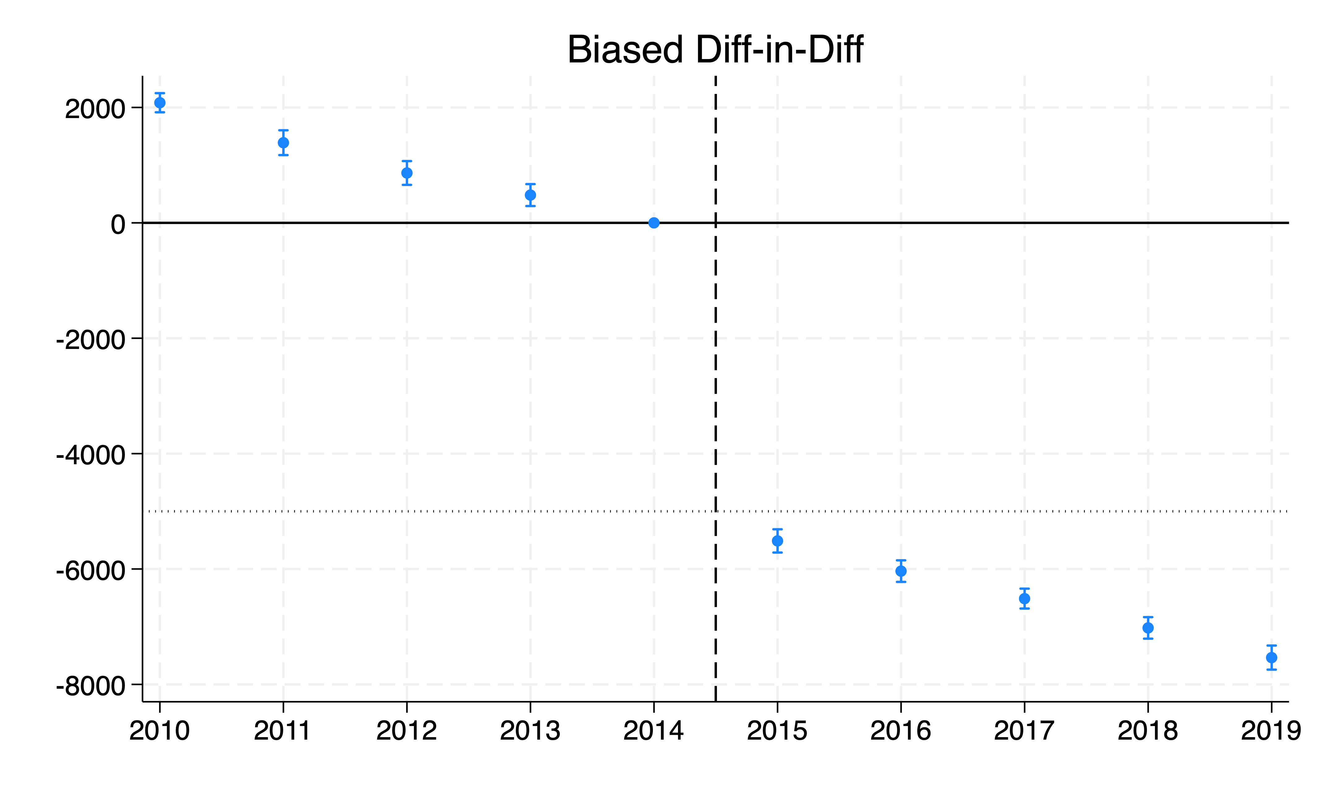
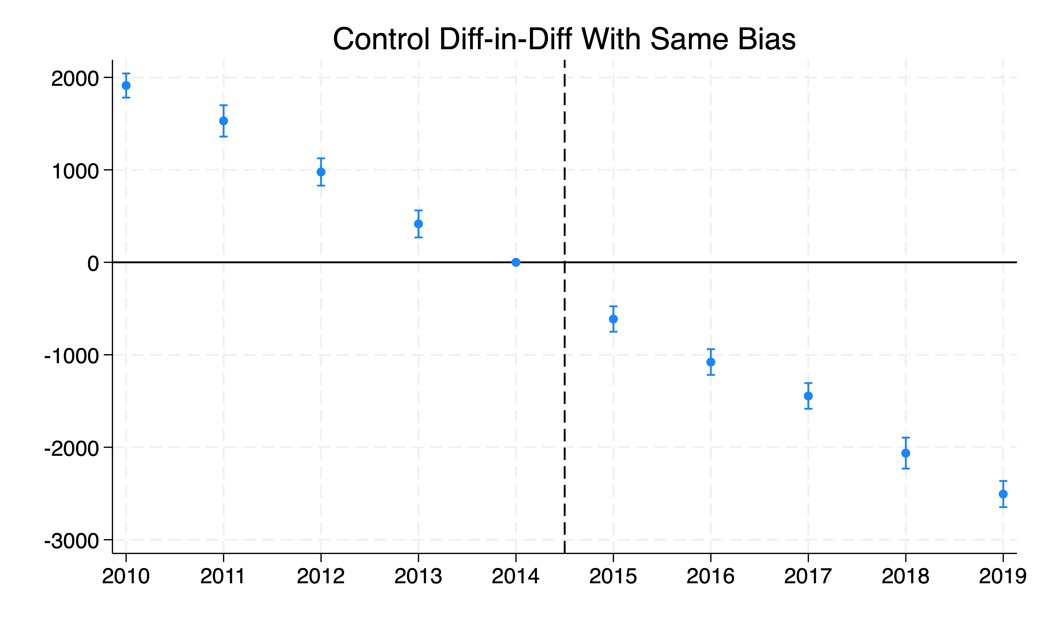
So, if you’re estimating something using triple differences, you’ll want to present graphical evidence in the event study. I’ve done that in Figure 10.2, which shows both the main diff-in-diff and the control diff-in-diff event studies side by side. As you can see, the pretrends are falling and nonzero, but they’re also falling and nonzero for the control group.

Triple Differences Event Study Regression Specification

Given that you usually want to provide some evidence for pretrends in diff-in-diff designs, it is wise to do so with triple diff as well. But how exactly does one specify a triple diff event study regression? Technically, this is the form: \[ \begin{eqnarray} Y_{igt} &=& \alpha + \sum_{t \neq -1} \beta_t \tau_t + \beta_2 \delta_g + \beta_3 D_i \nonumber \\ && + \sum_{t \neq -1} \gamma_t(\delta \times \tau)_{gt} + \sum_{t \neq -1} \theta_t(\tau \times D)_{ti} + \beta_6(\delta \times D)_{g} \nonumber \\ && + {\sum_{t \neq -1} \beta_{8t} (\delta \times \tau \times D)_{igt}} + \varepsilon_{igt} \label{eq:ddd_event_study} \end{eqnarray} \tag{10.17}\] where \(\tau_t\) is year fixed effects (with \(t=-1\) omitted as the reference period), \(\delta_g\) is a dummy for the treatment group (married women), \(D_i\) is a dummy for treatment states, \((\delta \times \tau)_{gt}\) are group-by-year fixed effects, \((\tau \times D)_{ti}\) are state-by-year fixed effects, and \((\delta \times D)_{g}\) is the group-by-state fixed effect. The triple diff leads and lags are \(\sum_{t \neq -1} \beta_{8t}\). And keeping with Bertrand, Duflo, and Mullainathan (2004), standard errors \(\varepsilon_{igt}\) are clustered at the same level at which the treatment was applied.

No doubt this is complex, so here is an example of code snipped in Stata and R.6 Assume there are experimental states and a treatment group (married women). We want to interact year dummies (but not \(t-1\)) with the married women dummy, the experimental state dummy, and their interactions as shown in the following code snippets:

ddd_equivalence.do

Code
gen     married_women = 0
replace married_women = 1 if worker==2

gen     treated3=0
replace treated3=1 if experimental==1 & married_women==1

reg earnings experimental##married_women year##experimental year##married_women treated3##ib2014.year, cluster(state)

coefplot, keep(1.treated3#*) omitted baselevels cirecast(rcap) ///
    rename(1.treated3#([0-9]+).year = \1, regex) at(_coef) ///
    yline(0, lp(solid)) yline(-5000, lp(dot)) xline(2014.5, lpattern(dash)) ///
    xlab(2010(1)2019)

ddd_equivalence.R

Code
# Create indicators
df$married_women <- ifelse(df$worker == 2, 1, 0)
df$treated3 <- ifelse(df$experimental == 1 & df$married_women == 1, 1, 0)

# Triple diff event study regression
lm(earnings ~ experimental*married_women + 
     year*experimental + 
     year*married_women + 
     treated3*relevel(factor(year), ref = "2014"), 
   data = df)

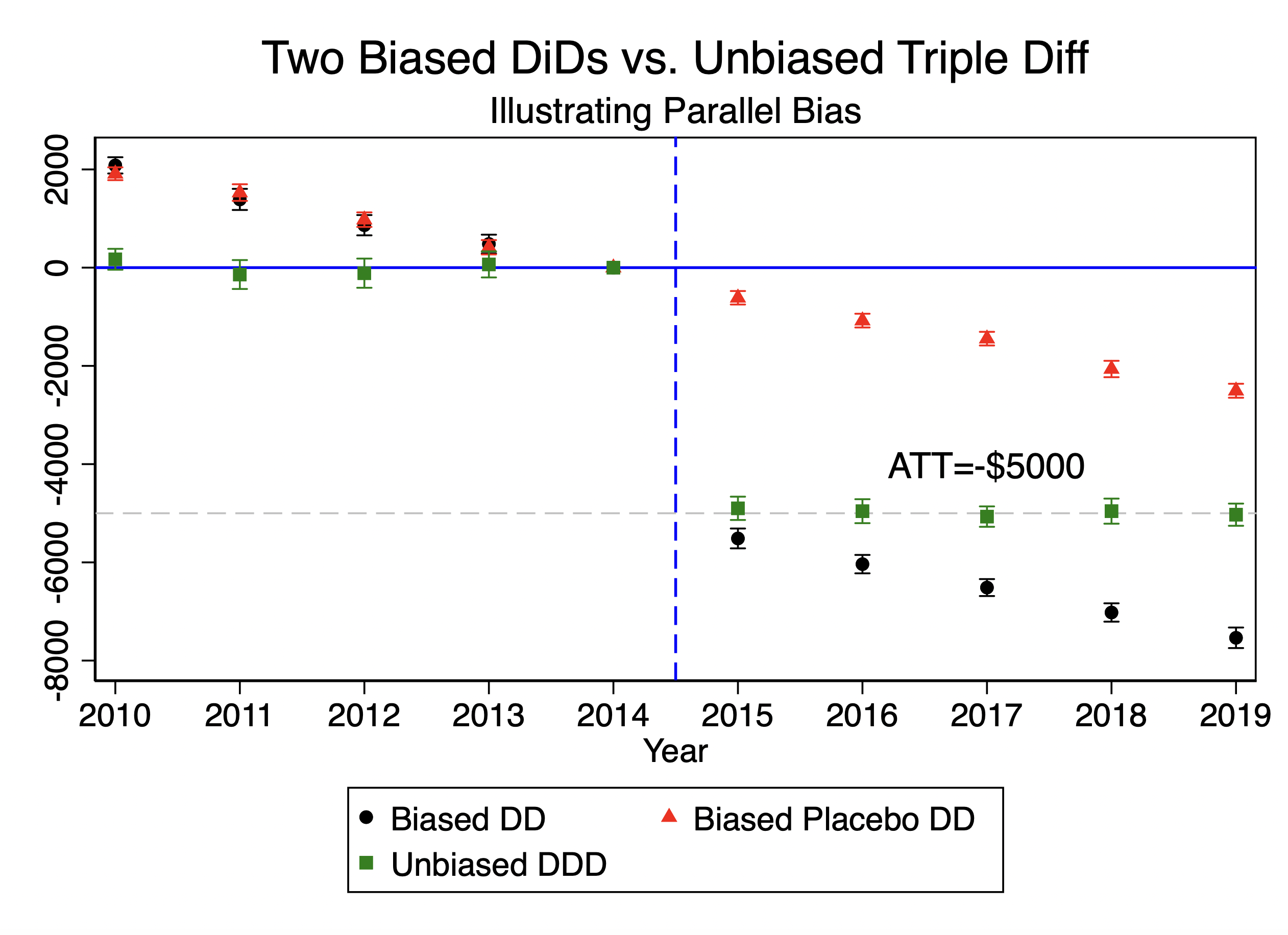
I’ve presented the triple difference event study from this regression in Figure 10.3 alongside the two diff-in-diffs in Figure 10.2 so that you can see an example of how you might present these. This is just a suggestion, though. The visual rhetoric of causal designs is principled in some ways, but utterly subjective in others, just like all of art. But I think the value of showing all three is that it might help the reader better understand that your triple diff research design is differencing the diff-in-diffs of two groups, both of which have the same biased parallel trends term, \(PTB\).

Main diff-in-diff with biased parallel trends

Control diff-in-diff equal to that bias
Figure 10.2: Main diff-in-diff with biased parallel trends term (left) and control diff-in-diff equal to that bias (right).

You can see in both sets of figures that the main diff-in-diff is biased, which in my example I made to be true also in the preperiod. But then the control diff-in-diff looks pretty similar in the preperiod on trends too, which is what makes it a candidate comparison group. It’s similar on trends, so we use it to difference out the bias of the main diff-in-diff, which is how we get an estimated that is approximately correct.

Figure 10.3: Triple difference event study results.

Gruber’s Results

So then, what did Gruber (1994) find? Did state mandated maternity benefits change 20–40-year-old married women’s wages? Both his main diff-in-diff and his triple differences estimator found that the state mandates reduced the wages of 20–40-year-old married women. I’ve reproduced his table below in Table 10.5. Let’s walk through it together.

Table 10.5 has two panels, A and B, and Panel A is the main diff-in-diff. To read the diff-in-diff equation off this table, just subtract row by row the after minus the before to get the first difference, just like we did in our simple illustrations using tables earlier. So for instance, in the experimental states after the law change, log hourly wages were 1.513, but prior they were 1.541, so 1.513 minus 1.547 is –0.034, which is the number in the Difference column. Wages fell 3.4% for married women age 20–40 after the law was passed compared to before. Then he calculated the first difference for the nonexperimental states, which was 0.028. And finally, he calculated the difference-in-differences of those two numbers, which was –0.034 minus 0.028, or –0.062. Thus, he finds using diff-in-diff that state mandated maternity benefits might have caused married women ages 20–40 to earn 6.2% less than they would have earned had the mandates not happened.

Table 10.5: DDD Estimates of the Impact of State Mandates on Hourly Wages
Location/year Prelaw Postlaw Difference
A. Treatment: married women, 20–40 yo
Experimental states 1.547 1.513 \(-0.034\)
(0.012) (0.012) (0.017)
Nonexperimental states 1.369 1.397 0.028
(0.010) (0.010) (0.014)
Difference 0.178 0.116
(0.016) (0.015)
Difference-in-difference \(-0.062\)
(0.022)
B. Control: over 40 and single males 20–40
Experimental states 1.759 1.748 \(-0.011\)
(0.007) (0.007) (0.010)
Nonexperimental states 1.630 1.627 \(-0.003\)
(0.007) (0.007) (0.010)
Difference 1.09 1.21
(0.010) (0.010)
Difference-in-difference \(-0.008\)
(0.014)
DDD \(-\textbf{0.054}\)
(0.026)

Note: Standard errors in parentheses. From Gruber (1994).

In Panel B, he estimates the bias of the main diff-in-diff using the control diff-in-diff. And here he finds that, using the single men 20–40 and older workers, the effect of the mandates was to decrease log hourly wages \(-\)0.008. If that is the bias of the first diff-in-diff, it’s not very large. But nonetheless, he puts that into the triple differences by subtracting \(-\)0.008 (the control diff-in-diff) from \(-\)0.062 (the main diff-in-diff) and gets an estimate of the to be \(-\)0.054.

There’s no event study in Gruber (1994), but that wasn’t a common practice until the early 2000s (see, for example, Autor (2003)). Even today, event study plots based on triple-difference designs are rare.7 This may be because triple-difference estimators are often treated as falsification tests rather than full-blown research designs. But to paraphrase the Disney movie Pinocchio: triple diff is a real boy—not one made of wood.

10.3 Covariates

Which Covariates?

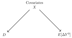
When estimating the with diff-in-diff, we need to impute the missing potential outcome \(\mathbf{E[Y^{\textbf{0}}|D=\textbf{1},Post]}\) using the comparison group and parallel trends. Under conditional parallel trends, we are imputing the missing potential outcomes for units with the same values of \(X\). This therefore means that when selecting covariates for diff-in-diff, our goal should be covariate confounders between the treatment and \(E[\Delta Y^0]\). Consider this DAG in Figure.

Figure 10.4: DAG representing differences in covariate composition (\(X\)) across treatment and control groups (\(D\)) as well as its determination of the untreated potential outcome trends (\(E[\Delta Y^0]\)).

There are two key pathways shown in Figure:

  1. \(X \rightarrow D\), and

  2. \(X \rightarrow E[\Delta Y^0]\)

Covariate selection in diff-in-diff is best thought of as identifying the variables that are the ordinary causes of trends in untreated outcomes—that is, the pretreatment factors that shape \(Y^0\) over time but are not the consequence of your treatment.

How should you choose those covariates? One option is to consult subject matter experts on the drivers of \(\Delta E[Y^0]\). For example, if you’re studying the effects of free long-acting reversible contraception (LARC) on county-level birth rates, you’d talk to demographers or maternal health researchers about the factors known to influence birth rate trends in the absence of intervention. The good news is: entire fields already study these baseline trends, so a defensible covariate list is usually within reach.

Alternatively, you might use data-driven approaches. For instance, Borgschulte and Vogler (2020) selected covariates using a LASSO procedure—a method I’ll return to later in this chapter. Still others might prefer a graphical approach, drawing a DAG (like the one in Figure) to formalize their assumptions. However you go about it, the covariates you choose should ideally serve two roles: they should be predictors of treatment (\(X \rightarrow D\)) and predictors of trends in the untreated potential outcome (\(X \rightarrow \Delta E[Y^0]\)).

And it’s worth emphasizing: the choice of covariates can swing your results—sometimes a lot. That makes covariate selection a major source of researcher discretion, and a potential avenue for “cherry picking” if it’s not done carefully. Even well-intentioned choices can shape the story the data appear to tell.

Baseline Covariate Balance and Normalized Difference

The second part of Figure is the \(X \rightarrow D\) channel. This represents differences in the distribution of \(X\) in the treatment than the control group. This, unlike the \(X \rightarrow E[\Delta Y^0]\), is directly testable as it represents imbalance in their means values between treatment and control.

To evaluate baseline balance, we use the normalized difference in mean covariates measured at baseline, since it is from baseline where the parallel trends assumption is thought to originate. This metric is designed to measure the degree of imbalance between the treatment and control groups for each covariate. Like the z-score, the normalized difference standardizes differences, making it unit-free. However, while the z-score measures how far a single observation is from the mean in standard deviation units, the normalized difference compares two group means relative to their pooled variance. This is why it is particularly suited for evaluating balance between groups.

The normalized difference is calculated as follows: \[ \begin{equation} \text{Norm. Diff}_\omega = \frac{\overline{X}_{\omega,T} - \overline{X}_{\omega,C}}{\sqrt{(S_{\omega,T}^2 + S_{\omega,C}^2)/2}} \label{eq:norm_diff} \end{equation} \tag{10.19}\] where \(\overline{X}_{\omega,T}\) and \(\overline{X}_{\omega,C}\) are the sample averages of the covariate \(X\) for the treatment and control groups, respectively, and \(S_{\omega,T}^2\) and \(S_{\omega,C}^2\) are the sample variances of the covariate for the treatment and control groups. As a rule of thumb, a normalized difference of less than 0.25 indicates acceptable balance between the groups, while values above this threshold may signal a problematic imbalance (Guide W. Imbens and Rubin 2015; A. Baker et al. 2025).

Now, let’s look at the data and analyze the balance of baseline covariates between the treatment and control groups. Let’s look at the LaLonde dataset that we discussed together in the earlier chapter on unconfoundedness (Dehejia and Wahba 2002). I calculated the normalized standardized difference in means of all the covariates and reported it in Table 10.6.

Table 10.6: Covariate Balance Statistics for LaLonde Dataset
Variable Mean (treated) Mean (control) Norm. diff.
Age 25.816 33.225 \(-0.796\)
Education 10.346 12.028 \(-0.679\)
Black 0.843 0.074 2.428
Hispanic 0.059 0.072 \(-0.051\)
Married 0.189 0.712 \(-1.233\)
No high school degree 0.708 0.296 0.904
Unemployment 1974 0.708 0.120 1.487
Unemployment 1975 0.600 0.109 1.192

This table reports the covariate balance between treated and control groups in the LaLonde dataset. Normalized differences (Norm. diff.) in excess of 0.25 indicate a potentially problematic imbalance.

Given a threshold of \(|0.25|\), then as you can see, pretty much every covariate, except for Hispanic, is severely imbalanced. These variables are irrelevant if the covariates don’t cause differential trends in \(Y^0\), but if they do, then the imbalance will introduce bias. The smallest in absolute value is the education variable, which is –0.679. The NSW treatment group, though, is highly selected—these were individuals facing considerable economic obstacles in their lives that volunteered to be in NSW prior to the randomization. And the CPS is a random sample of Americans. The two groups differ a lot, so if you think these covariates determine \(\Delta E[Y^0]\), then it means we will need to probably switch out the parallel trends assumption for the conditional parallel trends assumption and then examine estimators that work for that.

10.4 Inverse Probability Weighting

Abadie (2005) proposes a semiparametric approach to diff-in-diff that incorporates covariates using inverse probability weighting (IPW) based on a propensity score model. This method reweights the control group to create a balanced comparison with the treatment group, which can improve the validity of the diff-in-diff estimate of the treatment effect. In particular, the goal is to re-establish the parallel trends assumption in cases where the covariates differ between the treated and control groups, potentially biasing the standard diff-in-diff estimator. And interestingly, the final calculation will be “four averages and three subtractions,” only the averages will be differentially weighted by the propensity score, or not, depending on whether they are or are not in the control group.

The IPW approach is based on estimating the propensity score, which, recall, is the probability of receiving treatment as a function of baseline covariates. Once estimated, the propensity score is used to weight the control group’s contribution to the diff-in-diff estimate, effectively balancing the covariate distributions between treated and control groups. But note, it will not weight the treatment group—the propensity score weighting is only on the control group, as you’ll see. And the reason the paper has the word “semiparametric” in the title is because Abadie does not assume a specific functional form for the relationship between treatment and covariates beyond the estimation of the propensity score.

Steps in Abadie’s IPW Diff-in-Diff Method

Abadie’s method can be broken down into three main steps:

  1. Calculate “After Minus Before”: For each unit, calculate the change in outcomes between the post- and pretreatment periods. This is the \(D_1\) first difference we used in our diff-in-diff tables in the previous chapter.

  2. Estimate the Propensity Score: Estimate the conditional probability of receiving treatment based on baseline covariates, denoted \(X_b\). This is typically done using logistic regression. The propensity score summarizes how likely a unit was to receive treatment, based on its characteristics before the intervention.

  3. Reweight the Comparison Group’s First Differences: Use the estimated propensity scores to reweight the first differences for control group units. This aligns the covariate distribution of the control group with that of the treated group, allowing for better comparison and adjustment for observable differences.

While this might initially resemble Hong (2013), it’s distinct in important ways. In Abadie’s setup, reweighting is applied only to the control group’s first differences, because for the , we only need to estimate the counterfactual \(Y^0\) for the treated group. Additionally, all covariates are measured at baseline—a key feature of the design.

Abadie’s model has a distinctive structure when it comes to timing and covariate use, summarized as follows:

  • There is a single treatment group and one main treatment period, denoted \(t\).

  • The period before treatment is referred to as the baseline or \(b\) period. Here, treated units have not yet received treatment.

  • Covariates \(X_b\) are measured in the pretreatment period and used exclusively to estimate the propensity score.

  • Post-treatment covariates are excluded, since they may be affected by the treatment and thus not valid for establishing pretreatment comparability.

This exclusive use of baseline covariates is essential: the goal is to restore parallel trends at baseline, and including post-treatment variables would risk conditioning on outcomes influenced by the treatment itself.

Assumptions in Abadie’s Approach

To implement Abadie’s semiparametric diff-in-diff approach, four main assumptions are needed, in addition to SUTVA, which is always to be assumed when working with potential outcomes. Those four assumptions are:

  1. No Anticipation: Units do not alter behavior before treatment in anticipation of receiving treatment.

  2. Conditional Parallel Trends: The difference in potential outcomes between post- and pretreatment periods is the same for treated and control units, conditional on \(X_b\): \[ E[Y^0_t - Y^0_b \mid D=1, X_b] = E[Y^0_t - Y^0_b \mid D=0, X_b]. \tag{10.20}\]

  3. Common Support: There is real overlap in the propensity score distribution between treated and control units. Formally, \(0 < Pr(D=1 \mid X_b) < 1\), by which I mean that the control group has \(X\)’s corresponding to the \(X\)’s in the treatment group. We don’t require the other way around, but we do need our control group to satisfy that weak common support since this is ultimately an estimator for the .

  4. Correct Specification of the Propensity Score Model: The model used to estimate the propensity score must be correctly specified.

For the moment, note that since we are reweighting the control group with the (inverse) propensity score, getting the correct specification of the propensity score is playing a non-trivial role in estimation.

Propensity Scores as Dimension Reduction

While experimental designs know the true propensity score by construction, observational studies must estimate it. In Abadie’s approach, a series logit model is typically used, introducing a parametric structure to the estimation process—hence the term semiparametric in the name of the model.

Propensity scores offer a practical way to manage high-dimensional covariate spaces in diff-in-diff models. By summarizing all covariates into a single scalar—the estimated probability of treatment given covariates—we reduce the dimensionality of the problem. Rather than conditioning on every variable in a potentially large X, we condition on the propensity score itself.

If these terms still feel murky, just remember: in this context, dimension refers to the number of covariates you’re conditioning on. A binary variable contributes a small number of possible combinations, but as you add more variables—especially continuous ones—the number of combinations grows rapidly, making it harder to find good matches across treated and control units.

This is where common support becomes essential. It ensures that, for every combination of covariates (e.g., race, age, education), there are comparable units in both treatment and control groups. You may recall this issue from our discussion of exact versus inexact matching. As the number of covariates increases, it becomes increasingly unlikely that treated and control units overlap in all dimensions. Without sufficient overlap, identification may break down, and the estimates can become biased.

The propensity score theorem from Rosenbaum and Rubin (1983) justifies this approach. It states that if conditional parallel trends hold when conditioning on \(X\), they also hold when conditioning on the propensity score \(\Pr(D=1 \mid X_b)\). This result underpins the logic of using the propensity score to simplify covariate adjustment in diff-in-diff settings.

Since this is difference-in-differences, the treatment effect Abadie aims to estimate is the average treatment effect on the treated (), which, recall, is defined as: \[ \begin{eqnarray*} {\mathit{ATT}} &=& E[Y^1_t - \mathbf{Y^{\textbf{0}}_t \mid D=\textbf{1}}] \\ &=& E[Y_t \mid D=1] - \mathbf{E[Y_t^{\textbf{0}} \mid D=\textbf{1}]} \end{eqnarray*} \tag{10.21}\] where \(t\) is the postperiod only. As you can see, while the first part of the equation can be calculated as \(Y^1=Y\) for the treatment group in the postperiod, we cannot calculate \(Y^0\) in the postperiod for the treatment group. So, Abadie’s IPW estimator reweights the control group’s outcome changes by the inverse of their propensity score in order to impute it. The IPW estimator is given by: \[ \begin{equation} \widehat{\delta}_{ipw} = E \left[ \frac{Y_t - Y_b}{Pr(D=1)} \times \frac{D - Pr(D=1 \mid X_b)}{1 - Pr(D=1 \mid X_b)} \right] \label{eq:abadie_ipw} \end{equation} \tag{10.22}\]

The numerator captures the difference in outcomes between the post- and pretreatment periods whereas the IPW weights adjust the contribution of control units to align with the treated group’s covariate distribution. These calculations are done for each unit in the dataset, but the propensity score itself is only going to weight the control group because when the unit is treated, then the weight becomes \(\frac{1 - Pr(D=1 \mid X_b)}{1 - Pr(D=1 \mid X_b)} = 1\). But when it is a control group unit, the weight is \(\frac{- Pr(D=1 \mid X_b)}{1 - Pr(D=1 \mid X_b)}\).

I find that it is helpful for people to see how simple this is with an example. In Table 10.7, we see the difference in outcomes for four people—Pat, Tiffany, Dolores, and Danny. Two of them (Pat and Dolores) are in the control group, and two (Tiffany and Danny) are in the treatment group. We’ve estimated their propensity scores, and used the IPW equation to calculate their weight. And then we weighted the first difference in outcomes to get the weighted first difference.

Table 10.7: Sample Table of Treatment and Control Units with Outcome and Weighting Information
Name First difference \(D\) \(Pr(D=1 \mid X)\) IPW Weighted first difference
Pat 45 0 0.75 \(-3\) \(-135\)
Tiffany 100 1 0.9 1 100
Dolores 42 0 0.25 \(-\frac{1}{3}\) \(-14\)
Danny 75 1 0.5 1 75

Using Equation 10.22, we can calculate ourselves Pat’s IPW. His outcomes changed by 45 and his propensity score is 0.75. Since he’s in the control group, then using Equation 10.22, his IPW is \(\frac{-0.75}{0.25}=-3\). And then we multiply that IPW by his first difference, which is \(-3 \times 45=-135\). But then we see Tiffany, who is a member of our treatment group. Her first difference, is 100 and her propensity score is 9, but that just makes her IPW equal to 1, so her reweighted difference is 100.

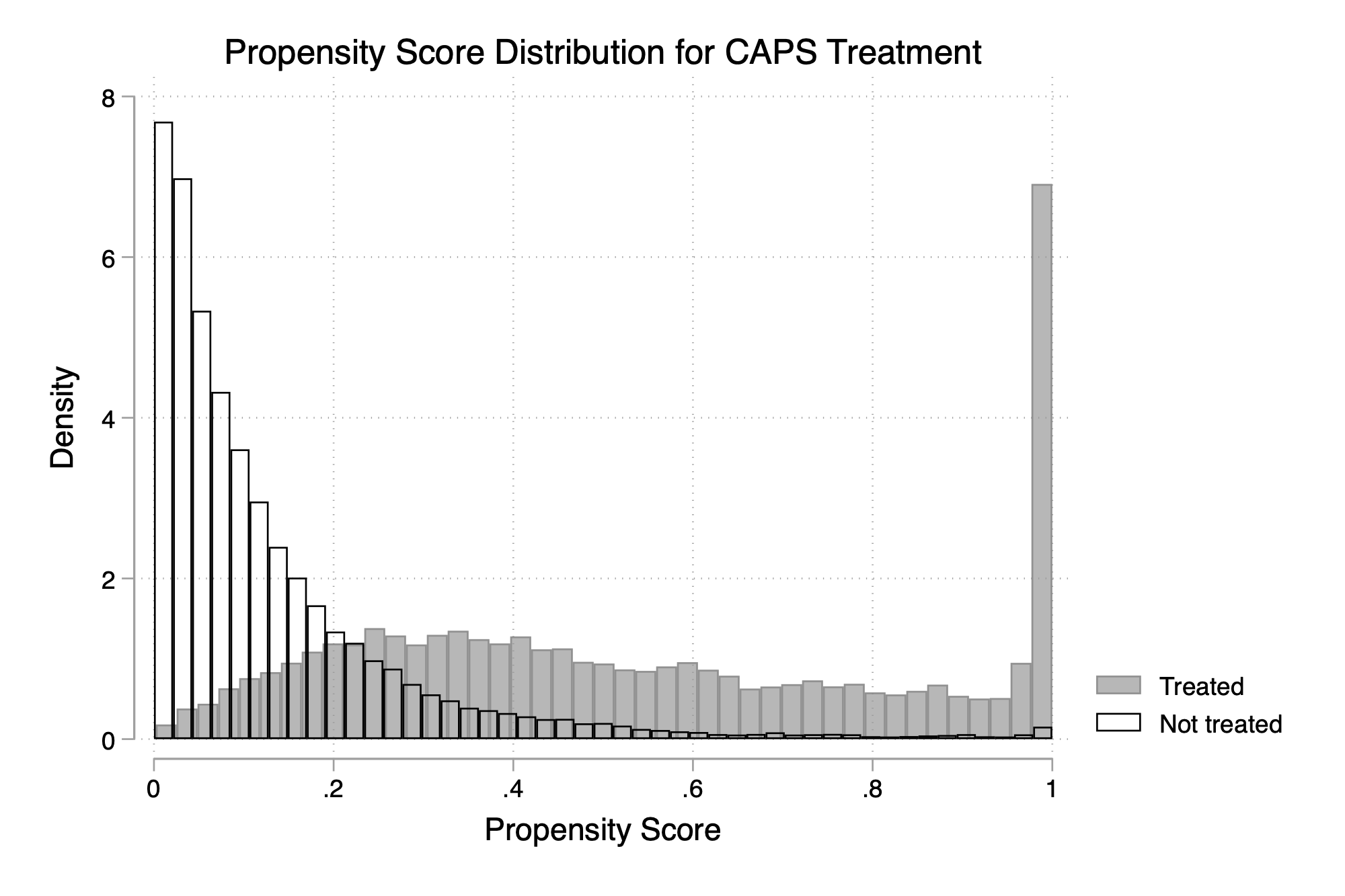
The fact that the propensity scores are being turned into inverse probability weights merits looking carefully at the distribution of the propensity scores, using the kinds of conventional tools we discussed in the Unconfoundedness chapter, like histograms and kernel density plots for the treatment and control group separately. Such plots help us judge whether common support holds, or if we have problematic separation in the propensity scores between the treatment and control such that one group has a disproportionate number of propensity score values compared to the other.

But, such plots will not usually help the researcher see whether explosive weights are likely to form on the control group; that usually will require basic diagnostics like simply counting the number of control group units with extremely high propensity score values. How high, and why does that matter? Consider this example: what if instead of a propensity score of 0.25, Dolores had had a propensity score of 0.99991? Then her inverse probability weight would be \(\frac{-0.99991}{1-0.99991} = 11,110\). That’s enormous. And, even if there were hundreds or thousands of control group units, a weight of 11,110 on just one single unit could skew the results massively. This is what an outlier looks like when using inverse probability weighting. In that procedure, an outlier is not when the unit’s outcome is extreme, but rather when the weighted group has an IPW that is extreme. And with diff-in-diff, that means high propensity scores for the control group, as remember in diff-in-diff, only the control group gets weighted by the IPW. In such a case, the safest recourse might be to trim the data such that the highest propensity score value in the control group is not so large as to create gigantic swings like that.

In the end, the final estimate is a weighted sum over all of that last column with the final adjustment made by \(E[D=1]\). And you can get the standard errors analytically or through bootstrapping, but remember: in diff-in-diff, the conservative approach will always be to cluster or bootstrap at the aggregate level of the treatment.11 But to the point of estimation, the purpose of this reweighting is to restore balance between treated and control groups with respect to the covariates needed to re-establish parallel trends.

10.5 Outcome Regression Imputation

Next we introduce the outcome regression imputation method for estimating treatment effects in a diff-in-diff framework when you need to adjust for covariates to satisfy the conditional parallel trends assumption. This estimator was originally proposed by Heckman, Ichimura, and Todd (1997). Outcome regression is an imputation method. It is a similar type of regression adjustment, like the Oaxaca-Blinder-Kitagawa decomposition (Słoczyński 2015), only here it’ll be based on conditional parallel trends, not unconfoundedness. It’s a diff-in-diff estimator, so the outcome in this case will be the “long difference” subtracting the baseline at \(t-1\) from the postperiod, \(t\).

The imputation assumes that if \(X \rightarrow \Delta Y^0\) in the control group then under conditional parallel trends it also would for the treatment group. Put another way, we use the logic implied by conditional parallel trends to impute the missing potential outcome needed for the using only the control group for initial estimation.

Steps for Outcome Regression Imputation

In this setup, we use \(\Delta Y\) from the control group as a stand-in for \(\Delta Y^0\) in the treatment group, estimating what outcomes for treated units would have looked like in the absence of treatment. This approach inherently relies on the control group to capture the relationship between \(\Delta Y^0\) and \(X\). Once that relationship is estimated, it is then applied to the treated group to impute the missing potential outcomes. I think the steps involved may make this easier to understand because some of us aren’t used to seeing imputations based on switching between groups before. We’ll start by writing down the outcome regression (OR) procedure as follows:

  1. Fit the Outcome Regression Model: Using only the control group, estimate a model of \(\Delta Y\) as a function of baseline covariates \(X_b\). This gives you a fitted function \(\widehat{\mu}(X)\), which predicts \(\Delta Y^0\) based on \(X\). OLS is commonly used here, though Heckman, Ichimura, and Todd (1997) originally used a nonparametric estimator. But given we are doing prediction, it’s worth considering whether machine learning methods might do better (Chang 2020).

  2. Impute Counterfactuals for Treated Units: Use the estimated model \(\widehat{\mu}(X)\) from Step 1 to predict the counterfactual change in outcomes, \(\Delta \widehat{Y^0}\), for each treated unit based on their baseline covariates \(X\). This assumes that the conditional relationship between \(\Delta Y^0\) and \(X\) in the control group also holds for the treated group.

  3. Calculate the Outcome Regression Estimator for : With the imputed counterfactuals in hand, compute the outcome regression estimator for the : \[ \widehat{\delta}_{OR} = \left( \overline{Y}_{1,1} - \overline{Y}_{1,0} \right) - \left( \frac{1}{n_T} \sum_{i : D_i = 1} \left[ \widehat{\mu}_{0,1}(X_i) - \widehat{\mu}_{0,0}(X_i) \right] \right) \tag{10.23}\] where \(\overline{Y}_{1,t}\) is the mean outcome for the treated group at time \(t\), and \(\widehat{\mu}_{0,t}(X_i)\) is the predicted outcome at time \(t\) for treated unit \(i\), using the model fitted on the control group.

Before we move into the assumptions, I’d like to note a subtle detail. Whereas Abadie’s IPW method reweighted the control group, note that the Heckman et al. method imputed the treatment group long difference counterfactual. These are different transformations in other words. Heckman et al. are deleting imputed counterfactuals for each individual unit \(i\), but Abadie’s IPW method is not doing anything to the treatment group. Abadie reweights the control group units, \(j\), rather. So, while each method works with both groups to undertake their respective steps, the first step in each is more or less “hidden” from the final estimator.

Assumptions for Outcome Regression Imputation

The outcome regression assumptions are, perhaps unsurprisingly, pretty similar to the ones for IPW. They are:

  1. No Anticipation: Same as always. We need the baseline to be untreated, otherwise the treatment effect from that preperiod will bias the calculation.

  2. Conditional Parallel Trends: The expected counterfactual outcome trends for the treated group mirror those of the control group after conditioning on \(X\). Formally, this is expressed as: $$ E[ - Y_0^0 X, D=1] = E[Y_1^0

  • Y_0^0 X, D=0] $$ {#eq-or-cpt} where the subscripts \(1\) and \(0\) refer to “After” and “Before” the treatment has taken place, respectively. This is the same assumption we introduced with Abadie’s IPW method.
  1. Common Support: There must be overlap in the distribution of \(X\) between treated and control groups. Specifically, for every \(X\) value observed in the treatment group, there should be a corresponding \(X\) in the control group. This is a weak overlap type of assumption like we discussed in the Unconfoundedness chapter because we don’t require that the treatment group have the same covariate values as the control group, but without it the other way around, we will be missing imputations. This ensures that we have a relevant control group observation for each treated observation, enabling valid counterfactual predictions. Again, same assumption with IPW.

  2. Correct Specification of the Outcome Model: Since the outcome model is fitted using the control group, the functional form of \(\Delta Y^0 \sim X\) must be correctly specified for the estimator to be unbiased. Misspecification in the model could lead to biased estimates of the . This is similar to how the propensity score must be correctly specified in the IPW estimator we just discussed.

With all four assumptions, outcome regression diff-in-diff is an unbiased estimator of the . Note that the only one that appears here that did not appear in the IPW approach was assumption 4—the correct outcome model. The IPW approach had its own version of this, but its was that the propensity score model was correctly specified. Here we require the outcome regression model to be correctly specified but other than the fourth assumption, both IPW and OR have the same core assumptions.

10.6 Doubly Robust (Combining IPW and OR)

In American baseball, you get three strikes before you’re out, and in American gridiron football, the offense has four chances to progress ten yards before giving up possession. Why mention this? Because life often allows us a few chances to get things right before calling it quits, and the same principle applies to IPW and OR.

What if there was a way to combine IPW and OR so that we had two chances to get the answer right without requiring that we choose? That’s exactly what Double Robust (DR) estimators accomplish: they allow you to apply IPW and OR simultaneously while only requiring that one of the two models be correctly specified. So, if there’s a nonzero chance that one of these approaches is right, a DR estimator increases the likelihood of valid results by combining them without additional cost.

Pedro H. C. Sant’Anna and Zhao (2020) and Chang (2020) brought DR methods into diff-in-diff estimation. The former leverages the IPW and OR methods we discussed by Abadie (2005) and Heckman, Ichimura, and Todd (1997), while the latter incorporates double debiased machine learning. I encourage you to study both papers, but here we’ll focus on Pedro H. C. Sant’Anna and Zhao (2020) to streamline this discussion. Still, for large datasets, especially in administrative or industry settings, Chang (2020) might prove to be the more relevant choice.

The DR estimator by Pedro H. C. Sant’Anna and Zhao (2020) combines both IPW and OR. It allows us to control for covariates twice: once by reweighting control observations with the propensity score, and then again by imputing \(Y^0\) with the outcome model. If either the IPW model (propensity score) or the OR model (outcome regression) is correctly specified, the estimator is unbiased. This flexibility—requiring only one correct specification—makes the DR approach a particularly robust choice in diff-in-diff settings. But before diving into the steps to estimation, let’s review the assumptions needed for this method to work at all in the first place.

Assumptions for Double Robust Diff-in-Diff

The DR estimator requires the following assumptions most of which we’ve already seen, but which are listed for the sake of completeness anyway:

  1. No Anticipation: The treatment does not influence outcomes in the pretreatment period.

  2. Conditional Parallel Trends: After controlling for covariates \(X\), the expected trends in \(Y^0\) are the same across treatment and control groups.

  3. Common Support: There must be overlap in the distribution of \(X\) between treated and control groups.

  4. Model Specification: Only one of the following must be correct:

    • 4a. The propensity score model is correctly specified.

    • 4b. The outcome regression model is correctly specified.

Notice that DR has the first three assumptions in common with both IPW and OR. And then notice that the fourth assumption is a combination of them both, only with a twist. DR doesn’t require both the IPW assumption and the OR assumption. Rather it’s an “either/or” assumption. Only one of the two “correct model specifications” are needed for the DR estimator to be an unbiased estimate of the . Which means you can be wrong—you just can only be wrong once.

Steps for Double Robust Diff-in-Diff

The DR diff-in-diff estimator proceeds with the following steps, combining the IPW and OR approaches:

  1. Fit the propensity score model and calculate IPW weights: Use the baseline covariates \(X_b\) to estimate the propensity score \(p(X) = Pr(D=1|X)\), which is the probability of treatment. For each unit in the control group, compute IPW weights based on this propensity score. Use your preferred model for the propensity score (e.g., logit), but not OLS.

  2. Fit the OR model and impute counterfactuals for treated units: Using the control group data only, estimate the outcome regression model \(\mu_{0,\Delta}(X)\) to capture the expected change in outcome \(\Delta Y\) as a function of \(X\). This model is then used to impute the counterfactual \(Y^0\) for treated units, based on their baseline covariates \(X_b\).

  3. Calculate weighted and imputed outcomes: For each unit, calculate the weighted outcomes for the control group using the inverse probability weights for the treated group based on the fitted OR model.

  4. Calculate the DR estimator for : Using the formula for \(\delta_{dr}\) above, combine the weighted difference in outcomes and the imputed outcomes for treated units to estimate the .

This setup essentially controls for \(X\) twice: once by weighting with the propensity score, and once by imputing with the outcome model. Mathematically, the estimator uses the IPW approach to reweight the control group and the OR approach to impute missing outcomes for the treatment group. Together, these provide a robust estimator of the with diff-in-diff. \[ \begin{eqnarray*} \delta_{dr} = E \bigg [ \bigg ( \frac{D}{E[D]} -\frac{ \frac{p(X)(1-D)}{(1-p(X))} }{E \bigg [\frac{p(X)(1-D)}{(1-p(X))} \bigg ]} \bigg )( \Delta Y - \mu_{0,\Delta}(X)) \bigg ] \end{eqnarray*} \tag{10.24}\] where \(p(x)\) is the propensity score model, \(\Delta Y\) is the first difference, or \(Y_{post} - Y_{pre}\), and \(\mu_{0,\Delta}\) is the imputed first difference, outcome for the treated units, \(\mu_{0,1}(X) - \mu_{0,0}(X)\) in which \(\mu(X)\) is a model for \(m_{d,t} = E[Y_t|D=d,X=x]\).

So, this means \(\mu_{0,\Delta}\) is just the treatment group’s imputed change in \(Y^0\) from that regression of \(\Delta Y_j\) for the control group units onto their own \(X_j\) baseline values. I think what often trips people up is all this new notation, but if they can get past that, it’s not so bad, and is actually quite interesting. Plus it’s a trick that shows up a lot, as we will see later in this chapter, as well as to a degree in the next one as well.

10.7 Standard TWFE Regression Specification with Additive Covariates

After all this, many people might ask “why not just do OLS with controls?” You absolutely can, but there are additional assumptions beyond the familiar no anticipation and conditional parallel trends that must be accepted, and if you’re fine making those, then you should proceed with it. These assumptions involve homogeneous treatment effects and no time-varying trends in the covariates, conditions that turn out to be much stronger than they may appear at first glance. Let’s walk through these assumptions and examine what they imply for the standard TWFE specification in diff-in-diff.

Decomposition of Standard TWFE with Additive Controls

What I mean by the standard TWFE regression model used in diff-in-diff is this: \[ \begin{eqnarray*} Y_{it} = \alpha_1 + \alpha_2 Post_t + \alpha_3 D_i + \delta (T_i \times Post_t) + \theta X_{it} + \varepsilon_{it} \end{eqnarray*} \tag{10.25}\] where the term \(\theta X_{it}\) represents the additive effect of covariates \(X\) on outcomes \(Y\). To illustrate the additional assumptions required when including controls in this regression, let’s derive the expected values of potential outcomes under this model. For treated units, the expected treated outcome is: \[ \begin{eqnarray*} E[Y^1_1|D=1,X] = \alpha_1 + \alpha_2 + \alpha_3 + \delta + \theta_1 X \end{eqnarray*} \tag{10.26}\] where \(Y^1_1\) is the posttreatment potential outcome for the treatment group.

And then to find \(\mathbf{E[Y^{\textbf{0}}|D=\textbf{1},X]}\), we can get there using the conditional parallel trends assumption because it implies the following: \[ \begin{eqnarray*} E[\mathbf{Y^{\textbf{0}}_{\textbf{1}}} - Y^0_{0}|D=1,X] = E[Y^0_{1} - Y^0_{0}|D=0,X] \end{eqnarray*} \tag{10.27}\] which rearranges to: \[ \begin{eqnarray*} \mathbf{E[Y^{\textbf{0}}_{\textbf{1}}|D=\textbf{1},X]} = E[Y^0_{0}|D=1,X] + E[Y^0_{1}|D=0,X] - E[Y^0_{0}|D=0,X] \end{eqnarray*} \tag{10.28}\] Under conditional parallel trends, this can be expressed as: \[ \begin{eqnarray*} \mathbf{E[Y^{\textbf{0}}_{\textbf{1}}|D=\textbf{1},X]} = E[Y_{0}|D=1,X] + E[Y_{1}|D=0,X] - E[Y_{0}|D=0,X] \end{eqnarray*} \tag{10.29}\]

Once we make some substitutions, and if we allow for the effect of \(X\) on \(Y^1\) to be different than the effect of \(X\) on \(Y^0\), then we can write down these two expected potential outcome functions as: \[ \begin{eqnarray*} &&E[Y^1_1|D=1,X] = \alpha_1 + \alpha_2 + \alpha_3 + \delta + \theta_1 X \\ &&\mathbf{E[Y^{\textbf{0}}_{\textbf{1}}|D=\textbf{1},X]} = \alpha_1 + \alpha_2 + \alpha_3 + \theta_2 X \end{eqnarray*} \tag{10.30}\]

Before we move on, let me explain these two equations. When I write down \(E[Y^1|D=1,X]\) to be based on \(X\) where the parameter on \(X\) is \(\theta_1\), what I am saying is that \(Y^1\), as a random variable, is impacted by \(X\) in a way dictated by the value of \(\theta_1\). But when I say that same \(X\) has a different effect on \(\mathbf{E[Y^{\textbf{0}}_{\textbf{1}}|D=\textbf{1},X]}\), or at least might, then I am saying the \(X\)’s can have different effects depending on whether a person is treated (i.e., \(Y^1\)) or not (i.e., \(Y^0\)). And if so, then we have to at least be open to the idea that these two parameters, \(\theta_1\) and \(\theta_2\), are not exactly the same value.

So, for instance, let’s say that \(Y_{Dignan}^1\) is the earnings that Dignan makes if he goes to college and \(X\) is his age. And \(Y^0_{Dignan}\) is Dignan’s earnings if he doesn’t go to college. When you model earnings as a function of age, it’s called the age-earnings profile and basically just measures your annual raises, if any, as you age. But in the realm of potential outcomes, it simply means: do you think the age-earnings profile for Dignan (or anyone) is the same if they’re college educated as if they never got the college degree? Well, it’s not answerable because we don’t know Dignan’s counterfactual; whether he did or did not go to college always eliminates the other one. We can look at samples of college and high school students and see the slope on that, but it’s still not exactly the same because college is not randomized, so we don’t know with certainty if the age-earnings profile we observe in the data means that would be true if we switched the treatment assignments for those workers.

But, maybe it’s not implausible to imagine that my wage progression with a college degree is different than it would have been if I hadn’t gotten a college degree. The types of jobs one gains access to with the college degree are very different. The pay is higher in levels, but at different points in time, it also seems like they’re progressing differently, sometimes simply because of the mobility that the college degree gets you. And, if that is in fact true at the level of the potential outcomes themselves, then it implies \(\theta_1 \neq \theta_2\), which will matter once we plug those two expectation functions into the definition of the in a moment.

Assumptions for Standard TWFE with Additive Controls

The standard TWFE model with additive covariates rests on the following assumptions, several of which are pretty familiar by now:

  1. No Anticipation: Treatment does not influence outcomes in the pretreatment period.

  2. Conditional Parallel Trends: After controlling for covariates \(X\), trends in \(Y^0\) are the same across treatment and control groups.

  3. Functional Form Specification: As this is a regression model, we assume the functional form is correct.

  4. Homogeneous Treatment Effects: The treatment effect does not vary by values of \(X\).

  5. No Covariate-Specific Trends: The coefficients on covariates must be constant across time for the potential outcomes in each period.

We already know about no anticipation and conditional parallel trends but the other three are new. First, because you’re not using common support, but rather you’re using a regression model in this way, you have to rely on the functional form to be correctly specified as you are aiming at the missing counterfactual with that model. So, if the model misspecified, then you won’t hit the target.

But the homogeneous treatment effect assumption is implied by this: \[ \begin{eqnarray} {\mathit{ATT}} &=& E[Y^1_1|D=1,X] - \mathbf{E[Y^{\textbf{0}}_{\textbf{1}}|D=\textbf{1},X]} \nonumber \\ &&= (\alpha_1 + \alpha_2 + \alpha_3 + \delta + \theta_1 X) - (\alpha_1 + \alpha_2 + \alpha_3 + \theta_2 X) \nonumber \\ &&= \delta + (\theta_1 X - \theta_2 X) \nonumber \end{eqnarray} \tag{10.31}\]

The only way the terms in the parentheses cancel out is if \(\theta_1=\theta_2\), and that happens if and only if there are no unique additional effects of \(X\) on \(Y^1\) than was already there with its effect on \(Y^0\). What it means in our age-earnings profile is that while Dignan’s college degree caused his salary to go up a thousand dollars, his earnings progression each year was the same either way. But then, what does that even mean? Because that’s maybe both specific and abstract, then I’ll be more plain about it.

If \(\theta_1=\theta_2\), you are saying that the effects of the program are the same for old and young people, for black and white people, for the rich and the poor, and so on. In other words you are assuming that the treatment effects are independent of individual characteristics. But the second you think treatment effects vary with the characteristics of the person is when \(\theta_1 \neq \theta_2\), and the standard TWFE specification used so often in diff-in-diff is biased and the magnitude of that bias will depend on the terms relative amounts in those parentheses.

Simulation of Biases

I’d like to now illustrate the sampling distribution of these four estimators under the following assumptions:

  1. No Anticipation: Each model will be estimated using as a baseline an untreated period.

  2. Conditional Parallel Trends: A particular formulation of conditional parallel trends is used.

  3. Correct Propensity Score and Outcome Model Specification.

The main differences are the fact that I do not impose homogeneous treatment effects, and I allow for covariate-specific trends. I ran this simulation 1,000 times, which gave the following distribution for the four estimators presented in Figure 10.5. While I show the entirety of the code in the online book, I want to here just emphasize a snippet to illustrate what it means for each potential outcome to have different \(\theta_d\) parameters.

gen          e = rnormal(0, 1500)
gen     y0 = unit_fe        + 100 * age + 1000 * gpa + e if year == 1990
replace y0 = unit_fe + 1000 + 200 * age + 2000 * gpa + e if year == 1991
* The change in coefficients on age and gpa generate trends in outcomes. If two units have the same age and same gpa, then they will have the same change in y0.

* Covariate-based treatment effect heterogeneity
gen         y1 = y0
qui replace y1 = y0 + 1000 + 100 * age + 500 * gpa if year == 1991

I generated “covariate-specific trends” and “heterogeneous treatment effects” in lines 2, 3, 7, and 8 of the code example to help readers whose first language is code to better understand the assumptions underlying TWFE with additive covariates.

For example, consider the coefficient on age: in line 2 it’s 100, but in line 3 it’s 200. That’s what I mean by a covariate-specific trend. Age is helping determine \(Y^0\), but the size of that effect—its parameter—changes over time. Covariate-specific trends occur when the influence of a covariate on untreated outcomes shifts over time, violating a key assumption in TWFE models.

Heterogeneous treatment effects appear in lines 7–8, just as we saw in the Unconfoundedness chapter. Here, treatment effects depend not only on \(Y^0\) but also on variables like age and GPA, which influence \(Y^1\) beyond what’s captured in \(Y^0\).

Together, lines 2–3 and 7–8 illustrate violations of two unique TWFE assumptions: no covariate-specific trends and homogeneous treatment effects. When those assumptions fail, TWFE estimates can be biased. But this isn’t true for IPW, OR, or DR estimators—so long as the OR model or the propensity score model is correctly specified. These methods do not require homogeneous treatment effects or stable covariate trends in \(Y^0\) to yield unbiased estimates.

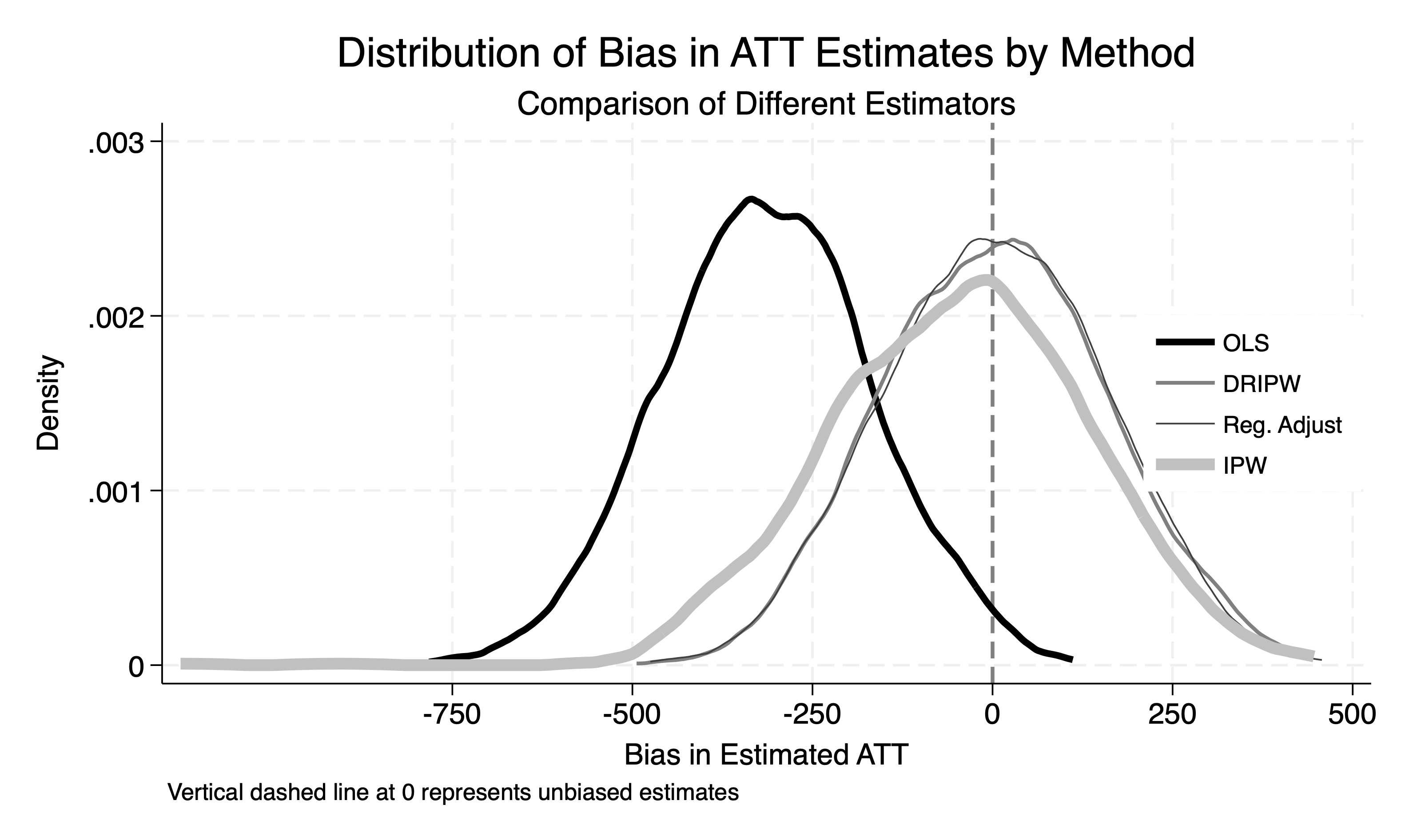
So, with these violations baked into the data, how does TWFE fare against our new heterogeneous robust estimators in our simulation? Well check it out in Figure 10.5. When I plot the coefficients from all 1,000 trials in Figure 10.5, you can see that the TWFE model is misspecified because it is biased relative to OR, IPW, and DR. The syntax for both the TWFE as well as the methods outlined by Abadie (2005), Heckman, Ichimura, and Todd (1997), and Pedro H. C. Sant’Anna and Zhao (2020) are here in Stata:

drdid earnings age gpa age_sq gpa_sq, time(year) ivar(id) tr(treat) all
regress earnings i.post i.treat i.post#i.treat i.post#c.age i.post#c.gpa i.post#c.age_sq i.post#c.gpa_sq, robust

As you can see, the TWFE specification was, on average, biased by around –500, while the other three models—IPW, OR, and DR—were centered on zero. This is, in fact, what we mean when we say an estimator is “unbiased”: the central tendency of its sampling distribution is, roughly speaking, correct.

Among the three unbiased estimators, notice that the IPW estimates have noticeably higher variance. This happens because IPW can assign extremely large weights when estimated propensity scores are very close to 1—particularly for control group units. Since those weights involve dividing by \(1 - p(X)\), small denominators can lead to disproportionately large weights on those control group outcomes, making the estimator highly sensitive to just a few observations.

Figure 10.5: Monte Carlo simulations for IPW, OR, DR, and standard TWFE specified diff-in-diff models.

The standard TWFE specification with additive covariates reveals several limitations that should prompt careful consideration. Much like with unconfoundedness assumptions, the problem is not with regression itself, but with the standard TWFE specification and how it handles (or fails to handle) heterogeneous treatment effects and covariate-specific trends. There are solutions, much like regression adjustment, though, which one can employ to overcome the limitations of the standard TWFE that still uses OLS, such as more recent work on the Mundlak estimator by J. M. Wooldridge (2021). Next we move into more pathologies of TWFE by discussing its performance when we have more than one treatment group. This is called differential timing.

10.8 Bacon’s TWFE Decomposition

My goal in this section is to present a deep dive into using TWFE to estimate diff-in-diffs in the context of differential timing, where the treatment or policy is implemented across groups at different times. As we go, you’ll notice connections with the previous chapter’s discussion about biases that arise when using an already-treated comparison group in diff-in-diff settings. These biases, especially the additional non-parallel trends bias, will come back into play.

Pathologies of Two-Way Fixed Effects Specifications

Until now, we’ve mostly used the phrase “four averages and three subtractions” to describe difference-in-differences. For this section, I will interchangeably refer to it as the “simple \(2 \times 2\) diff-in-diff,” or simply “\(2 \times 2\),” because in this section we are going to cover in considerable detail Goodman-Bacon (2021) and that is his phrasing. The two are the same calculation, but this is the more common nomenclature, so I’ll start using \(2 \times 2\) more than I have been.

The simple \(2 \times 2\) compares a single treatment and comparison group in their first differences. It’s a situation where you have one treatment group and a single comparison group, the treatment group gets treated at a point in time, and then both groups are compared before and after that point. But in differential timing, there is not one treatment group and there is not one treatment date. Rather, the treatment is adopted by groups of units at different points in time. You’ll often hear this described as “staggered adoption” or “differential timing.” It’s a more complex design, but it’s a valuable one because it mirrors many real-world situations where policies or programs move across some locations. In these scenarios, we have multiple groups that begin treatment at different points in time, making it more challenging to translate the \(2 \times 2\) diff-in-diff framework into this staggered adoption context.

To illustrate the challenges of making the calculations, let’s use the earlier Card and Krueger (1994) minimum wage study, which compared the effects of a 1992 minimum wage increase in New Jersey (NJ) with Pennsylvania (PA) as a comparison state. But, let’s now add New York (NY) to the example, and then for the sake of argument, assume New York also increased its minimum wage in mid-1993. Table 10.8 shows how this complicates things. We have two treatment groups and one untreated group, but when marking the pre- and postperiods for each group, how will we do it? Should PA’s “post-treatment” period be relative to NJ’s 1992 wage increase or NY’s 1993 policy change? If you were asked to estimate the following regression using the data in Table 10.8, how would you code “Treat” and “Post” forgroup? \[ \begin{equation} Y_{its} = \alpha + \gamma \text{NJ}_s + \lambda \text{Post}_t + \delta (\text{NJ}_s \times \text{Post}_t) + \varepsilon_{its} \end{equation} \tag{10.35}\]

Table 10.8: Diff-in-Diff Example with Two Treatment Groups and One Untreated Group
Year State Treat Post
1991 NJ Treat=1 Post=0
1992 NJ Treat=1 Post=1
1993 NJ Treat=1 Post=1
1991 NY Treat=1 Post=0
1992 NY Treat=1 Post=0
1993 NY Treat=1 Post=1
1991 PA Treat=0 Post=0
1992 PA Treat=0 Post=?
1993 PA Treat=0 Post=?

To estimate a difference-in-differences model with this setup, we would first code the treatment and postperiod indicators. However, with two treatment groups (NJ and NY) and a comparison group (PA), coding the “Post” variable is hard to do. Including a second treatment group automatically causes the reference point to shift around and makes it unclear what “Post” means, let alone how to code it, because “Post” is with respect to a specific point in time. So, instead of estimating that previous OLS regression, they would usually estimate this regression specification with TWFE: \[ \begin{equation} Y_{ist} = \beta_0 + \delta D_{ist} + \tau_t + \sigma_s + \varepsilon_{ist} \label{eq:twfe_dd} \end{equation} \tag{10.36}\] where \(\tau_t\) and \(\sigma_s\) represent time and unit fixed effects, respectively. This is much more straightforward in many ways. Anyone can see how they might code up \(D_{ist}\) if it is simply measuring whether and when a unit is treated. They would assign a zero for PA for all periods, a zero for NY and NJ in their preperiods, and a one for both states in their postperiods. And we know that estimating the equation with TWFE will, under strict exogeneity, identify \(\delta\), but the question we want answered is: what exactly does \(\widehat{\delta}^{TWFE}\) equal in the potential outcomes representation of causal effects and bias terms that we’ve beenusing?

Introducing Bacon’s Decomposition Using FWL

To clarify the calculations performed by the TWFE model specified in Equation 10.36 within a diff-in-diff framework with differential timing, let’s turn to an influential study by Goodman-Bacon (2021). This work, which has made a significant impact on the field, was developed by Andrew Goodman-Bacon during his early graduate studies at the University of Michigan.12 Motivated by a simple question—what exactly is the TWFE model calculating in these complex settings?—Bacon turned to the Frisch-Waugh-Lovell (FWL) theorem (Frisch and Waugh 1933; Lovell 1963; Filoso 2013) for answers.

As you may recall from our discussion of unconfoundedness, the FWL theorem is a powerful tool that allows us to interpret multivariate regression coefficients as simpler univariate coefficients. Bacon used FWL to simplify the \(\widehat{\delta}^{TWFE}\) coefficient by removing the fixed effects and collapsing the coefficient into a series of calculations. This approach provided a very helpful understanding of how TWFE estimates coefficients under differential timing, and when the potential outcomes were brought in, also illuminated the sources of bias implicit in the specification.

The FWL theorem lets us interpret a multivariate regression coefficient, which can feel like impenetrable algebra, as a much simpler two-dimensional correlation measured by the univariate regression coefficient, where the treatment variable, \(D\), has been demeaned twice. The first demeaning is similar to what we did in the previous chapter on fixed effects—we take the average value of \(D\) within each panel unit, \(\overline{D}_{s}\), and then subtract it from \(D_{st}\) to get the “dot-dot” demeaned variable, \(\ddot{D}_{st}\).

Since we have both unit and time fixed effects, we repeat this demeaning process across time as well. Specifically, we take the average of each \(\ddot{D}_{st}\) within each time period and subtract it from \(\ddot{D}_{st}\) itself to yield what we can call the “double-demeaned” or “tilde” version of \(D\), denoted \(\tilde{D}_{st}\). This double demeaning allows us to use the FWL theorem to express our TWFE estimate in terms of a univariate regression of \(\tilde{Y}_{st}\) on \(\tilde{D}_{st}\): \[ \begin{equation} \widehat{\delta} = \frac{\sum_{s,t} \tilde{D}_{st} \tilde{Y}_{st}}{\sum_{s,t} \tilde{D}_{st}^2} \label{eq:bacon_decomp} \end{equation} \tag{10.37}\]

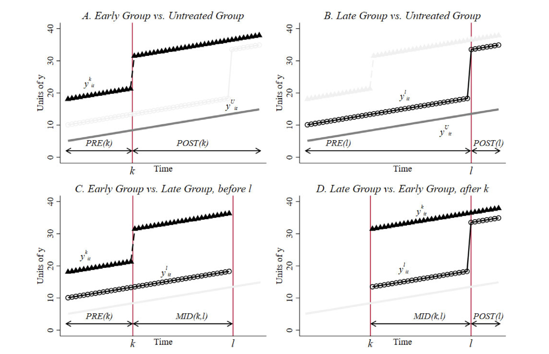
In Equation 10.37, the TWFE coefficient \(\widehat{\delta}\) is expressed as the univariate regression coefficient between \(\tilde{Y}_{st}\) and \(\tilde{D}_{st}\), where both the outcome and treatment variables are adjusted for unit and time means. Goodman-Bacon (2021) showed that \(\widehat{\delta}\) is numerically identical to taking a weighted average over all simple \(2\times 2\), but with weird weights and using as comparison groups units we probably would not have chosen ourselves. For instance, we know from the previous chapter that using an already-treated group as a control introduces an extra bias term on top of the non-parallel trends bias—the treatment dynamics bias term—which is overly restrictive.

The realization that standard TWFE specifications, in staggered adoption settings, make what are now called “forbidden comparisons” was a startling insight to many of us who had been using it our entire careers. But it wasn’t widely recognized until the late 2010s and early 2020s, when a wave of influential papers—Goodman-Bacon (2021), Chaisemartin and D’Haultfoueille (2020), Sun and Abraham (2021), Borusyak, Jaravel, and Spiess (2024), and Gardner (2021)—brought the issue to the forefront.13

To unpack this issue, I’ll walk us through Goodman-Bacon (2021) step by step. First, we’ll explore the numerical mechanics behind the Bacon decomposition in Equation 10.37. Then we’ll move beyond the algebra to consider what these weights imply for identification, bias, and the use of TWFE in practice.

All \(2 \times 2\) Comparisons

Imagine someone asked you, “What’s the average of the numbers 4, 10, and 3? And what weights did you use?” You might respond with a simple mean: “Well, \(4+10+3=17\), and \(17/3=5.67\). Since I used a simple average, I weighted each number equally by \(\frac{1}{3}\).” That seems natural, straightforward, and intuitive.

Now, suppose that person followed up that question with, “The \(\widehat{\delta}^{TWFE}\) coefficient is an average over nine \(2 \times 2\) comparisons. If it’s a weighted average over nine numbers, what do you think the weights are?” It’s natural to guess \(\frac{1}{9}\), as that would mean each diff-in-diff would get the same weight in the final calculation, but TWFE doesn’t work this way, even if it might seem like it should. When it takes a weighted average, it weights some \(2 \times 2\) more prominently than others.

This is not the first time we’ve encountered the unusual weighting schemes that OLS assigns to its slope coefficients. Like Słoczyński (2022) showed, OLS often applies unexpected and undesirable weights when it comes to our goals in causal inference even outside of diff-in-diff contexts. This happens because OLS is designed to find the best linear prediction of the outcome, rather than estimate counterfactuals or make direct causal comparisons. While OLS can be a tool for both prediction and causal inference, these goals often require different specifications, particularly when researchers are agnostic about what treatment effects can be.

In the case of TWFE, the estimator indeed computes a weighted average over all \(2 \times 2\) comparisons, but it applies weights determined by OLS optimization rather than by an intuitive equal weighting. For the purposes of predicting outcomes, that’s fine, but causal inference is not about predicting the outcome—not the realized outcome, anyway. If anything, causal inference is about predicting missing potential outcomes—counterfactuals in other words—and so those weights, while optimal for prediction tasks, does not therefore mean they are optimal for every task (Słoczyński 2022).

The TWFE specification (Equation 10.36) does not yield a simple, equally-weighted average of all diff-in-diff estimates; rather, it produces an unequal weighted average across all \(2 \times 2\) comparisons in the data. To clarify what I mean, I’ll walk you through an example to show the two critical parts: the different types of \(2 \times 2\) comparisons and the underlying elements that determine TWFE weights.

For simplicity, let’s consider a setup with three timing groups—denoted \((a, b, c)\)—and one untreated group, \((U)\). Imagine that five states received treatment in 1980 and constitute group \(a\), another five were treated in 1983 as group \(b\), and an additional five were treated in 1986 as group \(c\). The remaining 35 states were never treated and thus make up group \(U\).

Notice that while there are 50 states, there are only four groups in this example. Here, a group refers to a collection of units—whether states, workers, or another category—that share a common treatment date. It’s like having the same “birthday” for treatment. For example, all entities treated in 1980 belong to group \(a\), and so on. By contrast, the untreated group \(U\) has no treatment date, so it lacks this “birthday” characteristic. This distinction between units and timing groups is foundational when discussing differential timing and understanding the biases that arise in TWFE estimates.

With three timing groups and one untreated group, there are \(K^2 = 9\) possible \(2 \times 2\) diff-in-diff calculations that can be made using the “four averages and three subtractions” equation.14 Which nine, specifically, are we talking about? Let’s make a table to show it.

Table 10.9: Three Timing Groups and One Untreated Group Yield Nine Simple \(2 \times 2\) Diff-in-Diff Comparisons
a to b b to a c to a
a to c b to c c to b
a to U b to U c to U

In this table, each cell represents a distinct \(2 \times 2\) diff-in-diff comparison. For instance, “\(a\) to \(b\)” compares the early treatment group \(a\) to the later-treated group \(b\), while “\(a\) to \(U\)” compares \(a\) to the untreated group \(U\). Let’s use the timing we discussed to illustrate it. If group \(a\) was treated in 1980 and group \(b\) was treated in 1985, then the “\(a\)” to “\(b\)” diff-in-diff is: \[ \begin{align} \widehat{\delta}^{ab} &= \bigg( E[Y | \, \text{After} \, 1980, \, \text{Group}=a] - E[Y | \, \text{Before} \, 1980, \, \text{Group}=a] \bigg) \nonumber \\ &\quad - \bigg( E[Y | \, \text{After} \, 1980, \, \text{Group}=b] \nonumber\\ &\quad - E[Y | \, \text{Before} \, 1980, \, \text{Group}=b] \bigg) \label{eq:twfe_ab} \end{align} \tag{10.38}\] So, that looks familiar. We took the average outcome for group \(a\) in the period after 1980 and then again before 1980, then subtracted one from the other. Then we did it again for group \(b\)—we just did it for the same time periods. But, what then is this “b to a” comparison about? It’s about this: \[ \begin{align} \widehat{\delta}^{ba} &= \bigg( E[Y | \, \text{After} \, 1985, \, \text{Group}=b] - E[Y | \, \text{Before} \, 1985, \, \text{Group}=b] \bigg) \nonumber \\ &\quad - \bigg( E[Y | \, \text{After} \, 1985, \, \text{Group}=a] \nonumber \\ &\quad - E[Y | \, \text{Before} \, 1985, \, \text{Group}=a] \bigg) \label{eq:twfe_ba} \end{align} \tag{10.39}\] Do you notice anything? In Equation 10.38, the control group, \(b\), is not treated—at least, not yet anyway. But in Equation 10.39, the control group, \(a\), is already treated. It was treated five years before. If you recall from the previous chapter, we analyzed diff-in-diff equations when the control group is already treated, and we saw that this setup introduces two bias terms—rather than just one.

Now, if you count the diff-in-diff equations in Table 10.9, there are nine in total. Out of these nine diff-in-diffs, three are what we could call “problematic” because they use already-treated groups as controls. The problematic diff-in-diffs are the b to a, c to a, and c to b cells, as each one uses an already-treated group as a control. The a to b, a to c, and b to c diff-in-diffs, on the other hand, each use a not-yet-treated as a control. And finally, the last row in which a timing group is compared to U, a never-treated group, is also not problematic.

For now, just note that with multiple timing groups, the TWFE specification averages over all possible \(2 \times 2\) diff-in-diff comparisons, each with its own weight in the final estimate. But to dive deeper, let’s examine these weights. To simplify, I’ll focus on an example with just three groups: Group \(k\) is treated first, Group \(l\) is treated later, and Group \(U\) remains untreated throughout the dataset. In this setup, we have four possible \(2 \times 2\) diff-in-diff equations, which are as follows: \[ \begin{align*} \widehat{\delta}^{2\times 2}_{kU} &= \underbrace{{\bigg( \overline{y}_k^{\text{post}(k)} - \overline{y}_k^{\text{pre}(k)} \bigg) - \bigg( \overline{y}_U^{\text{post}(k)} - \overline{y}_U^{\text{pre}(k)} \bigg)}}_{\mathclap{\text{A. Early Group vs Untreated Group}}} \\ \widehat{\delta}^{2\times 2}_{lU} &= \underbrace{{\bigg( \overline{y}_l^{\text{post}(l)} - \overline{y}_l^{\text{pre}(l)} \bigg) - \bigg( \overline{y}_U^{\text{post}(l)} - \overline{y}_U^{\text{pre}(l)} \bigg)}}_{\mathclap{\text{B. Late Group vs Untreated Group}}} \\ \widehat{\delta}^{2\times 2}_{kl} &= \underbrace{{\bigg( \overline{y}_k^{\text{mid}(k,l)} - \overline{y}_k^{\text{pre}(k)} \bigg) - \bigg( \overline{y}_l^{\text{mid}(k,l)} - \overline{y}_l^{\text{pre}(k)} \bigg)}}_{\mathclap{\text{C. Early Group vs Late Group, before l}}} \\ \widehat{\delta}^{2\times 2}_{lk} &= \underbrace{{\bigg( \overline{y}_l^{\text{post}(l)} - \overline{y}_l^{\text{mid}(k,l)} \bigg) - \bigg( \overline{y}_k^{\text{post}(l)} - \overline{y}_k^{\text{mid}(k,l)} \bigg)}}_{\mathclap{\text{D. Late Group vs Early Group, after k}}} \end{align*} \tag{10.40}\]

These \(2 \times 2\) equations illustrate the four distinct types of comparisons possible with two timing groups (\(k\) and \(l\)) and one untreated group (\(U\)). Each of these comparisons corresponds to a visual representation in Goodman-Bacon (2021), which I’ve reproduced in Figure 10.6. Let me explain each one to make the intuition clear.

The first simple \(2 \times 2\) is represented in Panel A of Figure 10.6. Here, group \(k\) is treated at time period \(t = k\), and we define the preperiod and postperiod with respect to the vertical line marking the treatment. Group \(U\) remains untreated, creating a familiar diff-in-diff scenario that we explored extensively in the last chapter.

Panel B mirrors Panel A, except that now the timing date is \(t = l\) and the treated group is group \(l\). In this case, \(\widehat{\delta}^{2 \times 2}_{lU}\) represents the diff-in-diff estimate comparing group \(l\) to the untreated group \(U\).

Panel C, labeled “Early Group vs Late Group,” is often called the “not-yet-treated \(2 \times 2\).” This setup compares group \(k\) (treated earlier) with group \(l\) (not-yet-treated within the period of analysis). Since group \(l\) has not yet been treated during the calculation period, this comparison will not contain the additional bias that arises when the control group is already treated that we worked out together in the last chapter.

But Panel D is different. It illustrates the “already-treated \(2 \times 2\),” which is sometimes referred to as a “forbidden comparison” (Borusyak, Jaravel, and Spiess 2024). Here, the control group was treated before the treated group—either before the first time period in the dataset or just simply before the treatment group itself. But regardless of when, since the comparison group was already treated, then using it as a control introduces a second bias term, making this comparison problematic, and sometimes even very much so.

Figure 10.6: Four \(2\times2\) diff-in-diffs from Goodman-Bacon (2021).

These four diff-in-diff equations will be weighted and combined to produce the \(\widehat{\delta}^{TWFE}\) coefficient from Equation 10.36. Understanding these weights is crucial, as they differ from the simple averages one might expect; instead, they reflect the intricacies of the TWFE model’s optimization process. By examining these four distinct \(2 \times 2\) contrasts, we can better grasp how various treatment timing scenarios influence the bias structure within TWFE models, highlighting why not all \(2 \times 2\) comparisons yield unbiased estimates of the .

Bacon Decomposition

When I first encountered the econometric literature on difference-in-differences, I was struck by how different authors presented various decompositions of the TWFE estimator. At times, these decompositions seemed contradictory, raising a basic question: how could they all be true? For instance, in the decomposition we’ll explore shortly, known as the Bacon Decomposition, the weights are always positive. However, in another influential decomposition by Chaisemartin and D’Haultfoueille (2020), the weights associated with TWFE can be negative. So, which is it—are the TWFE weights always positive, or can they sometimes be negative?

The answer lies in recognizing that each author’s decomposition describes a different aspect of TWFE, even though both address the same TWFE coefficient. Recall how we showed earlier that a specific OLS specification (e.g., using treatment dummies and an interaction term) produces a result that can be broken down into “four averages and three subtractions.” This breakdown serves as a purely mechanical decomposition of the regression’s calculations, based entirely on observable data, and shows that a TWFE regression coefficient is a positively weighted average of all \(2\times 2\) comparisons.

By contrast, when we replaced these averages with quantities derived from potential outcomes, we introduced a theoretical decomposition, or perhaps if you prefer a causal decomposition, that expresses the TWFE coefficient as a weighted average of treatment effects, not \(2\times 2\) comparisons. This theoretical/mechanical distinction can hopefully help you navigate some of this technical terrain. The theoretical decomposition will link the TWFE coefficient to unobservable quantities like the and the non-parallel trends bias, which depend on potential outcomes that aren’t directly observable in the data. It’s termed theoretical because, unlike the mechanical decomposition, these quantities can’t be calculated directly from existing data—they exist in principle rather than in practice.

The Bacon Decomposition opens up the mechanics of TWFE calculations by showing that there are two equivalent paths to the same thing: a direct path through OLS estimation or an indirect path through calculating all \(2 \times 2\) comparisons, and weighting them according to group sizes and timing variances. Both approaches yield the same number. What makes the decomposition valuable, for our purposes though, is that it puts the TWFE coefficient back into the familiar “four averages and three subtractions” that define diff-in-diff.

The TWFE weights originate from the double demeaning process, adjusting for both panel unit and time fixed effects. These weights are always positive and consist of two components: one based on each timing group’s sample share and the other on its time share. Together, these components create weights that TWFE applies across the multiple \(2 \times 2\) diff-in-diff comparisons.

The first demeaning, based on panel unit fixed effects, adjusts for the share of units in each group relative to the total units in a given diff-in-diff comparison. These sample shares vary across different \(2 \times 2\) comparisons, as each comparison uses distinct groups. For example, for a timing group \(k\) that includes all units treated simultaneously, its sample share can be expressed as \(n_k = \frac{\sum_i 1 \{ t_i = k \}}{N}\), where \(N\) is the total number of units. Or to use an example, if group \(k\) comprises 5 states out of a total of \(N=50\) states, then its sample share is \(n_k=\frac{5}{50} = 0.1\). We can also find the relative size of a timing group as \(n_{kU} = \frac{n_k}{n_k + n_U}\), which measures the relative size of a timing group in the pair used in the \(2 \times 2\) comparison. And finally, since \(n_k\) is the sample share of group \(k\), it’s a positive number between 0 and 1. Thus, these sample shares are always positive and constitute a key part of the TWFE weights.

The second set of fixed effects—time fixed effects—provides the time shares. In the TWFE calculation, time shares represent the fraction of time a group spends treated, and they differ by group because groups vary in how many time periods they were treated. I’ll denote these time shares as \(\overline{D}\). To make this more intuitive, Table 10.10 shows the treatment status of New Jersey and New York from 1990 to 1995. New Jersey, treated in 1992, spends four of the six years treated, or 66.67% of the time, giving a time share \(\overline{D} = 0.67\). New York, treated in 1993, spends three of the six years treated, or 50%, with a time share of \(\overline{D} = 0.5\).

Table 10.10: Treatment status, time share, \(\overline{D}\), and treatment variance, \(\overline{D}(1-(\overline{D}))\), for New Jersey and New York from 1990 to 1995
Year New Jersey treatment New York treatment
1990 0 0
1991 0 0
1992 1 0
1993 1 1
1994 1 1
1995 1 1
\(\overline{D}\) 0.67 0.5
\(\overline{D} (1 - \overline{D})\) 0.22 0.25

The time share is just the mean of the treatment column, but the variance of the treatment column is the product, \(\overline{D} \times (1 - \overline{D})\). For New Jersey’s treatment status, this yields a variance of 0.22, while for New York, it’s 0.25. So then, what is the exact relationship between the size of the variance and the size of the mean?

  • If \(\overline{D} = 0.1\), then \(0.1 \times 0.9 = 0.09\)

  • If \(\overline{D} = 0.4\), then \(0.4 \times 0.6 = 0.24\)

  • If \(\overline{D} = 0.5\), then \(0.5 \times 0.5 = 0.25\)

  • If \(\overline{D} = 0.6\), then \(0.6 \times 0.4 = 0.24\)

Variance gets larger the more time that a group is treated—but only up to a particular point, and then it starts to fall. Consider these four examples: a group that’s treated for 10%, 40%, 50%, and 60% of the time. The variance of treatment rises to 0.25 then falls on either side of \(\overline{D}=0.5\). Figure illustrates this visually. The takeaway is that treatment variance follows a parabolic shape, peaking at 0.25 for groups that spend exactly half their time treated. Groups that are treated for either most or very little of the panel period have the lowest treatment variance.

Figure 10.7: Variance of treatment is maximized for groups treated at the mid-point time period of the dataset.

And with all that information, the Bacon decomposition shows that the TWFE coefficient is equal to a weighted sum of all simple \(2 \times 2\) diff-in-diff equations equal to the following: \[ \begin{equation} \widehat{\delta}^{TWFE} = \sum_{k \neq U} s_{kU}\widehat{\delta}_{kU}^{2 \times 2} + \sum_{k \neq U} \sum_{l>k} \bigg [s^k_{kl} \widehat{\delta}_{kl}^{2 \times 2,k} + s^l_{lk} \widehat{\delta}_{lk}^{2 \times 2,l} \bigg] \label{eq:bacon_decomp2} \end{equation} \tag{10.41}\] in which the \(s\) weights sum to 1. Recall, too, that each individual \(\widehat{\delta}\) is a specific type of \(2 \times 2\) diff-in-diff equation, of which there are only three kinds: \[ \begin{align*} \widehat{\delta}^{2\times 2}_{kU} &= \underbrace{{\bigg( \overline{y}_k^{\text{post}(k)} - \overline{y}_k^{\text{pre}(k)} \bigg) - \bigg( \overline{y}_U^{\text{post}(k)} - \overline{y}_U^{\text{pre}(k)} \bigg)}}_{\mathclap{\text{Never-treated $2\times 2$ (legal)}}} \\ \widehat{\delta}^{2\times 2}_{kl} &= \underbrace{{\bigg( \overline{y}_k^{\text{mid}(k,l)} - \overline{y}_k^{\text{pre}(k)} \bigg) - \bigg( \overline{y}_l^{\text{mid}(k,l)} - \overline{y}_l^{\text{pre}(k)} \bigg)}}_{\mathclap{\text{Not-yet-treated $2 \times 2$ (legal)}}} \\ \widehat{\delta}^{2\times 2}_{lk} &= \underbrace{{\bigg( \overline{y}_l^{\text{post}(l)} - \overline{y}_l^{\text{mid}(k,l)} \bigg) - \bigg( \overline{y}_k^{\text{post}(l)} - \overline{y}_k^{\text{mid}(k,l)} \bigg)}}_{\mathclap{\text{Already-treated $2 \times 2$ (forbidden)}}} \end{align*} \tag{10.42}\] and the \(s\) weights in Equation 10.41 are: \[ \begin{eqnarray} s_{kU} &=& \frac{(n_k + n_U)^2 \, n_{kU} (1 - n_{kU}) \, \overline{D}_k (1 - \overline{D}_k)}{\widehat{Var}^D} > 0 \label{eq:bacon1}\\ s^k_{kl} &=& \frac{((n_k + n_l) (1 - \overline{D}_l))^2 \, n_{kl} (1 - n_{kl}) \, \frac{\overline{D}_k - \overline{D}_l}{1 - \overline{D}_l} \, \frac{1 - \overline{D}_k}{1 - \overline{D}_l}}{\widehat{Var}^D} > 0 \label{eq:bacon2} \\ s^l_{lk} &=& \frac{((n_k + n_l) (\overline{D}_k))^2 \, n_{kl} (1 - n_{kl}) \, \frac{\overline{D}_l}{\overline{D}_k} \, \frac{\overline{D_k} - \overline{D}_l}{\overline{D}_k}}{\widehat{Var}^D} > 0 \label{eq:bacon3} \end{eqnarray} \tag{10.43}\]

I am the first to say that these equations are technical, tedious, and maybe bewildering, but I think the main takeaways are what we’ve been building toward. First, note that all the weights are positive, even the interior terms like \(\overline{D}_k - \overline{D}_l\).15 In Table 10.10, remember that New Jersey (our group \(k\)) has \(\overline{D}=0.67\), while New York (group \(l\)) has \(\overline{D}=0.5\). Thus, \(0.67 - 0.5 = 0.17 > 0\), so all the weights are indeed positive, making \(\widehat{\delta}^{\text{TWFE}}\) a positively weighted average of the \(2 \times 2\) diff-in-diff comparisons.

Next, consider Equation 10.43. Notice how treatment variance appears in the numerator. From Figure, groups with the highest treatment variance are those treated for about half of the observation period. This implies that, ironically, the TWFE coefficient weights up groups treated near the midpoint of the panel (like New York) and weights down groups treated further from the center (like New Jersey). This isn’t because these comparisons are inherently better but due to OLS’s tendency to favor the center.

The TWFE decomposition reveals these central tendencies, showing that the estimator disproportionately weights groups treated around the midpoint. Groups treated closer to the center of the panel receive extra emphasis because treatment variance peaks when treatment duration is close to 50%. As a result, TWFE gives more weight to groups treated near the dataset’s midpoint—not because they provide more insight, but due to the OLS mechanics that prioritize a balanced timespan.

This structure means that panel length and timing can heavily influence TWFE estimates simply by changing the variance of treatment. Adjustments in panel length or treatment timing can also affect the \(2 \times 2\) comparisons, but it’s probably more intuitive that these adjustments will affect the variance weights as well, thereby impacting the TWFE estimate due purely to OLS’s internal workings. The decomposition thus highlights TWFE’s inclination to emphasize groups treated at the most “centered” point in time.

Dynamic Treatment Effect Bias

Now, let’s move forward by substituting potential outcomes into the three types of simple \(2 \times 2\) diff-in-diff equations we’ve discussed—the never-treated \(2 \times 2\), the not-yet-treated \(2 \times 2\), and the already-treated \(2 \times 2\). What I like about Bacon’s Decomposition is that by transforming the TWFE coefficient into these simple diff-in-diff comparisons, we can replace outcome averages with potential outcome averages (as we did in the previous chapter) and immediately reinterpret the decomposition of the TWFE coefficient in terms of treatment effects and biases.

We know from the last chapter that if we have an untreated comparison group, then four averages and three subtractions assuming no anticipation is equal to the plus non-parallel trends bias term: \[ \begin{align} \widehat{\delta}^{2\times 2}_{kU} &= {\mathit{ATT}}_k{\Post} + \Delta Y^0_k(\Post(k),\Pre(k)) - \Delta Y^0_U(\Post(k),\Pre) \\ \widehat{\delta}^{2\times 2}_{kl} &= {\mathit{ATT}}_k(MID) + \Delta Y^0_k(MID,\Pre) - \Delta Y^0_l(MID, \Pre) \end{align} \tag{10.44}\]

And we also know from the last chapter that when the comparison group is already treated, then the diff-in-diff equation is equal to: \[ \begin{align} \widehat{\delta}^{2\times 2}_{lk} &= {\mathit{ATT}}_{l,\Post(l)} + \underbrace{\Delta Y^0_l(\Post(l),MID) - \Delta Y^0_k (\Post(l), MID)}_{\mathclap{\text{Parallel trends bias}}} \nonumber \\ & - \underbrace{({\mathit{ATT}}_k(\Post) - {\mathit{ATT}}_k(Mid))}_{\mathclap{\text{Group $k$'s Dynamic Treatment Effect}}} \end{align} \tag{10.45}\]

Check that out—that is literally the same result we discovered at the beginning of the previous chapter when we examined the impact of using a treated group as a control. Now, that initial exercise is paying off here, as we’re seeing that TWFE was, in effect, computing that very diff-in-diff behind the scenes, which introduces an additional bias term beyond parallel trends. Specifically, the coefficient on the treatment variable when estimated with TWFE is equal to the sum of threeterms: \[ \begin{equation} p\lim\widehat{\delta}^{TWFE}_{n\to\infty} = VW{\mathit{ATT}} + VWPT - \Delta {\mathit{ATT}} \label{eq:twfe_bias} \end{equation} \tag{10.46}\] where \(VW{\mathit{ATT}}\) is a variance weighted average over all \({\mathit{ATT}}\) quantities, \(VWPT\) is the variance weighted parallel trends assumption and \(\Delta {\mathit{ATT}}\). What this means is that parallel trends is not a strong enough assumption if you’re estimating treatment effects with that TWFE specification; you also have to believe that the treatment effects don’t change over time.

But what if they change over time? Well, if they do, then it will bias the effects towards zero. There were early suggestions by noneconometricians that that might be going on. For instance, in Meer and West (2016), they noted this could be a problem when studying minimum wage’s effect on the growth in employment, as opposed to the levels. If minimum wages were to impact employment growth, then it is basically having potentially dynamic effects where the effects get larger over time.

Let’s look at two scenarios together. In the first scenario, let’s assume that the comparison group who was already treated when the diff-in-diff calculation was made did not have dynamic treatment effects. What would that look like visually? I have a drawing in Figure showing it. Notice how in time period 1 and time period 2, the \({\mathit{ATT}}_1={\mathit{ATT}}_2\) are the same. If we go back to Equation 10.46, then Figure means \(\Delta {\mathit{ATT}}=0\), and in that instance, the TWFE coefficient would only need variance weighted parallel trends to hold in order to identify the variance weighted . It’s still not identifying the —it’s just getting that variance weighted , which is causing the parameters for the groups at the middle of the panel to grow and the ones at the edges to decline. But otherwise, the \(VW{\mathit{ATT}}\) does have a causal interpretation that, while not ideal—since it is a parameter wholly connected to the regression model and the start and stop dates of your panel—is still at least sort of correct.

Figure 10.8: Treatment effects that don’t change over time.

Now, let’s look at a situation where \(\Delta {\mathit{ATT}} \neq 0\). I have an example of that in Figure. After the point of treatment, \(E[Y^1]\) starts to increase but the counterfactual \(E[Y^0]\) remained flat. It doesn’t have to be like this, but this is an illustration of one such example of dynamic treatment effects because what it shows is that \({\mathit{ATT}}_2>{\mathit{ATT}}_1\) and therefore \(\Delta {\mathit{ATT}}>0\). But, if \(\Delta {\mathit{ATT}}>0\), then our TWFE coefficient is biased towards zero even with parallel trends because under parallel trends it would become: \[ \begin{eqnarray*} \widehat{\delta}^{TWFE} = VW{\mathit{ATT}} - \Delta {\mathit{ATT}} \end{eqnarray*} \tag{10.47}\]

Well, if \(VW{\mathit{ATT}}=+10\) and the treatment effects increased by \(+3\), then \(\widehat{\delta}^{TWFE} = 10-3=+7\). It’s wrong, but it’s not too bad, right?

Figure 10.9: Treatment effects that change over time (“dynamic treatment effects”).

But what if \(VW{\mathit{ATT}}=+10\) and the treatment effects increased by \(+11\)? Then \(\widehat{\delta}^{TWFE} = 10-11=-1\). This is a completely different kind of wrong answer because this is actually coming to a qualitatively wrong conclusion about the treatment effects. It would be like using rat poison to treat a headache because TWFE told you it would help, but TWFE got the sign wrong! Sign flips have catastrophic effects if anyone is actually reading the results, taking them seriously, and making judgment calls as to what to do next. They think poison will help and medicine hurts.

Simulation of TWFE Bias with Dynamic and Non-Dynamic Treatment Effects

Once again, I’m going to generate a dataset consisting of 1,000 firms followed over 30 years. I will have 40 states in my simulation and four groups. Each group will mark when firms were treated. Group 1 will be treated in 1986, Group 2 in 1992, Group 3 in 1998, and Group 4 in 2004. And, I will put 250 firms in each group.16 Each frim sells goods on the market in exchange for revenue. Therefore, our outcome will be firm revenue that is measured every year for every firm from 1980 to 2009. Secondly, there is an intervention that hits each group in their respective years. That intervention is a state-level tax credit that causes each group of firms to see an increase in earnings.

The code is below, but I want to show a snippet now. In the Stata snippet below, I have pulled out of the larger code a few things I want to emphasize. First, I have generated an error term, e, which is normally distributed with a standard deviation of 0.25. Second, I have generated a variable called te that is a noisy 10 for group 1, a noisy 8 for group 2, a noisy 6 for group 3, and a noisy 4 for group 4. Finally, I have generated two different revenue measures. The first is y2 and it is the sum of a firm fixed effect (firms), a counter measuring how many years have passed since the panel started, n, and a measure of the treatment effect. When a firm isn’t treated, then it does nothing, which is how I’ve imposed no anticipation on the data. And then, each unit in every period has that error term added to it, which remember, is on average equal to zero, independent of every other firm’s error, independent of all previous errors, and identical. Which means I have created data that has no endogeneity that can be found anywhere, no omitted variables, and homoskedastic errors with only a small amount of noise.

gen e   = rnormal(0,(0.5)^2)
gen te1 = rnormal(10,(0.2)^2) 
gen te2 = rnormal(8,(0.2)^2)
gen te3 = rnormal(6,(0.2)^2)
gen te4 = rnormal(4,(0.2)^2)
gen te = .

gen     treat=0  
replace treat=1 if group==1 & year>=1986
replace treat=1 if group==2 & year>=1992
replace treat=1 if group==3 & year>=1998
replace treat=1 if group==4 & year>=2004

replace te = te1 if group == 1
replace te = te2 if group == 2
replace te = te3 if group == 3
replace te = te4 if group == 4

* Non-dynamic treatment effects.  
gen y2 = firms + n + te*treat + e 

* Estimation using TWFE - constant treatment effects
areg y2 i.year treat, a(id) robust 

The way that the te*treat part works is that if a firm gets treated, then their earnings go up by 10, 8, 6, or 4, depending on which group they’re in. And you can see how parallel trends is also happening in these data—if treat\(=\)0, then earnings grow at \(n+e\) and since \(E[e]=0\), then it means on average every firm is growing by 1 unit each period. So in other words, these data give us not just group-level parallel trends, but unit-level parallel trends. Every single firm’s earnings is growing by 1 on average every period.

When I generate these data, I can actually create a table visualizing for you the treatment effects. Table 10.11 shows the average treatment effects for each of the four groups in each time period. It is therefore an but of a specific group, \(g\), in a particular year, \(t\). So for instance, in 1986, the effect of the tax credit increased the 1986 group’s earnings by 10, and from then on after, it remained above by 10. So, this is more like the diagram earlier in Figure in that the treatment causes a level increase in earnings over the counterfactual, but not a dynamic increase. You can see what differential timing looks like here too—the 1992 group gets treated in 1992, its earnings go up by 8, then remain 8 above the counterfactual until the end of the sample. Same with the others. And, you can see how no anticipation works too—it means zero treatment effects before the treatment event occurs.

Table 10.11: Group-Time \({\mathit{ATT}}\) Parameters for Non-Dynamic Treatment Effects from Baker Simulation
Calendar Time \({\mathit{ATT}}(1986,t)\) \({\mathit{ATT}}(1992,t)\) \({\mathit{ATT}}(1998,t)\) \({\mathit{ATT}}(2004,t)\)
1980 0 0 0 0
1981 0 0 0 0
1982 0 0 0 0
1983 0 0 0 0
1984 0 0 0 0
1985 0 0 0 0
1986 10 0 0 0
1987 10 0 0 0
1988 10 0 0 0
1989 10 0 0 0
1990 10 0 0 0
1991 10 0 0 0
1992 10 8 0 0
1993 10 8 0 0
1994 10 8 0 0
1995 10 8 0 0
1996 10 8 6 0
1997 10 8 6 0
1998 10 8 6 0
1999 10 8 6 4
2000 10 8 6 4
2001 10 8 6 4
2002 10 8 6 4
2003 10 8 6 4
2004 10 8 6 4
2005 10 8 6 4
2006 10 8 6 4
2007 10 8 6 4
2008 10 8 6 4
2009 10 8 6 4
\({\mathit{ATT}}(group)\) 10 8 6 4
Simple \({\mathit{ATT}}\) 8
Average \({\mathit{ATT}}(group)\) 7

At the bottom of the table, I listed three more causal parameters: the (group) parameter, the “Simple” parameter and the “Average (group)” parameter. What’s nice about this table is that you can literally recreate these yourself by simply adding and dividing. The (group) parameter is just the average over all the s in each column. So for instance, since all the s for the 1986 group are 10, then the (1986) is 10, too. The Simple is the average over all the s. It’s easier to do that with Excel or Google Sheets, but basically it’s \(\frac{10 + 10 + \dots + 4 + 4}{60} = \frac{480}{60}=8\). In other words, the Simple is just a simple average over all the group-time s. And then last, there is the Average (group), which is simply the average over each group’s own (group), which here is \(\frac{10+8+6+4}{4}=7\).

The Simple and the Average (group) values are both “correct.” They are based on the same s; they just have different weights. The Simple is, like I said, the sum of all group-time s divided by the number of group-time s. But the Average (group) is the average over the four (group) parameters that are themselves the average over all the s.

So, if we use these data from the baker simulation, then what will we get when we estimate Equation 10.48 with TWFE? \[ \begin{eqnarray} Y_{ist} = \beta_0 + \delta D_{ist} + \tau_t + \sigma_s + \varepsilon_{ist} \label{eq:twfe_baker1} \end{eqnarray} \tag{10.48}\] Well, we know from Bacon’s Decomposition that \(\widehat{\delta}^{TWFE}\) is equal to \(VW{\mathit{ATT}} + VWPT - \Delta {\mathit{ATT}}\), and since parallel trends holds, then \(VWPT=0\). That leaves only the dynamic treatment effect bias, but this outcome doesn’t have any dynamics (Table 10.11). That means \(\Delta {\mathit{ATT}}=0\), which means the only thing left is the variance weights. I’ll leave you to work that out if you want, but I will just point out that the 1992 and 1998 groups are centered in our dataset, but the 1986 and 2004 groups are closer to the start and end of the panels. The Bacon Decomposition shows, then, that the variance weights will be larger for the 1992 and 1998 groups and less for the 1986 and 2004 groups. To save you the suspense, the \(VW{\mathit{ATT}}=7\) in these data. And when I estimate Equation 10.48, that’s what I find. My estimate is 7.003 with a standard error of 0.019.

Now let’s look at a different variable. In the next snippet, I show the variable \(y\), which has embodied in it dynamic treatment effects. Each year from the first year a group gets treated, its for that year is a multiple of a starting value of a noisy 10, 8, 6, or 4. I have shown these s in Table 10.12. Notice that the only thing different here is that these s are growing over time. They are associated with the picture of dynamic treatment effects from Figure in which at each time period, the for that year is larger than the year before, meaning that in this case \(\Delta \neq 0\).

 * Data generating process with dynamic treatment effects over time
gen y  = firms + n + te*treat*(year - treat_date + 1) + e 

* Estimation using TWFE - dynamic treatment effects over time
areg y  i.year treat, a(id) robust 
Table 10.12: Group-Time Parameters for Dynamic Treatment Effects from Baker Simulation
Calendar Time \({\mathit{ATT}}(1986,t)\) \({\mathit{ATT}}(1992,t)\) \({\mathit{ATT}}(1998,t)\) \({\mathit{ATT}}(2004,t)\)
1980 0 0 0 0
1981 0 0 0 0
1982 0 0 0 0
1983 0 0 0 0
1984 0 0 0 0
1985 0 0 0 0
1986 10 0 0 0
1987 20 0 0 0
1988 30 0 0 0
1989 40 0 0 0
1990 50 0 0 0
1991 60 0 0 0
1992 70 8 0 0
1993 80 16 0 0
1994 90 24 0 0
1995 100 32 0 0
1996 110 40 6 0
1997 120 48 12 0
1998 130 56 18 0
1999 140 64 24 4
2000 150 72 30 8
2001 160 80 36 12
2002 170 88 42 16
2003 180 96 48 20
2004 190 104 54 24
2005 200 112 60 28
2006 210 120 66 32
2007 220 128 72 36
2008 230 136 78 40
2009 240 144 84 44
\({\mathit{ATT}}(group)\) 125 76 39 14
Simple \({\mathit{ATT}}\) 82
Average \({\mathit{ATT}}(group)\) 63.5

The summary parameters are all different than before. The (group) parameters are 126, 76, 39, and 14. The Simple is now 82, and the Average of the (group) numbers is 63.5. But, while this is a lot of information to take in, what I will say is that we know at minimum that (a) all treatment effects are positive, (b) treatment effects get larger over time, (c) all weights are positive, and therefore (d) all of our aggregate summaries are positive—either 82 or 63.5. We also know (e) parallel trends holds, (f) there are no omitted variables, and (g) the error is on average equal to zero. So, what could possibly be a better situation? Isn’t this what strict exogeneity means?

So then, what do I find when I estimate the effect using Equation 10.48? I should probably find something like 82 or maybe some variance weighted version that is lower, but at least positive, right? Look at the results from Table 10.13. Let that sink in—not only is TWFE biased with dynamic treatment effects, it’s the wrong sign.

Why did this happen? Why did we get an accurate estimate of the VW with constant treatment effects but such an extremely biased estimate with dynamic treatment effects, even though both are nearly the identical data generating process? Because of \(- \Delta {\mathit{ATT}}\). It’s the minus sign—a negative weight—and because the dynamics were so large, it caused the sign to flip because the TWFE coefficient is equal to the sum of all three terms—\(VW{\mathit{ATT}}\), \(VWPT\), and \(-\Delta {\mathit{ATT}}\). So, it all depends on relative magnitudes of \(VW{\mathit{ATT}}\) and \(\Delta {\mathit{ATT}}\).

Table 10.13: Parameter Estimates from TWFE
Constant treatment effects Dynamic treatment effects
Estimated \({\mathit{ATT}}\) 7.00 \(-6.69\)
(0.019) (0.666)
Simple \({\mathit{ATT}}\) 8 82

Because the Bacon Decomposition is based on weights that can be calculated as simple shares—which are measurable in the data and can be calculated directly—and simple diff-in-diffs, we actually can calculate \(\widehat{\delta}^{TWFE}\) directly using the formula. In Table 10.14, I present the results from that. The command for doing this in Stata is the user created package “ddtiming” by Thomas Goldring.

Table 10.14: Bacon Decomposition (TWFE \(= -6.69\))
Weight \({\mathit{ATT}}\)
Earlier T vs Later C 0.500 51.800
Later T vs Earlier C 0.500 \(-65.180\)
T = Treatment; C = Comparison
\((0.5 \times 51.8) + (0.5 \times -65.180) = -6.69\)

While large weight on the “late to early \(2\times 2\)” is suggestive of an issue, these would appear even if we had constant treatment effects, and besides, the point of this is simply to illustrate for us what mechanically TWFE is doing. All we know for now, though, is that with constant treatment effects, TWFE is an unbiased estimate of the VW, but not the Simple . And for dynamic treatment effects, TWFE was neither unbiased for the VW nor for the Simple , and got the sign wrong.

10.9 Aggregating Building Blocks with Callaway and Sant’Anna (CS)

Introduction to CS

The Callaway and Sant’Anna (CS) estimator, introduced in their 2021 paper “Difference-in-Differences with Multiple Time Periods” (Callaway and Sant’Anna 2021), provides a flexible and robust alternative to TWFE in cases of differential timing. Given Goodman-Bacon’s insights into the fairly standard TWFE specification and its associated problems with handling heterogeneous treatment effects, CS fills a critical gap by allowing for heterogeneous treatment effects across groups treated at different times. Instead of assuming a single, uniform treatment effect, CS enables us to estimate unique, cohort-specific effects—referred to as group-time s—and aggregate these into more policy-relevant parameters. This flexibility makes CS particularly powerful for settings where treatment timing varies, and where we need to capture both dynamic (changing over time) and static (average post-treatment) effects.

There are several scenarios in which you might consider using a robust diff-in-diff estimator like CS that should be familiar by now, but which may be worth mentioning. They are all situations related to timing differences and heterogeneity such as:

  • When treatment effects depend on adoption timing.

  • When treatment effects are expected to change over time.

  • When short- and long-run treatment effects differ.

  • When macroeconomic conditions (such as recessions or expansions) might influence treatment effects.

The CS approach handles each of these situations in an intuitive way. Instead of focusing on a single as TWFE does, CS estimates smaller, more narrowly defined, “group” level parameters known as group-time s. These group-time s represent the average treatment effect for units treated at the same time, at any point in time. CS achieves this by using straightforward \(2 \times 2\) diff-in-diff comparisons to isolate these group-specific effects, while avoiding the use of already-treated groups as controls.

Once these building-block group-time parameters are calculated, they can be aggregated with non-negative weights—unlike TWFE, which selects weights that maximize variance and using comparisons that introduce negative weights. This approach provides flexibility in constructing overall causal measures as well as more targeted analyses, such as event studies that capture treatment effects across different points in time. By starting with building blocks, CS allows us to tailor our analysis to the precise needs of our policy or research question since those building blocks, if unbiased, can be aggregated a number of different ways into unbiased estimates of larger parameters like the simple .

Defining the Group-Time

The group-time is the core building block of the CS estimator. It’s a treatment effect specific to a cohort (or group) treated at the same time and evaluated in a particular post-treatment period. For example, if states A and B pass a policy in 2005, they are both part of the “2005 cohort” and remain distinct states too. Since the group-time is defined at both the group level and the time level, we can follow the groups’ across years—forward and, as we will see, backwards as well. This approach is powerful because it allows for different treatment effects over time without forcing every group into the same mold.

Each group-time is represented as: \[ \begin{equation} {\mathit{ATT}}(g,t) = E[Y_t^1 - Y_t^0 | G_g=1] \end{equation} \tag{10.49}\] where \(G_g=1\) denotes that the unit belongs to group \(g\) (e.g., the cohort treated in 2005) and \(t\) denotes calendar time (e.g., 2006). This formulation allows us to identify all feasible \((g,t)\) across groups and times, giving a window into how treatment effects unfold dynamically.

The group-time is a fairly straightforward version of the concept in general, only it’s measured at a smaller level of aggregation than is usually the point of most studies, at least historically. Usually, we want to know the overall average treatment effect and then, once we get it, we like to report that. But with CS, we target these disaggregated group-time parameters and then aggregate up. You’ll still report the overall average treatment effect like you did with TWFE, but you will get it in two steps, not one. First by estimating the \({\mathit{ATT}}(g,t)\) parameters, second by aggregating up. But in the end, you will still most likely, be presenting the things you were used to presenting, like event studies and estimated average effects of a program.

Data Structure and Notation in CS

Understanding the data structure and notation in the CS estimator is essential, but the new components are straightforward. First, it’s important to note that CS does not handle cases where treatments can turn on and then off again. If your context requires this flexibility, the Chaisemartin and D’Haultfoueille (2020) estimator, which I’ll discuss later, can accommodate it.

Like I shared above, group-time notation relies on the lowercase letter \(g\) to signify the treatment timing for each group. For example, if a group was treated in 1986, we denote this as \(g=1986\). Similarly, if it’s the 1992 treatment group, then \(g=1992\), and so forth.

There are two binary variables in the CS model you should be familiar with. The first is a binary indicator, \(G_g\), that signals membership in a specific treatment group. For instance, if a unit was treated in 1986, then for that unit, \(G_{1986} = 1\). If they were not part of that treatment group, then \(G_{1986} = 0\).

The second binary variable, \(C\), identifies control units. CS accommodates control groups that consist of either not-yet-treated or never-treated units. For either type of control, \(C = 1\). However, if a unit is already treated, then \(C\) is undefined, as CS does not allow the already-treated units to be used as controls.

Finally, CS handles conditional parallel trends by incorporating covariates using IPW, OR, or DR. Because I will illustrate calculations using the IPW method, I’ll focus on the propensity score, \(\widehat{p(X)}\), which acts as a weight in the CS estimator: \[ \widehat{p(X)} = Pr(G_g = 1 | X, G_g + C = 1) \tag{10.50}\] Notice that since the predicted group membership changes group-to-group, always refusing to use an already-treated group as a control, then the propensity score will change by group depending on when that group was treated and how many untreated units remain. Also worth emphasizing is that the covariates, \(X\), cannot be affected by the treatment and thus typically the canned packages that abound will use covariates at \(g-1\), that is, each group’s baseline.

What’s nice about CS is that it handles heterogeneity with respect to cohort, timing, treatment duration, and covariates in theoretically valid ways. It allows for aggregations of the group-time s into broader policy-relevant estimates, like the simple . And inference is valid under common problems like clustering.

Assumptions in the CS Estimator

To use the CS estimator, certain assumptions must hold:

  1. Irreversible treatment: Once treated, units remain treated.

  2. No anticipation: Treatment effects are assumed to be zero pretreatment.

  3. Conditional or unconditional parallel trends: Parallel trends hold conditional on covariates \(X\) for the never-treated or not-yet-treated. \[ \begin{equation} E[\mathbf{Y_t^{\textbf{0}}} - Y_{t-1}^0 | X, G_g=1] = E[Y_t^0 - Y_{t-1}^0 | X, C=1] \end{equation} \tag{10.51}\] But if one thinks that unconditional parallel trends is plausible, you’d assume it here instead.

  4. Weak common support: Control groups must have overlapping support with the treatment group’s propensity score distribution, ensuring comparability across both groups.

And, there will be an additional assumption, similar to IPW, OR, and DR, in that either the propensity score model or the outcome regression must be specified correctly, depending on which method is used for estimation.

CS Estimator: Inverse Probability Weighting Version

The simplest presentation of the CS estimator, with the least amount of clutter, is the one that incorporates covariates via the inverse probability weighting (IPW) scheme that we covered earlier in the chapter. This is the CS estimator using IPW for covariates to estimate any particular group-time : \[ \begin{equation} {\mathit{ATT}}(g,t) = E \left[ \left( \frac{G_g}{E[G_g]} - \frac{\frac{\hat{p}(X)C}{1 - \hat{p}(X)}}{E \left[ \frac{\hat{p}(X)C}{1 - \hat{p}(X)} \right]} \right) (Y_t - Y_{g-1}) \right] \end{equation} \tag{10.52}\] But there are other options too like outcome regression (OR) and a doubly robust (DR) estimator, all three of which are based on Abadie (2005), Heckman, Ichimura, and Todd (1997), and Pedro H. C. Sant’Anna and Zhao (2020) from earlier in the chapter. The key in CS is that they avoid using already-treated units as controls, instead drawing comparisons from either never-treated or not-yet-treated units—sidestepping the problematic “forbidden contrasts” that Goodman-Bacon revealed in TWFE.

Aggregating Group-Time for Policy-Relevant Estimates

As mentioned, CS offers several ways to aggregate the identified group-time parameters into something useful. You can take a simple average, the simple . You can take the average over time for each \(g\) group, or \({\mathit{ATT}}(g)\). You can even take the average over all the \({\mathit{ATT}}(g)\), as opposed to uniformly weighting the \({\mathit{ATT}}(g,t)\) to the simple \({\mathit{ATT}}\). And finally, you can use them to make event study plots by aggregating each \({\mathit{ATT}}(g,t)\) across relative time periods (e.g., \(g-1\)).

The point is, once you have the group-time \({\mathit{ATT}}(g,t)\) parameter estimates, you can use them to construct conventional summaries of causal effects, as well as explore the heterogeneity in the treatment effects more closely.

Once again, I think it’s easier to understand the group-time if we have before us a table, so I’ve reproduced an earlier table based on the Baker dataset. Table 10.15 is the same as the earlier dynamic treatment effect table, but with some differences, mainly in how the aggregations will be done, which are listed at the bottom. As you can see, all groups have dynamic treatment effects (over time), but their dynamics also differ across groups as well. CS accommodates these different types of heterogeneity.

Table 10.15: Group-Time Parameters for Dynamic Treatment Effects with Feasible and Infeasible Cells from Baker Simulation
Calendar Time \({\mathit{ATT}}(1986,t)\) \({\mathit{ATT}}(1992,t)\) \({\mathit{ATT}}(1998,t)\) \({\mathit{ATT}}(2004,t)\) Untreated Control?
1980 0 0 0 0 Yes
1981 0 0 0 0 Yes
1982 0 0 0 0 Yes
1983 0 0 0 0 Yes
1984 0 0 0 0 Yes
1985 0 0 0 0 Yes
1986 10 0 0 0 Yes
1987 20 0 0 0 Yes
1988 30 0 0 0 Yes
1989 40 0 0 0 Yes
1990 50 0 0 0 Yes
1991 60 0 0 0 Yes
1992 70 8 0 0 Yes
1993 80 16 0 0 Yes
1994 90 24 0 0 Yes
1995 100 32 0 0 Yes
1996 110 40 6 0 Yes
1997 120 48 12 0 Yes
1998 130 56 18 0 Yes
1999 140 64 24 4 Yes
2000 150 72 30 8 Yes
2001 160 80 36 12 Yes
2002 170 88 42 16 Yes
2003 180 96 48 20 Yes
2004 190 104 54 24 No
2005 200 112 60 28 No
2006 210 120 66 32 No
2007 220 128 72 36 No
2008 230 136 78 40 No
2009 240 144 84 44 No
(All) \({\mathit{ATT}}(g)\) 125 76 39 14
(CS) \({\mathit{ATT}}(g)\) 95 52 21 n/a
(All) Simple \({\mathit{ATT}}\) 82
(All) Group \({\mathit{ATT}}\) 63.5
(CS) Simple \({\mathit{ATT}}\) 68.33
(CS) Group \({\mathit{ATT}}\) 56

In Table 10.15, I’ve introduced a new column labeled “Untreated Group?” in the far-right position, where each cell indicates “Yes” or “No” based on whether an untreated group is available for comparison. Additionally, I’ve separated the calculations into “All” and “CS” versions for the \({\mathit{ATT}}(g)\), Simple , and Group .

The “All” parameters continue to use every available group-time parameter, as before. For example, the \({\mathit{ATT}}(g)\) for the 1986 group is 125 because it averages across all periods (e.g., \(\frac{10+20 + 30 + \dots + 180}{24}=125\)). The same applies to the Simple and Group , aggregating each parameter across all group-times, as discussed earlier in relation to the Baker dataset.

The “CS” versions, however, differ by using only those group-time s where an untreated control group is available. This restriction avoids biased comparisons with already-treated units. For instance, the 1986 group’s in 1991 can include controls from the 1992, 1998, and 2004 groups, as indicated by “Yes” in the “Untreated Group?” column. However, in 1998, CS excludes the 1992 group from the control set because they received treatment by then.

Consequently, the number of “feasible” parameters for the CS approach shrinks, as it omits group-times lacking untreated controls. Only those parameters from 1986 to 2003 for the 1986 group, 1992 to 2003 for the 1992 group, and 1998 to 2003 for the 1998 group remain feasible. When aggregating these reduced parameters, the \({\mathit{ATT}}(g)\), Group , and Simple are all smaller because they exclude later periods with larger treatment effects, where treatment effects have grown over time.

Implementing CS with Code

So, what I want to do next is show you that in two steps. First, I’ll walk through how CS works in practice, estimating it step by step—not by using a canned routine like R’s did or an equivalent package, but by performing basic math you could even manage on the back of a napkin. I’ll demonstrate this in Stata, as its syntax will be more easily readable and accessible since I will simply be showing basic calculations. The online book will have code for R as well.

Let’s let our target parameter be the 1986 group-time in 1986, or: \[ \begin{equation} {\mathit{ATT}}(g=1986,t=1986) = E \left[ \left( \frac{G_{g=1986}}{E[G_{g=1986}]} - \frac{\frac{\hat{p}(X)C}{1 - \hat{p}(X)}}{E \left[ \frac{\hat{p}(X)C}{1 - \hat{p}(X)} \right]} \right) (Y_{1986} - Y_{1985}) \right] \end{equation} \tag{10.53}\]

There are several steps involved in estimating the \({\mathit{ATT}}(1986,1986)\). We need to get dummies for \(G_g\), we need to identify untreated control group units, we need to get estimates of propensity scores, and then we need to combine them all into a weighted version of diff-in-diff. Below is the Stata code to do it, which should help you see, by the end, that CS is simply calculating “four averages and three subtractions,” only with different weights.

* Create relative time counter
gen time_til = year-treatdate

* Create group dummies
gen g1=0
replace g1=1 if group==1

gen     g2=0
replace g2=1 if group==2

gen     g3=0
replace g3=1 if group==3

gen     g4=0
replace g4=1 if group==4


* Estimate propensity scores. 
logit g1 if ((year==1991) & ((g1==1) | (time_til<0)))
predict pg1_1991 // pscore is 0.25 because there's four groups and no covariates. 

* Estimate {\mathit{ATT}}(1986,1986)
gen ypost = y if year==1986
gen ypre = y if year==1985

* Generate Denominators of the weights
bysort year: egen g1_mean = mean(g1)
bysort year: egen g1_cont_1991mean = mean((1 - g1)*pg1_1991/(1 - pg1_1991))

* Estimate entire weights
gen w1= g1/g1_mean
gen w0 = ((1 - g1)*pg1_1991/(1 - pg1_1991))/g1_cont_1991mean

* Weight each sample mean for group and untreated control
egen att_11 = mean(w1*ypost)
egen att_10 = mean(w1*ypre)
egen att_01 =  mean(w0*ypost)
egen att_00 = mean(w0*ypre)

* Estimate the {\mathit{ATT}}(1986,1986) which is 10
gen att1986_1986 = (att_11 - att_10) - (att_01 - att_00)
su att1986_1986 // 10.0258 

So, let’s see how it works: our target parameter was the \({\mathit{ATT}}(1986,1986)\). To find its value, go to Table 10.15, locate \({\mathit{ATT}}(1986,t)\), then scroll down to 1986, where you’ll see it equals 10. When we went through this exercise, we calculated a value of 10.0258. But notice how straightforward the calculation was—it was simply (att_11 \(-\) att_10) \(-\) (att_01 \(-\) att_00), a basic weighted diff-in-diff equation. Four weighted averages and three subtractions. Surely CS can’t be that simple? But that’s really it.

Do you see now why I mentioned that you could calculate CS estimates of each individual \({\mathit{ATT}}(g,t)\) with just pencil and paper? You can because diff-in-diff itself is just four weighted averages and three subtractions. You simply avoid using already-treated units as controls and use the time_til\(<\)0 condition to ensure that only units not yet treated serve as controls. You can experiment with the code by setting ypost to 1987 to calculate \({\mathit{ATT}}(1986,1987)\) and get a feel for how CS operates mechanically. I encourage you to try it.

In practice, however, you won’t usually do this manually. Instead, you’ll use a package, such as Stata’s csdid or csdid2, R’s did, or Python’s differences.17 These packages estimate CS both with and without covariates, and when covariates are called, you have options to use the IPW method, the OR method, or the DR method. You can also specify whether you want to use the not-yet-treated or the never-treated only, the manner in which the standard errors will be constructed, as well as produce various aggregations of the \({\mathit{ATT}}(g,t)\) such as event study plots, calendar aggregations, simple averages, or even group-level averages. You can consult the help files to learn the syntax for which ones you want to use. Here is the code in Stata using csdid2, which is considerably faster than csdid, and in the original R package by Brantly Callaway and Pedro Sant’Anna, did. I will use the IPW estimation method so that it fits with the manual exercise we just did together, but note there are others you could’ve tried.

baker_cs.do

Code
* load the baker dataset
use https://github.com/scunning1975/mixtape/raw/master/baker.dta, clear

* Install packages
net install csdid2, from("https://friosavila.github.io/stpackages")
ssc install csdid, replace
ssc install drdid, replace

csdid2 y, ivar(id) time(year) gvar(treat_date) notyet method(stdipw) long2 cluster(state)
estat attgt, wboot  // list all group-time ATT(g,t) with wild bootstrap
estat simple, wboot     // simple average over all ATT(g,t)
estat group, wboot  // averaging the group-averaged ATT(g)
estat calendar, wboot   // calendar time average, ATT(t), over all group-time ATT(g,t)
estat event, wboot  // relative event time average, ATT(l), over all ATT(g,t)
estat plot      // plot the last aggregation (e.g., event)

baker_cs.R

Code
# name: baker_cs.R

# install.packages("haven", dependencies = TRUE)
library(haven)
# install.packages("devtools"); devtools::install_github("bcallaway11/did")
library(ggplot2)
library(did) # Callaway & Sant'Anna

baker <- read_dta("https://github.com/scunning1975/mixtape/raw/master/baker.dta")
# untreated units have effective year of 0
baker$treat_date[is.na(baker$treat_date)] <- 0 

# Estimating the effect on y2 (constant) and y (dynamic treatment)
atts <- att_gt(
  yname = "y", # LHS variable
  tname = "year", # panel time variable
  idname = "id", # firms' panel id variable
  gname = "treat_date", # first treatment period variable
  data = baker, # data
  xformla = NULL, # no covariates
  #xformla = ~ l_police, # with covariates
  est_method = "ipw", # "dr" is doubly robust. "ipw" is inverse probability weighting. "reg" is regression
  control_group = "notyettreated", # set the comparison group which is either "nevertreated" or "notyettreated" 
  bstrap = TRUE, # if TRUE compute bootstrapped SE
  biters = 1000, # number of bootstrap iterations
  print_details = FALSE, # if TRUE, print detailed results
  base_period="universal", # long-differences
  clustervars = "state", # cluster level
  panel = TRUE # whether the data is panel or repeated cross-sectional
) 

# Group-time ATTs
summary(atts)

# Simple ATT
agg_effects <- aggte(atts, type = "simple", balance_e=TRUE)
summary(agg_effects)

# Group Average ATT
agg_effects <- aggte(atts, type = "group", balance_e=TRUE)
summary(agg_effects)

# Plot group-time ATTs
ggdid(atts)

# Event-study
agg_effects_es <- aggte(atts, type = "dynamic")
summary(agg_effects_es)

# Plot event-study coefficients
ggdid(agg_effects_es)

In Table 10.16, I present my CS estimates of both the Simple (first column) and the Average Group (second column). Recall from earlier that, for feasible \({\mathit{ATT}}(g,t)\) values excluding already-treated units as controls, the Simple was 68.33, while the average Group was 56. And with the CS estimation, we see these same values confirmed.

Table 10.16: Estimated Simple and Group Average \({\mathit{ATT}}\) Using CS and Baker Data
Simple \({\mathit{ATT}}\) Group \({\mathit{ATT}}\)
Estimated 68.34 56
(5.19) (0.01)
Feasible 68.33 56

A few things to note: First, we’re using IPW, though DR or OR could also be applied. Second, this approach relies on not-yet-treated units as controls. Third, depending on your syntax choices, you can estimate either the Simple or the Group , depending on your project’s focus and needs. Finally, and this is important for the next discussion, I used the universal baseline when calculating \({\mathit{ATT}}(g,t)\) in the pretreatment periods. I’ll explain more about this approach momentarily.

Constructing Event Study Parameters and Estimates with CS

A robust diff-in-diff estimator would lose much of its appeal if it couldn’t generate interpretable event studies. However, before diving into the event study plots that CS produces, this seems like an opportune moment to clarify what event study coefficients are meant to measure within the \({\mathit{ATT}}(g,t)\) building block framework.

When faced with differential timing scenarios, the concept makes intuitive sense until one is pressed to precisely define each event study coefficient. Often, we find ourselves resorting to shorthand terms like “leads” and “lags.” But here, I aim to go beyond that shorthand. The event study coefficients in a diff-in-diff under differential timing, once sample means are replaced with potential outcomes, are actually aggregate \({\mathit{ATT}}(g,t)\) parameters. Specifically, they represent aggregations based on relative event time. I’m excited to share this table because, well, I love tables, and also because this table was a huge help for me—not only in interpreting the building block aggregations but also in setting up the next section on the Sun and Abraham (SA) estimator.

Table 10.17 maps these \({\mathit{ATT}}(g,t)\) building block parameters to relative event time parameters. In this setup, each treated group has specific time frames:

  • The 1986 group spans three periods: 1986 to 1991, 1992 to 1997, and 1998 to 2003.

  • The 1992 group spans two periods: 1992 to 1997 and 1998 to 2003.

  • The 1998 group covers just one period, from 1998 to 2003.

The 2004 group, however, has no parameters; it serves solely as a control group for estimating \({\mathit{ATT}}(g,t)\) parameters. But here, estimation isn’t our focus—this table simply describes how individual group-time \({\mathit{ATT}}(g,t)\) parameters aggregate into the “feasible \({\mathit{ATT}}(l)\)” parameters.

Why call them “feasible \({\mathit{ATT}}(l)\) parameters"? I’m assuming that CS will only tackle group-time parameters that can be identified using a not-yet-treated group. The feasible column aggregates accordingly, based on relative time—that is, how many years have passed since each unit’s treatment, either in pre- or post-treatment periods. For instance, \(t = 0\) corresponds to 1986 for the 1986 group, 1992 for the 1992 group, and 1998 for the 1998 group. By contrast, \(t = 6\) represents 1992 for the 1986 group and 1998 for the 1992 group. The 1998 group’s \(t = 6\) would be 2004, but because no untreated units are available, this parameter is not identifiable—thus, beyond \(t+5\), the 1998 group drops out of our analysis.

Table 10.17: Relative Event Time Aggregated \({\mathit{ATT}}\) Parameters Under Differential Timing
Calendar time \({\mathit{ATT}}(1986,t)\) \({\mathit{ATT}}(1992,t)\) \({\mathit{ATT}}(1998,t)\) \({\mathit{ATT}}(2004,t)\) Relative time (feasible) \({\mathit{ATT}}\) Event group
1980 0 0 0 0 \(t-6\) 0 1986,1992,1998
1981 0 0 0 0 \(t-5\) 0 1986,1992,1998
1982 0 0 0 0 \(t-4\) 0 1986,1992,1998
1983 0 0 0 0 \(t-3\) 0 1986,1992,1998
1984 0 0 0 0 \(t-2\) 0 1986,1992,1998
1985 0 0 0 0 \(t-1\) 0 1986,1992,1998
1986 10 0 0 0 \(t=0\) 8 1986,1992,1998
1987 20 0 0 0 \(t+1\) 16 1986,1992,1998
1988 30 0 0 0 \(t+2\) 24 1986,1992,1998
1989 40 0 0 0 \(t+3\) 32 1986,1992,1998
1990 50 0 0 0 \(t+4\) 40 1986,1992,1998
1991 60 0 0 0 \(t+5\) 48 1986,1992,1998
1992 70 8 0 0 \(t+6\) 63 1986,1992
1993 80 16 0 0 \(t+7\) 72 1986,1992
1994 90 24 0 0 \(t+8\) 81 1986,1992
1995 100 32 0 0 \(t+9\) 90 1986,1992
1996 110 40 0 0 \(t+10\) 99 1986,1992
1997 120 48 0 0 \(t+11\) 108 1986,1992
1998 130 56 6 0 \(t+12\) 130 1986
1999 140 64 12 0 \(t+13\) 140 1986
2000 150 72 18 0 \(t+14\) 150 1986
2001 160 80 24 0 \(t+15\) 160 1986
2002 170 88 30 0 \(t+16\) 170 1986
2003 180 96 36 0 \(t+17\) 180 1986

Next, let’s consider the actual \({\mathit{ATT}}(l)\) values in relative time. For instance, \({\mathit{ATT}}_{t=0} = 8\) because it averages each group’s \({\mathit{ATT}}(g,t)\) at the moment of treatment, or \({\mathit{ATT}}_{t=0} = \frac{8 + 10 + 12}{3} = 8\). This aggregation continues for each relative event time, showing how the relative event time coefficients aggregate \({\mathit{ATT}}(g,t)\) for corresponding periods. The aggregation shifts as groups phase out based on their treatment timing, hence the noticeable increases in feasible \({\mathit{ATT}}(l)\): 8 from \(t = 0\) to \(t + 5\), then 9 from \(t + 6\) to \(t + 11\), and 10 from \(t + 12\) to \(t + 17\). As time progresses, fewer early groups contribute to the later event times.

This trend is natural. At \(t + 17\), only the 1986 group still has a record of that lag, making it solely responsible for the \({\mathit{ATT}}_{t+17} = 180\). This value is thus specific to that group rather than reflecting the broader population’s treatment effect. It’s a real parameter, but it’s worth noting that as relative event time extends, early adopters increasingly dominate the analysis.

This selective contribution pattern also holds in pretreatment. Under no anticipation and parallel pretrends assumptions, pretreatment values are mechanically zero for each group. Consequently, averaging these zeroes also yields zero. If we were to extend one more year back to \(t-7\), only late adopters with a six-year lead would contribute. As in post-treatment, the further we go back in time, the fewer groups have such leads.

In Figure 10.10, I present the aggregated (feasible) \({\mathit{ATT}}(l)\) parameter estimates based on taking simple weighted averages over each group’s own \({\mathit{ATT}}(g,t)\). These relative event time average treatment effects reflect the original group-time \({\mathit{ATT}}(g,t)\) parameters, once aggregated into relative time event study parameters, showing that CS can be used to generate accurate event study coefficients with an intuitive interpretation as the average causal effect at each relative time period.

Figure 10.10: CS event study using Baker dataset.

10.10 Event Study with Sun and Abraham (SA)

Liyang Sun and Sarah Abraham developed their influential estimator while they were PhD students at MIT, and the story of how it came about is a fascinating one. The idea took root during a graduate coursework class when their professor made a casual remark about event studies. The professor noted that small tweaks to event study models often produced odd results without clear explanations, based on their own research experience. That casual observation was enough to spark curiosity in Sun and Abraham, who went on to explore the econometric properties of the canonical TWFE event study under differential timing, as well as create an alternative estimator that has become what it is not an overstatement to call a modern classic in diff-in-diff econometrics.

Sun and Abraham approached the problem differently than Goodman-Bacon (2021). Goodman-Bacon (2021) had not studied the event study, though. Instead, he had focused on this equation: \[ \begin{eqnarray*} Y_{ist} = \underbrace{\alpha + \delta D_{st} + \sigma_s + \tau_t + \varepsilon_{ist}}_{\text{Canonical TWFE Static Specification}} \end{eqnarray*} \tag{10.54}\] Let’s just call this the “Canonical TWFE Static Specification” because it uses a single dummy to model the treatment effect. When estimated with TWFE, he showed that \(\widehat{\delta}^{TWFE}\) equaled a variance-weighted average of all simple \(2 \times 2\) calculations. He used FWL to decompose \(\widehat{\delta}^{TWFE}\) into those quantities.

But, Goodman-Bacon did not decompose this equation: \[ \begin{eqnarray*} Y_{i,t} = \underbrace{\alpha_i + \delta_t + \sum_{g \in G} \mu_g 1\{t - E_i \in g \} + \varepsilon_{i,t}}_{\text{Canonical TWFE Event Study}} \label{eq:twfe_saes} \end{eqnarray*} \tag{10.55}\] This is the standard event study regression model under differential timing, which I’ll refer to here as the “Canonical TWFE Event Study Specification.” Essentially, it involves creating dummy variables for every relative event time value (e.g., like the previously mentioned variable time_til = year-treat_date) and controlling for them in the regression alongside time and panel unit fixed effects.

Sun and Abraham (2021) make two important contributions. First, they decomposed the event study coefficients from the canonical TWFE event study specification from Equation 10.55. In that sense, it parallels not only Goodman-Bacon (2021) but also Guideo W. Imbens and Angrist (1994), who carefully deconstructed the IV estimator and introduced the concept of the local average treatment effect (LATE). Each of these papers took a pre-existing model, applied econometric tools to it, and, like a particle accelerator, cracked the coefficient open to reveal what was inside. And, when Sun and Abraham did this, they found an odd arrangement of many different causal effects and biases lurking within each of the event study coefficients of Equation 10.55.

Secondly, they presented a solution, much like Chaisemartin and D’Haultfoueille (2020), Callaway and Sant’Anna (2021), and others, by introducing an alternative estimator: the interaction-weighted (IW) estimator. While they abbreviate it as IW in their article, it’s now more commonly known as the SA estimator (i.e., Sun and Abraham). This estimator directly addresses the bias arising from heterogeneous treatment effects by accounting for the differential timing of treatment across groups.

Next, I’ll walk through the decomposition of the \(\widehat{\mu_{t<0}}^{TWFE}\) and \(\widehat{\delta_{t\geq 0}}^{TWFE}\) coefficient estimates from Equation 10.55, clarifying how SA’s approach differs and why it matters.

Three TWFE Event Study Assumptions

To understand Sun and Abraham (2021)’s decomposition of the TWFE event study coefficients, we introduce two familiar assumptions and one slight modification of an otherwise familiar one. These assumptions—parallel trends, no anticipation, and what we’ll refer to as a “homogeneous treatment effect profile"—each play a critical role in interpreting the decomposition. Before diving into the decomposition itself, let’s take a moment to walk through each of these assumptions to ensure we’re all on the same page.

The first assumption we’ll consider is parallel trends. When modeling dynamics, it is common to use a different potential outcomes framework associated with Robins (1986). In this framework, the notation for the untreated potential outcome is \(Y_{i,t}^{\infty}\) instead of \(Y^0_{i,t}\). The superscript \(\infty\) signifies a specific untreated potential outcome in which the \(i\) never receives treatment. That is not the only form of counterfactual for a treated unit since a person could also delay taking the treatment. Delaying the treatment a year, two years, ten years would all, in the current period, be represented as \(Y^0_{i,t}\). Sun and Abraham (2021) uses the never-treated potential outcome, represented with the \(\infty\) symbol, and that distinction can be a little distracting to people not expecting to see it, but that’s what it means. So, with this notation in mind, we can express the parallel trends assumption as follows:

\[ E[\mathbf{Y^{\infty}_{i,t}} - Y^{\infty}_{i,s} | E_i = e ] = E[Y^{\infty}_{i,t} - Y^{\infty}_{i,s}] \tag{10.56}\] where \(E_i=e\) denotes the treatment cohort in the calculation and also includes the comparison group. Note that, as always, the first potential outcome is counterfactual and thus cannot be observed as it does not exist.

The second assumption, no anticipation, is more straightforward and does not require new notation. This assumption implies that all pretreatment causal effects are zero, indicating that units do not adjust behavior in anticipation of treatment. Mathematically, it means:

\[ E[Y_{i,e-l}^e - Y_{i,e-l}^{\infty} | E_i = e]=0 \tag{10.57}\] for all possible pretreatment relative time periods (leads).

The final assumption is a version of the homogeneous treatment effect assumption seen in earlier TWFE specifications, though it differs slightly in the context of the event study specification. Unlike the static TWFE specification discussed in Goodman-Bacon (2021), the canonical TWFE event study specification does not require treatment effects to be static. Interestingly, dynamic treatment effects do not create problems for our canonical TWFE event study model, so long as the dynamic treatment effects are identical for every group. What this means is if the early adopters see an of 10 in the first, a 20 in the second, and a 30 in the third period, then so will every one else. So, it is basically a homogeneous treatment effect, but more that the treatment effect profiles must be the same for everyone, and if those aren’t true, then the canonical TWFE specification as we will see will be biased.

In summary, these are the three assumptions that we will use to examine carefully Sun and Abraham (2021)’s decomposition of the TWFE event study coefficients. And by plugging them in and out of the decomposition, we can better ascertain precisely when TWFE is and is not biased.

SA Decomposition

Before diving into the SA decomposition, let’s clarify some important notation that may otherwise become a source of confusion. In the following decomposition, we’ll encounter two symbols that play distinct roles: the lowercase letter \(g\) and the lowercase letter \(l\).

  • \(\textbf{\textit{g}}\) (Binned Intervals): This refers to broader, binned intervals around treatment time, such as a 12 month bin.

  • \(\textbf{\textit{l}}\) (Specific Leads/Lags within \(\textbf{\textit{g}}\)): This represents the specific leads or lags within each bin \(g\). This would be like the 12 separate months within the single 12-month bin.

The use of \(g\) and \(l\) is introduced to maintain the generality of the SA decomposition. Authors often bin high-frequency data (e.g., monthly data) into coarser intervals (e.g., annual bins) to manage variability and emphasize broader trends. Sun and Abraham (2021) accommodate this practice by defining \(g\) for bins and \(l\) for positions within bins. In cases where the data is not coarsened, we can think of \(g = l\), and the decomposition still applies without modification. With that in mind, SA decompose each coefficient \(\widehat{\mu}_g\) into the following weighted sum: \[ \begin{eqnarray} \widehat{\mu}_g &=& \underbrace{\sum_{l \in g} \sum_{e} w^g_{e,l} \big ( E[Y_{i,e+l} - Y^{\infty}_{i,0} | E_i = e] - E[Y^{\infty}_{i,e+l} - Y^{\infty}_{i,0}] \big )}_{\mathclap{\text{Diff-in-diff for targeted period}}} \nonumber \\ &+& \underbrace{\sum_{g' \neq g} \sum_{l \in g'} \sum_e w^g_{e,l} \big ( E[Y_{i,e+l} - Y^{\infty}_{i,0} | E_i=e] - E[Y^{\infty}_{i,e+l} - Y^{\infty}_{i,0}] \big )}_{\mathclap{\text{Contamination from other leads and lags}}} \nonumber \\ &+& \underbrace{\sum_{l \in g^{excl}} \sum_{e} w^g_{e,l} \big ( E[Y_{i,e+l} - Y^{\infty}_{i,0} | E_i=e] - E[Y^{\infty}_{i,e+l} - Y^{\infty}_{i,0}] \big )}_{\mathclap{\text{Contamination from dropped periods}}} \label{eq:sa_decomp} \end{eqnarray} \tag{10.58}\]

This decomposition, similar to the Goodman-Bacon (2021) decomposition, represents the TWFE coefficient in a way that could be calculated directly using the formula on the right. The formula essentially aggregates weighted values from three sources:

  1. Intended period (top row): This row includes the weighted values from difference-in-difference calculations for the intended period.

  2. Other leads and lags (middle row): The second row consists of weighted sums drawn from difference-in-difference calculations across every other relative time period in the event study model. These include all leads and lags that the regression model specifies, not just the target period for each coefficient. Essentially, they represent “contamination” from these additional time periods, seeping into each TWFE estimate and pulling in diff-in-diff terms from other event times that, ideally, would remain isolated from one another. This contamination reflects a challenge that isn’t unique to event studies with differential timing. In fact, Goldsmith-Pinkham, Hull, and Kolesár (2024) highlight how it is a general issue that arises anytime regression models try to estimate multiple treatment effects.

  3. Omitted period (bottom row): The final row captures weighted values from difference-in-difference calculations that rely on sample averages from periods intentionally left out or excluded from the analysis. These values reflect the influence of these omitted time points on the TWFE coefficients, contributing an underlying effect from periods not directly observed or controlled within the specified model.

The formula shows that TWFE is implicitly calculating “all diff-in-diffs,” similar to what Goodman-Bacon (2021) found with the static specification. And just as with the Bacon Decomposition, the SA decomposition in Equation 10.58 shows that one could in principle exactly reconstruct the TWFE coefficient, \(\widehat{\mu}_g\), by running through the calculations with sample averages and applying weights to each one. When all terms are combined, the result is exactly equal to the TWFE coefficient obtained through the algebra of OLS, underscoring how the decomposition provides a clear, alternative view of what each TWFE coefficient represents.

What’s interesting about the SA decomposition is that the weights have known properties, but these properties differ depending on which row I’ve just laid out. And here they are, by row:

  • Own bin weights: Weights in the top row sum to 1.

  • Other specified bins: Weights in the second row sum to 0 .

  • Excluded bins: Weights in the third row sum to \(-1\).

So, if weights sum to 1, it’s a properly weighted average. But when weights sum to 0, it means some of the weights are negative, which can cause the averages to not have a coherent interpretation.

Implications of Assumptions on Causal Interpretation of TWFE Coefficients

To illustrate the impact that these quantities and weights have on our ability to ascribe to the coefficients a causal interpretation, let’s consider what happens under a variety of scenarios.

Assuming parallel trends turns every diff-in-diff in Equation 10.58 into a group-time , like was discussed in the previous section. But, as the hope is that the following exposition will encourage you to study Sun and Abraham (2021), I will use their nomenclature, which is that group-time s are called “cohort-time s,” or C for short, as well as their pedagogical examples. Invoking parallel trends turns Equation 10.58 into this equation: \[ \begin{eqnarray*} \widehat{\mu}_g &=& \underbrace{\sum_{l \in g} \sum_e w^g_{e,l} C{\mathit{ATT}}_{e,l}}_{\mathclap{\text{Desirable}}} \\ && + \underbrace{\sum_{g' \neq g, g' \in G} \sum_{l' \in g'} \sum_e w^g_{e,l'} C{\mathit{ATT}}_{e,l'}}_{\mathclap{\text{Bias from other specified bins}}} \\ &&+ \underbrace{\sum_{l' \in g^{excl}} \sum_e w^g_{e,l'} C{\mathit{ATT}}_{e,l'}}_{\mathclap{\text{Bias from dropped relative time indicators}}} \label{eq:sa_decomp2} \end{eqnarray*} \tag{10.59}\] Note that the first row row has become a “properly weighted average” of all the \(l\) Cs contained in the \(g\) bin. So, if we are looking for instance at \(g=-2\) where \(-2\) refers to the second year prior to treatment, but that actually has 12 \(l\) months in it, then the top row of Equation 10.59 says that the \(g=-2\) lead is a positively weighted average of all 12 months \(C{\mathit{ATT}}_l\) where the weights sum to 1.

The problem is that the other two rows are now also \(C{\mathit{ATT}}_l\) quantities—but from other relative time periods that you specified in the model when you included those particular \(l\) dummies. So, not only does the \(g=-2\) lead contain the average causal effect from that relative time period, it also contains a weighted average of all causal effects from every other period, where the weights sum to 0. And finally, the final row says that it will also include bias from the causal effects associated with the omitted group.

What if we also assume no anticipation in addition to parallel trends? What happens then? If we can invoke no anticipation as well as parallel trends, then all of the \(C{\mathit{ATT}}_l\) parameters from the pretreatment period are immediately deleted in that they are equal to zero so the weights modifying them don’t matter. This means that if we dropped a pretreatment period for estimation, then the third row disappears too. But, unfortunately that is not enough to cause \(\widehat{\mu}_g\) to be an unbiased estimate of \(\mu_g\) using TWFE because there will still be causal effects from the postperiod seeping into all of the coefficients being multiplied by whatever weights still remain.

If we can appeal to homogeneous treatment profile as well as parallel trends, then all \(C{\mathit{ATT}}_l\) for a given \(l\) relative time period are equal, which means that they become \({\mathit{ATT}}_l\) instead: \[ \begin{eqnarray*} \widehat{\mu_g} &=& \sum_{l \in g} w^g_l {\mathit{ATT}}_l \\ &&+ \sum_{g' \neq g} \sum_{l' \in g'} w^g_{l'} {\mathit{ATT}}_{l'} \\ &&+ \sum_{l' \in g^{excl}} w^g_{l'}{\mathit{ATT}}_{l'} \end{eqnarray*} \tag{10.60}\]

This is advantageous because it means that the second row is deleted entirely because under homogeneous treatment profiles, \({\mathit{ATT}}_l\) is a constant for each relative time period \(l\), and when you take a weighted average of a constant where the weights sum to zero, then the weighted average is zero. But, that is not enough to delete the third row because if no anticipation is not true, then the third row contains the \(C{\mathit{ATT}}_l\) from omitted periods in the preperiod and \(\widehat{\mu_g} \neq \mu_g\).

And under no anticipation, the third row is also zero, so long as the omitted group was a pretreatment period or periods. Leaving only the top row, which is the exact target we care about—the weighted average of the \({\mathit{ATT}}\)s for that specific relative time period, \(g\).

It sounds like a lot to take in, so let’s use a simple example. This is from Sun and Abraham (2021). Assume a balanced panel of two periods and two groups or cohorts. The first cohort was treated in the first period, but the second cohort was treated in the second period. We will include dummies for bins \(\{-2,0\}\) but drop the \(\{-1,1\}\) bins. Using the SA decomposition, the coefficient on \(\widehat{\mu_{-2}}\) is equal to: \[ \begin{eqnarray*} \widehat{\mu_{-2}} &=& \underbrace{C{\mathit{ATT}}_{2,-2}}_{\mathclap{\text{own period}}} + \underbrace{\frac{1}{2}C{\mathit{ATT}}_{1,0} - \frac{1}{2} C{\mathit{ATT}}_{2,0}}_{\mathclap{\text{other included bins}}} \\ &&+ \underbrace{ \frac{1}{2} C{\mathit{ATT}}_{1,1} - C{\mathit{ATT}}_{1,-1} - \frac{1}{2} C{\mathit{ATT}}_{2,-1} }_{\mathclap{\text{Excluded bins}}} \end{eqnarray*} \tag{10.61}\]

Notice what the three assumptions do for us. If we assume parallel trends, then all diff-in-diffs have a causal interpretation as \(C{\mathit{ATT}}_l\). If we assume no anticipation, then \(C{\mathit{ATT}}_{2,-2}\), \(C{\mathit{ATT}}_{1,-1}\), and \(C{\mathit{ATT}}_{2,-1}\) all equal zero since they are all pretreatment. And under homogeneous treatment effect profiles, then all \(C{\mathit{ATT}}_l={\mathit{ATT}}_l\) and thus the second row is zero. But, since we dropped a post-treatment bin, that still leaves \(\frac{1}{2} C{\mathit{ATT}}_{1,1}\) and so \(\widehat{\mu_{-2}}=\frac{1}{2} C{\mathit{ATT}}_{1,1}\) even though technically\(C{\mathit{ATT}}_{2,-2}=0\).

Now, no one is going to drop a post-treatment bin when estimating a dynamic event study regression, but that’s not the point—the point is to show that this introduces its own problems because of this contamination bias that happens in linear regressions with multiple treatment dummies. And, what you see from the SA decomposition is that the canonical TWFE specification suffers from different forms of contamination biases that only vanish under strong homogeneous treatment effect assumptions.

Why then does this happen? It happens because when you are estimating the canonical TWFE specification for event studies, it is doing comparisons with already-treated units, and so the problems with heterogeneous treatment effects that plagued the static specification are in the event study specification as well. Fortunately, though, the authors introduced an alternative called the interaction-weighted (IW) estimator.

Implementation Steps for SA’s Interaction-Weighted Estimator

The interaction-weighted estimator, often called SA, offers an alternative approach to event study estimation that circumvents the contamination issues found in the canonical TWFE specification under differential timing. By focusing on untreated comparison groups, SA avoids the negative weighting problem that can distort estimates. Like the Callaway and Sant’Anna (CS) estimator, SA builds event study coefficients from group-time specific parameters, referred to as \(C{\mathit{ATT}}_{e,l}\)—the cohort-specific average treatment effect at a given relative time period \(l\). The steps to estimate event study coefficients, beginning at the building block level, proceed as follows:

Step 1: Difference-in-Differences Regression for CATT\({}_{\textbf{e,l}}\) Estimates. The first step in the SA estimator involves performing a difference-in-differences regression, with or without covariates, separately for each cohort \(e\) at each time period. These are straightforward diff-in-diff calculations, but when covariates are included, they require a basic two-period, two-group regression framework. In this approach, the control group is either the last-treated cohort or the never-treated group—never the not-yet-treated group, marking a key distinction from CS. Upon completion of this step, all feasible cohort-time \(C{\mathit{ATT}}_{e,l}\) estimates are available, which align with \({\mathit{ATT}}_{g,t}\) parameters. However, they may diverge from CS results due to the difference in control groups and the possibility that the parallel trends assumption holds for one method but not the other.

Step 2: Estimating Cohort Weights Based on Sample Shares. In the second step, the SA estimator computes weights based on the sample shares of each cohort in relevant time periods. These weights represent the relative contribution of each cohort to the overall treatment effect estimate. Practically, this is done by calculating the probability that a unit belongs to cohort \(e\) given that it is observed within a particular time period. By applying these weights, SA is able to adjust for potential over or underrepresentation of certain cohorts. This cohort-weighting step ensures that the calculated treatment effects align with the real distribution of treated and control groups.

Figure 10.11: SA and TWFE event study using Baker dataset.

Step 3: Aggregating Weighted Estimates. Finally, in Step 3, SA combines the diff-in-diff estimates from Step 1 using the weights estimated in Step 2. The resulting weighted sum, \(\widehat{v}_g\), is a weighted average of cohort-time \(C{\mathit{ATT}}\)s for a given relative time bin, \(g\). It is a consistent estimate, also, of the \({\mathit{ATT}}_l\) for that particular relative time period.

The final step is to implement the SA estimator using code. I’ve written code to estimate effects using both the TWFE and SA approaches, and Figure 10.11 shows the results from both estimators overlaid for comparison. The SA estimator closely mirrors our CS estimates from the previous section, and this similarity is expected: both are unbiased in this dataset because all firms adhere to parallel trends and no anticipation. However, the Baker dataset departs from homogeneous treatment effect profiles, as treatment effects differ across cohorts. Specifically, the 1986 group’s effects increase by 10 each period, the 1992 group’s by 8, and the 1998 group’s by 6, while the 2004 group is the last cohort and serves as the comparisongroup.

With only parallel trends and no anticipation assumptions, we delete only the pretreatment \(C{\mathit{ATT}}_{l < 0}\) parameters, as they automatically resolve to zero under these assumptions. However, due to heterogeneous treatment effect profiles, the second row in the SA decomposition does not fully cancel out, even though the weights sum to zero. While some of the negative weights are eliminated under no anticipation, the remaining weights enter positively, giving TWFE estimates the appearance of declining trends that, in truth, do not exist.

In closing, the SA decomposition highlighted the stringent assumptions TWFE needs to yield unbiased estimates of event study coefficients, and it underscored the persistent issue of heterogeneous treatment effects. However, the SA estimator avoids this pitfall because, like the CS estimator, it excludes already-treated groups from the control set, which shields it from the contamination that TWFE suffers in these cases. With SA, unbiased estimates are achievable under parallel trends and no anticipation, making it a more robust alternative when treatment effect heterogeneity is a concern.

10.11 Joining and Leaving with de Chaisemartin and D’Haultfoeuille (dCDH)

One of the seminal papers in this literature has been Chaisemartin and D’Haultfoueille (2020), or what is sometimes shortened to dCDH. There are a number of unique contributions not previously covered in Chaisemartin and D’Haultfoueille (2020), and in this section, I will focus on a few of them while avoiding repetition of points emphasized by other papers. I will therefore discuss the negative weighting in TWFE under differential timing and corresponding diagnostics, their weighted estimator, the ability to analyze situations where treatments turn on and off, and the estimation of instantaneous causal parameters.

TWFE Decomposition and the Negative Weighting of Individual Treatment Effects

The authors dCDH offer a unique perspective on treatment effect estimation by diagnosing the negative weighting of TWFE at the level of unit-level treatment effects. This approach highlights the problem of heterogeneous treatment effects and differential timing—demonstrating that the canonical specification cannot reliably protect against sign flipping. By focusing on unit-level treatment effects, dCDH explicitly identify and recover negative weights. They propose that under differential timing, TWFE coefficients are more likely to assign a negative weight to periods where a large fraction of groups are treated, or to groups that have been treated for many periods. Negative weights thus become particularly concerning when treatment effects differ significantly between periods with many versus few treated groups, or between groups treated for varying durations.

Unlike the Bacon decomposition, where the weights on the \(2 \times 2\) diff-in-diff comparisons must always be positive, the weights in dCDH can be negative because they operate at a different level—they reweight the unit-level treatment effects directly, not the \(2 \times 2\) group comparisons. This isn’t to say Bacon didn’t uncover negative weighting; he did, especially in dynamic settings where already-treated units were (improperly) used as controls. But those were indirect diagnostics—post-hoc descriptions of what’s going wrong inside forbidden comparisons. What dCDH offer is more direct: a set of weights defined at the unit-time level, not only to diagnose the problem but also to construct an alternative estimator that avoids it entirely. In TWFE, these problematic weights are baked into the regression and invisible unless you go looking for them. In dCDH, they’re explicit—right there in the formula, applied to each treated observation: \[ w_{i,t} = \frac{\varepsilon_{i,t}}{\frac{1}{N^T} \sum_{i,t:D_{i,t}=1} \varepsilon_{i,t}} \tag{10.62}\] These weights enable practitioners to explicitly see the extent and impact of negative weights, making it possible to evaluate if the degree of treatment effect heterogeneity is sufficient to flip signs. As a diagnostic step, dCDH recommend reporting the number or fraction of group-time s with negative weights, providing transparency and enabling researchers to anticipate possible contamination.18

Dynamic Treatment: Turning On and Off

A unique feature of the diff-in-diff estimator that dCDH offer as an alternative to TWFE is that it can handle treatments that do not remain “on” indefinitely. Their method accommodates reversible treatments that can “turn on” and “off” over time. This approach is particularly useful for studying policies or interventions that vary in their application, such as tax incentives or temporary subsidies, allowing for a more realistic modeling of dynamic treatment effects. This non-absorbing treatment model aligns with real-world settings where policies or interventions are not always permanent but may be enacted, repealed, or adjusted as circumstances change.

However, with this flexibility comes the need for careful consideration, as this dynamic treatment handling requires an additional assumption known as the “no carryover” assumption. Under this assumption, outcomes depend only on the current treatment status, not on any history of treatment, allowing dCDH to interpret treatment effects as instantaneous changes. This assumption facilitates clear causal interpretation but may be restrictive in settings where treatment effects accumulate over time.

When analyzing treatment effects in these reversible settings, researchers must also determine whether treatment should be viewed as simply “on” or “off” or as part of a more nuanced sequence of interventions. For example, while the reversal of Roe v. Wade in 2022 may seem to “turn off” a federal policy, each state’s legislation and decades of evolving unobserved factors complicate a binary interpretation. In cases like this, viewing the change as a simple switch may obscure relevant complexities, potentially warranting separate analyses for each “on” and “off” period.

Consider, for instance, a study on minimum wage policy. The no carryover assumption would imply that employment effects depend only on the minimum wage level at time \(t\), not on previous changes. Recognizing that this can be restrictive, recent work has begun to relax the no carryover assumption, allowing potential outcomes to reflect full treatment history, broadening applicability to cases where treatments’ past influence is relevant.

If the no carryover assumption reminds you of the no anticipation assumption, it should. Both are versions of SUTVA in their own way, as they stipulate that treatment effects occur only during periods when a unit is actively treated. For no anticipation, this applies to pretreatment periods, whereas for no carryover, it applies after a policy has been “turned off.” However, this assumption may be difficult to justify in certain cases. If it stops raining, for example, the road remains wet until the sun dries it—a process that reflects the lingering effects of past conditions. Similarly, assuming no carryover implies that a policy’s effects are so mild that they leave no residual impact once removed, which may be overly simplistic in many real-world contexts.  

dCDH Solution and the DIDM Estimator

The final element of dCDH’s approach is the DIDM estimator, a weighted average of multiple (“M”) diff-in-diff estimators that separately estimates the effects for groups entering treatment (“joiners”) and those exiting treatment (“leavers”) for each time period. The estimator compares outcome changes for these groups with untreated units, thus isolating the treatment effect from potential contamination by pre-existing treated units. The estimator is defined as follows: \[ DID_M = \text{weighted average of DID}_{+,t} \text{ and DID}_{-,t} \tag{10.63}\] where DID+,t captures the treatment effect for groups that start treatment at time \(t\), and DID-,t captures the effect for groups exiting treatment. In staggered designs where the treatment stays on, DIDM effectively simplifies to a weighted average of DID+,t estimators since no groups revert to untreated status. By structuring treatment effects around each transition, dCDH provides a more transparent view of treatment dynamics and avoids the negative weighting problem inherent in TWFE.

To understand the DIDM estimator in practice, consider it as a tool for measuring the impact of entering or exiting treatment states over time. By focusing on “joiners” and “leavers,” DIDM offers insight into how treatment changes affect outcomes with each transition. Here’s how this approach unfolds:

Imagine we have groups of individuals moving in and out of treatment, and we’re interested in seeing how these shifts influence outcomes. The DIDM estimator captures this by focusing on two types of transitions: “joiners” and “leavers.”

Step 1: Tracking Joiners. Consider groups that begin treatment for the first time in period \(t\). DID+,t estimates the treatment effect for these “joiners” by comparing the change in outcomes for those newly treated between period \(t-1\) and period \(t\) to the change in outcomes over the same interval for a comparison group that remains untreated. This comparison yields DID+,t, which isolates the effect of “joining” treatment and captures how much outcomes shift for those who newly experience treatment compared to those who remain consistently untreated. This diff-in-diff is the more typical scenario in which the treatment is turned on.

Step 2: Tracking Leavers. Now consider groups that stop receiving treatment, or “leavers,” during the same interval. DID-,t captures the effect of exiting treatment by comparing the change in outcomes for these leavers between period \(t-1\) and period \(t\) to the change in outcomes for those who stay continuously in treatment. This estimate, DID-,t, provides insight into how outcomes adjust once treatment stops, offering a perspective on the “off” effect of treatment. This is the “turning off” situation.

Building the Overall Effect with DIDM.

The DIDM estimator then combines the turning on DID+,t and the turning off DID-,t in a weighted average, capturing the effect of both joining and leaving treatment across time. In cases of staggered adoption, where groups only begin treatment at different points and never revert to being untreated, DIDM simplifies to a weighted average of DID+,t. This structure pinpoints how the timing of treatment influences outcomes without conflating these effects with those from previously treated units.

Note that the comparison group differs depending on the treatment transition: when treatment turns on, the estimator compares to units that are still untreated; when treatment turns off, it compares to units that are still treated. This asymmetry is critical for correctly identifying the treatment effect associated with each transition.

By comparing changes for those entering or exiting treatment with those who stay untreated or continuously treated, DIDM provides a clean estimate of the treatment’s impact, grounded in real-time transitions. This approach allows us to address a broader range of treatment dynamics, especially when treatments can “turn on” and “off” over time.

But keep in mind that no carryover assumption, because if you think the effects of the treatment last more than zero periods once it turns off, then this will be biased. So buyer beware. My personal preference is to consider if turning off is more like turning into something else than literally reverting to the baseline untreated state.

In summary, dCDH offers a general, diagnostic-driven approach to treatment effect estimation that is flexible enough to accommodate dynamic treatment states and robust enough to identify contamination biases, making it a valuable alternative to traditional TWFE in the presence of treatment heterogeneity.

10.12 Imputation Difference-in-Differences under Differential Timing

If you think about treatment effects using potential outcomes, then any accurate estimation of treatment effects must have imputed the missing potential outcome, because it does not exist. So, if you get the answer “correct,” you must have filled in correctly that missing potential outcome, because at its core causal inference is a missing data problem.

But, as Guide W. Imbens and Rubin (2015) said, sometimes imputation is not transparent to us at all. Even instrumental variables, which is a ratio of two covariances, is an estimator doing imputation since the LATE has missing counterfactuals, too. So if an estimator is on average "correct", meaning it has approximated the target parameter, then on some level it has imputed missing counterfactuals. And yet it must be because the LATE has missing counterfactuals, too.

And yet, sometimes the estimator is very clearly an imputation estimator. For instance, matching and synthetic control has those qualities. You take a comparison group and you replace the treatment group’s missing counterfactual with the comparison group’s actual outcomes according to some theoretically valid rule, like selection on observables.

I think the three diff-in-diff estimators we just covered, plus two-way fixed effects too, all have the “implicit imputation” feel to them because they use weights and aggregate basic diff-in-diffs. And even though the parallel trends under the hood is what makes those calculations become imputations of the missing potential outcome, \(\mathbf{E[Y^{\textbf{0}}|D=\textbf{1}, Post]}\), it still doesn’t always feel that way.

This section will be different though. In this section, I’m going to review versions of a very similar imputation estimator for difference-in-differences. They will all be versions of the regression adjustment method, which, as you recall from the Unconfoundedness chapter, was a regression-based imputation estimator, too. And the first paper I’ll review is the robust efficient imputation estimator by Borusyak, Jaravel, and Spiess (2024), which I’ll be shortening as BJS, a common name for it in the literature.

Robust Efficient Imputation Estimator with Borusyak, Jaravel, and Spiess (BJS)

Borusyak, Jaravel, and Spiess (2024) started out as Borusyak and Jaravel (2017), a working paper written by Kirill Borusyak and Xavier Jaravel posted to an internal Harvard working paper series. Like Sun and Abraham, the authors had done this important work as PhD students at Harvard. This, as it turns out, has been a pattern with all of the new diff-in-diff papers—without exception, they were written by early career researchers, and in this case, PhD students.

Like Chaisemartin and D’Haultfoueille (2020), Goodman-Bacon (2021), and Sun and Abraham (2021), the early working paper by Borusyak and Jaravel (2017) documented unusual performance of the fixed effects estimator under differential timing. The original study, though, was more narrowly focused on the event study (hence the title, “Revisiting Event Study Designs") similar to Sun and Abraham (2021), but with a greater emphasis on simulations under various types of data generating processes. Many of the early discoveries about TWFE pathologies showed up there. They, for instance, are thought to be the source of the phrase that describes how using the already-treated groups as a comparison were both inside the TWFE event study specification and were”forbidden comparisons” (Roth et al. 2023).

But the original paper was more like Goodman-Bacon (2021) than Sun and Abraham (2021) in that it was more of a diagnosis of an illness than a cure. It was not until the econometrician and their former office mate from Harvard, Jann Spiess, was brought on to the project that the imputation estimator was introduced. And, since we’ve already covered in detail the problems with TWFE, I’m going to focus next on the imputation estimator’s construction as I feel like that’s what readers are looking for at this point.

Estimating Fixed Effects with the Control Group

The BJS imputation estimator echoes familiar causal inference strategies, such as those by Heckman, Ichimura, and Todd (1997) and Abadie and Imbens (2011), for estimating the . Here, too, the approach begins by predicting outcomes for the untreated (control) group, imputing missing outcomes for treated units, and using these to estimate . However, BJS requires a stronger “unit-level parallel trends” assumption, holding for all periods and groups, not just from a fixed baseline as in CS. This assumption enables BJS to use all untreated units in the preperiod to estimate unit-level and time fixed effects, \(\alpha_i\) and \(\tau_t\), which in turn form the basis for imputing counterfactual outcomes for treated units post-treatment.

In practice, BJS leverages this parallel trends assumption to estimate \(\widehat{\alpha_i}\) and \(\widehat{\tau_t}\) from all untreated observations—the never-treated controls, but also the not-yet-treated ones too. These units outcomes are all equal to \(Y^0\). So, like Heckman, Ichimura, and Todd (1997), they estimate an outcome, model conditional on time and unit fixed effects. This gives them unbiased fixed effect estimates and since their parallel trends assumption is expressed as the sum of unit fixed effects and period fixed effects, they use those coefficients to impute the missing \(Y^0_{it}\) for all treated units. With those in hand, they estimate individual level treatment effects as \(\widehat{\delta}_{it} = Y_{it} - \widehat{Y}_{it}^0\), and while the estimated individual treatment effect estimates are not themselves interpretable as such, their aggregated estimates are consistent. By drawing data from untreated units across multiple periods, this approach generally improves efficiency over CS and other diff-in-diff estimators, particularly under homoskedasticity so long as parallel trends holds in every pretreatment time period. To summarize, their imputation-based structure follows a familiar four-step logic:

  1. Predict using only the control group.

  2. Impute missing potential outcomes for treated units.

  3. Use these imputations to refine the estimate.

  4. Construct standard errors.

With BJS, what distinguishes this process is the use of all untreated unit-time cells, not just comparison groups—maximizing the consistency and reliability of \(\widehat{\alpha_i}\) and \(\widehat{\tau_t}\). Under the unit-level parallel trends, these fixed effects yield accurate imputations for treated units’ missing potential outcomes, allowing the calculation of individual treatment effects. As with CS, SA, and dCDH, parameters are then aggregated through simple weighting schemes like \({\mathit{ATT}} = \sum_{it} w_{it} \widehat{\delta}_{it}\), yielding unbiased estimates.

The authors note that, under homoskedasticity, the BJS estimator has a smaller standard deviation compared to SA and dCDH, performing well even in simulations with relaxed homoskedasticity assumptions. This efficiency gain underscores BJS’s utility, especially for researchers confident in parallel trends across extended periods and seeking a balance between imputation accuracy and estimation efficiency.

BJS is particularly suited to scenarios where parallel trends are expected to hold over multiple pretreatment periods, as this increases the power of the estimator by leveraging several pretreatment periods per group. This efficiency comes at the cost of a more stringent assumption on long-term parallel trends, in contrast to CS, which uses only the immediate pretreatment period as a baseline. In settings with potential serial correlation or less stable parallel trends over time, CS, SA, or dCDH may be more appropriate due to their more limited reliance on long-term parallel trends. Consequently, the BJS method’s trade-off between efficiency and stringent parallel trends assumptions distinguishes it from CS, SA, and dCDH, particularly in cases where serial correlation is a concern.

Other imputation estimators can match BJS’s numerical results under certain conditions. J. M. Wooldridge (2021) has an imputation estimator that is numerically identical to BJS for balanced panels that also imputes untreated outcomes for the treatment group in the postperiod under parallel trends with similar efficiency under specific assumptions. Wooldridge’s framing generalizes the imputation approach, positioning it closer to a number of methodologies such as regression adjustment and Heckman, Ichimura, and Todd (1997). Gardner (2021)’s “two-stage diff-in-diff” approach, which also estimates fixed effects and then residualizes the outcome before a second-stage regression on the treatment indicator, also resembles BJS but uses a different method for calculating its standard errors called generalized method of moments, or GMM, which can offer practical advantages depending on the context.

Concluding Remarks About Robust Diff-in-Diff

If, after reading all of this, you are wondering if any of this matters in practice, let me conclude with a discussion of A. C. Baker, Larcker, and Wang (2022). In this paper, the authors examined the trustworthiness of difference-in-differences with differential timing estimation, particularly as they are widely used in finance and accounting research. They identify over 700 papers in top-tier finance and accounting journals that apply diff-in-diff methodologies, with around 400 specifically using differential timing designs. The authors replicated two major studies in finance and accounting that used a diff-in-diff differential timing design—one study about banking deregulation, and another about global board reform—which had used two-way fixed effects for estimation. Using some of the methods we covered, they found that the original results were weakened or even overturned entirely. They concluded the study by urging research to use methods with known consistency properties in these more complex situations so as to avoid coming to the wrong conclusions as causal effects because, recall, that under unbounded heterogeneous treatment effects, TWFE can flip signs depending on things that cannot be directly observed.

10.13 Checking for Robustness in the Event Study

Short Gaps and Long Differences in Event Study Coefficients

Now that we have covered event studies estimated with TWFE, CS, dCDH, and BJS, I’d like to make a quick comment regarding the estimation of the event study coefficients for each. Roth (2024) is a very helpful paper for explaining some of the subtleties about easy mistakes to make and it’s important enough that I decided to include it. What I want to do in this section is a couple of things. I want to explain the calculations of pretreatment coefficients not only inside regressions but also outside regressions using things like the “four averages and three subtractions” basic formulas for difference-in-differences. I then want to note that there is a lack of understanding broadly that some of the estimators we have reviewed allowed for either of these to be calculated, depending largely on the syntax of popular programs in R, Stata, and Python, but others only allow for just one kind. As this is not well known, researchers often sort into one of them, not quite realizing that the interpretation isn’t what they may think it is. The last thing is to offer my own opinion about which of these is probably the scientific default we should be using, though reasonable people can disagree with me, so I offer it only as a personal statement.

Whereas ordinarily we start with a target parameter before diving into an estimate of it, I’m going to start with the calculations so as to set up the issue that there are in fact two ways you can calculate pretreatment coefficients in an event study. In his paper, Roth (2024) created fake data for two groups (and only two groups) to illustrate this, so I’m going to go with his paper for illustrative purposes. I’ll assume that there is just one group who gets treated at time period \(t=0\) and one comparison group that is never treated. In other words, we won’t be starting with the differential timing scenario, but rather the simpler case from the last chapter on the fundamentals of diff-in-diff. And furthermore, we will assume that there are trends in one of the calculations possible for pretreatment coefficients and no treatment effects in any pretreatment period.

Using this setup, imagine we ran this regression: \[ \begin{eqnarray} Y_{it} = \alpha_i + \lambda_t + \sum_{r \neq -1} \delta_r \times \textbf{1}\{D_i = 1\} \times \textbf{1}\{t = r + 1\} + \varepsilon_{it} \label{eq:twfe_rothes} \end{eqnarray} \tag{10.64}\] Note that \(\alpha_i\) and \(\lambda_t\) are panel unit and time fixed effects, and the second to last term before the error is the treatment indicator, \(D_i\), multiplied by each of the year dummies. If you look closely at the summation operator, you’ll notice that all years are included except for the one just prior to treatment, which we ordinarily call the baseline. This is standard, recall, for regressions applied to diff-in-diffs. And so, when we drop the baseline period, \(t=-1\), all coefficients, both before treatment and after treatment, use \(t=-1\) as the preperiod in the basic diff-in-diff calculation of “four averages and three subtractions.” In other words, when we estimate Equation 10.64 with TWFE, each estimated coefficient in the event study is estimated using \(t=-1\) as the baseline in a series of individual diff-in-diff equations. For instance, consider calculating the \(t-2\) coefficient when \(t=-1\) is the omitted group: \[ \begin{align} \widehat{\delta}_{t-2} &= \left( E[Y|D=1, t-2] - E[Y|D=1, t-1] \right) \nonumber\\ &\quad- \left( E[Y|D=0, t-2] - E[Y|D=0, t-1] \right) \label{eq:long2a} \end{align} \tag{10.65}\] But now consider how the \(t=-3\) coefficient is calculated too: \[ \begin{align} \widehat{\delta}_{t-3} &= \left( E[Y|D=1, t-3] - E[Y|D=1, t-1] \right) \nonumber\\ &\quad- \left( E[Y|D=0, t-3] - E[Y|D=0, t-1] \right) \label{eq:long2b} \end{align} \tag{10.66}\]

See how in both of these, TWFE uses a “universal baseline” (i.e., \(t=-1\)) such that each coefficient is a “long difference” version of the diff-in-diff formula? It’s called a long difference because no matter where you go on the event study number line, you are still using that same \(t=-1\) as the preperiod. This means that when estimating event studies using OLS, each coefficient was calculated using the omitted period, \(t=-1\), as the baseline, no matter where you were in that event study.

Figure 10.12: Short vs long gap coefficients in four estimators from Roth (2024).

So, recall that above I said for you to consider a dataset in which the treatment group’s outcome was rising relative to the comparison group both pre- and post-treatment. What exactly did I mean by “rising?” Consider a situation where \(\delta_{t-2}\) and \(\delta_{t-3}\) were negative pretreatment where each subsequent coefficient was smaller in absolute value than the one before it when measured using \(t=1\) as the baseline. Panel (a) in Figure 10.12 plots the coefficients from that kind of dataset where the event study was estimated using TWFE, and prior to the intervention, the treatment group was trending up relative to the comparison group’s own trend.

So, to summarize, event study coefficients estimated using OLS will always use the omitted year as the baseline and so all trend calculations are relative to its value.

But, since each coefficient is equivalent to “four averages and three subtractions,” the long difference is not the only way to do that, even when making comparisons in trends for the same groups. To see what I mean, consider Equations Equation 10.67 and Equation 10.68. Notice that these are “four averages and three subtractions” like from Equations Equation 10.65 and Equation 10.66, but with one key difference—whereas Equations Equation 10.65 and Equation 10.66 used \(t=-1\) as the baseline comparison, Equations Equation 10.67 and Equation 10.68 use the period next to it. The “baseline,” in other words, is not fixed, but rather is rolling as we moved across the number line. Notice then that this is technically a diff-in-diff formula, but always a “short” difference, not a “long” difference. You may hear someone then call the short difference the “short gap” calculation, but honestly, more times than not you won’t even hear someone say that. And that is partly because OLS cannot calculate the short gap, and not all of the new estimators are able to either. \[ \begin{align} \widehat{\delta}_{t-2} &= \left( E[Y|D=1, t-2] - E[Y|D=1, t-1] \right) \nonumber\\ &\quad - \left( E[Y|D=0, t-2] - E[Y|D=0, t-1] \right) \label{eq:shorta} \end{align} \tag{10.67}\] and \[ \begin{align} \widehat{\delta}_{t-3} &= \left( E[Y|D=1, t-3] - E[Y|D=1, t-2] \right)\nonumber\\ &\quad - \left( E[Y|D=0, t-3] - E[Y|D=0, t-2] \right) \label{eq:shortb} \end{align} \tag{10.68}\] Put aside whether long difference or short gap approach is “right” for a moment, and just notice that they are not the same, and interpreting them as the same is a fallacy that you must train yourself to avoid.

Look at the event study coefficients for panel (b) and panel (c), which were estimated with CS and dCDH, respectively. These are the exact same data as was estimated in panel (a) with OLS. And there is no differential timing in either case, so that does not explain the differences between the panels. Furthermore, the post-treatment coefficients, meant to measure average treatment effects for the treated groups in that time period, are the same for TWFE, CS, and dCDH. But not the event study coefficients. Why?

They are different because the syntax in the programs used to create these plots allow for either long differences or short gaps to be displayed. And in Roth (2024), for illustrative purposes, he chose to present the short gap coefficients for CS and dCDH so that you could compare it with TWFE where short gaps are impossible to present.

So, since TWFE allows for only one way to calculate the coefficients, but other estimators allow for either, which one is correct? Well, that’s where things get a bit abstract because, remember, event study coefficients have always been in the first place an ad hoc test for parallel trends in the postperiod. As they are not true “tests,” the form of their presentation has no agreed upon standard. All I can see then are two things. First, TWFE was the first mover in diff-in-diff, and for decades, it only used the long difference method. When people were presenting event study coefficients with OLS, they were actually always displaying the long difference version. So, that’s one thing you should keep in mind.

But the second thing to remember is that event studies were always only falsifications. They weren’t true tests so much as they were “same outcome, different periods” where treatment effects were known to be zero. And if treatment effects were known to be zero in the preperiod, then each diff-in-diff coefficient would equal the sum of two things: the \({\mathit{ATT}}\) (which we said is zero) plus the non-parallel trends bias term, where that non-parallel trends bias term was measured with respect to whichever baseline you used for that particular diff-in-diff calculation.

I’ll put my cards on the table then: I think for both of those reasons just listed, you should present your event study coefficients using the long differences method so as to conform with the expectations of readers as well as your own implicit beliefs insofar as the OLS model was always your framework for thinking about diff-in-diff in the first place. It will avoid confusion, but I think it’s also probably more like a true falsification, as true falsifications are meant to display results that are as similar to the causal model as possible, and since each post-treatment coefficient is always estimated with respect to the baseline of \(t=-1\), it is my opinion you should display results on the preperiod that is too. But to do this, you’ll need to carefully read the documentation in the packages that goes with your preferred programming language to ensure you did in fact select a universal baseline. In Stata, for csdid, you have to specify “long2” in the syntax and base_period="universal" in the R package.19

cs_long.do

Code
csdid2 y, ivar(id) time(year) gvar(treat_date) notyet method(stdipw) long2 cluster(state)

cs_long.R

Code
atts <- att_gt(
  yname = "y", # LHS variable
  tname = "year", # panel time variable
  idname = "id", # firms' panel id variable
  gname = "treat_date", # first treatment period variable
  data = baker, # data
  xformla = NULL, # no covariates
  #xformla = ~ l_police, # with covariates
  est_method = "ipw", # "dr" is doubly robust. "ipw" is inverse probability weighting. "reg" is regression
  control_group = "notyettreated", # set the comparison group which is either "nevertreated" or "notyettreated" 
  bstrap = TRUE, # if TRUE compute bootstrapped SE
  biters = 1000, # number of bootstrap iterations
  print_details = FALSE, # if TRUE, print detailed results
  base_period="universal", # long-differences
  clustervars = "state", # cluster level
  panel = TRUE # whether the data is panel or repeated cross-sectional
) 

As for dCDH, the default syntax in Stata will automatically use long differences, but for the R packages out there, you’ll need to consult the documentation. The new package to focus on is called did_multiplegt_dyn. Regardless, it’s possible to make CS and dCDH create event study coefficients in the preperiod that are directly comparable to the TWFE coefficients, which are probably what people have in mind. This works so long as you use the universal baseline, not a rolling baseline. Rolling baselines create short gaps that estimate quantities probably not relevant for evaluating pretrends and may be very hard for the average person to interpret.

So, let’s say then that you are reading a paper that used CS or dCDH and an event study was presented. Is it possible for you as the reader to determine whether the pretreatment coefficients were calculated using short gap or long differences if the authors didn’t say so? The answer is yes, usually. The easiest way to spot it is if you see a coefficient at \(t=-1\). Look again at Figure 10.12 panels (b) and (c). Notice that there are coefficients for all time periods except for \(t=-16\). But then notice that for panel (a), the \(t=-1\) coefficient is a dark circle that does not have confidence intervals. That’s because people usually present event studies estimated with OLS with a dark circle and no confidence intervals to mark the baseline whereas with CS and dCDH, we see confidence intervals at \(t=-1\). That basically means that they calculated \(t=-1\) using a diff-in-diff formula with a different baseline, as one cannot use as a baseline \(t=-1\) when calculating it for the \(t=-1\) coefficient in the first place.

You’ll also see that if you count the coefficients in panels (b) and (c), they top off at \(t=-15\), which means they kept rolling right to left until they got to \(t=-15\) and then they had to stop, as they couldn’t get the \(t=-16\) coefficient since there was no one left to compare it to. But all of them only have 15 coefficients pretreatment—they just aren’t the same ones because they don’t measure the same things.

But now let’s look at BJS in panel (d). Notice the way a strange discontinuity at the date of the treatments happens. BJS gets the trends right, but it is clearly not comparable to the TWFE coefficients, which are smooth through the baseline. What is responsible for the difference? The kink at the \(t=-1\) is actually a mechanical feature of how BJS uses all pretreatment periods to compute the counterfactual post-treatment outcomes. Under homoskedasticity, this is how they achieve improvements in efficiency, but as Roth (2024) explains, it also leads to asymmetries between how the post-treatment estimates are made and how the pretreatment estimates are made. The post-treatment estimates assume parallel trends holds, recall, in all periods, but the pretreatment estimates are meant to evaluate that assumption. The way in which BJS event studies are valid tests of pretreatment parallel trends, according to Roth (2024), is if parallel trends holds in all periods, in which case the coefficients should all be zero. But when they are not, strange patterns like this can emerge, which will simply require care and depth of understanding as to the mechanics of these estimates.

If nothing else, the fact that these coefficients all have subtly different mechanics in their construction as well as their interpretation, not to mention different assumptions supporting them, could very well be a reason that researchers should not produce the “all the diff-in-diffs event study” plot that has become somewhat familiar. The “all the diff-in-diffs” plots definitely have some utility, particularly, I think, when comparisons are made to the biased TWFE. But they are not without limitations, so let me give an example of what I’m talking about.

Presenting Multiple Event Study Models on the Same Graph

It has become increasingly popular for people to present multiple estimators’ event study coefficients on the same graph. This is usually done for the sake of “robustness” and because the author may not want to take a strong stand on which one’s particular assumptions are more plausible than another. These usually are also implicitly meant to compare with TWFE because, recall, when there are different treatment profiles across treatment groups, TWFE will have negative weights, whereas the others won’t. So, the fact they differ, if they even do differ, could imply that there was sorting into treatment at different time periods based on dynamics. I call graphs like this “all the diff-in-diffs event study,” somewhat tongue in cheek.

An excellent example of the “all the diff-in-diffs event study” is the plot from Braghieri, Levy, and Makarin (2022), which studies the staggered rollout of “The Facebook” (i.e., the original platform before it was changed to Facebook and released to the broader public) and its effect on college students’ mental health.20 The authors used an ingenious data linkage method in which they collected initial dates of arrival to schools with the Wayback Machine, as Facebook would post which new schools it had just entered on its front page. They then worked directly with the administrators of a large repeated cross-section survey of college students to link the start dates with survey questions measuring mental health. One set of questions measured “poor mental health” as an index and they converted it into a z-score so that diff-in-diff estimates could be interpreted parameters expressed as standard deviations.

Rather than choose one particular robust diff-in-diff estimator, the authors used all of them for robustness and presented them together. Figure 10.13 is an example of an event study plot that I call the “all the diff-in-diffs event study plot.” In these types of event study plots, researchers will put several estimators up at once, including TWFE, to illustrate some feature as to why they favored one method over another. I would not say that I am particularly fond of this kind of thing because, as we’ve discussed, each estimator has slightly different technical assumptions, not to mention different interpretations of the pretreatment coefficients if the universal baseline is not used for estimation.

Figure 10.13: “All the diff-in-diffs” event study plot from Braghieri, Levy, and Makarin (2022).

As a general principle, if a researcher cannot select between two methods ex ante, they must use both to avoid \(p\)-hacking. One could interpret Figure 10.13 in this light.21 But remember, there are good reasons to use one method over another, too. For instance, with the necessity to include covariates, one might want to use BJS or Wooldridge’s Mundlak estimator if you have so many covariates that the curse of dimensionality creates major common support problems for your estimates of the propensity score used in CS. However, that also places restrictions on the relationship between the covariates and the treatment effects as well as makes estimation dependent on functional form restrictions. In my concealed carry example in the next major section on the diff-in-diff checklist I’ll be proposing, I have a dataset with almost 50 covariates to deal with. That fact alone might be a good reason to use the imputation estimators over CS, dCDH, or SA, simply because the common support problems could be large and difficult to assess otherwise. So it would be better, I think, to use careful design—as outlined in the checklist section below—to select your estimator, rather than take an agnostic approach. These estimators all have slightly different assumptions and should not be considered robustness checks for one another.

Honest Diff-in-Diff

In Cunningham and Goodman-Bacon (2024), the authors are studying the impacts of the War on Poverty’s Legal Services on divorce and welfare access.22 The program, which provided legal services to poor communities, spread across areas at different time periods. They found large effects using CS of these services on the number of aid to families with dependent children (AFDC) cases that were particularly pronounced in an event study graph. But they had slight trends in the preperiod, so maybe parallel trends is violated. Do they reject the explosively large estimated treatment effects in the postperiod, or is there perhaps a way to still say something under some principled quantification of the uncertainty of the parallel trends assumption?

That’s what the “honest diff-in-diff” approach by Rambachan and Roth (2023) is about. Since we are already in the habit of using event study graphs to provide simple heuristics about the reliability of our comparison group to perform as a stand-in for approximating parallel trends, then what if we used the pretreatment event study coefficients, regardless of how they’re estimated, and used the discreprancy in the coefficients from some ideal zero, or its confidence intervals, to assume worst case scenarios about parallel trends in the postperiod? I’ll be concrete by showing you Figure 10.14 containing both original CS estimates and estimates that relax parallel trends. They present multiples of those violations, too, based on pre-existing differential trends that they found in the data. The authors write:

Figure 5 shows a small pre-existing differential trend of about 0.2 cases per 1,000 women per year. To judge whether this affects the conclusion that LSPs had any effect on AFDC or what magnitude we should interpret, Appendix Figure C11 plots event-study estimates that net out differential postperiod trends that range from 0.1 to 0.4 cases per year. The longer-run point estimates under these assumptions are between about 7.5 and 10.5 cases per 1,000 women. We also plot confidence intervals for the set of identified ATT estimates under a weaker assumption that parallel trends violations that may get worse by up to 0.1 cases per year (Rambachan and Roth 2023). Even under nonlinearly rising bias of this magnitude, we can reject the null of no effects on AFDC rates for all event-times except the last two. (Cunningham and Goodman-Bacon (2024))

In other words, they took the size of the pre-existing differential trends they found in their event study, and then assumed that parallel trends was violated in the postperiod by a range of numbers from \(\frac{1}{2}\) that number (e.g., 0.1 is half of the 0.2 cases differential trends in the preperiod they found in their pretreatment event study coefficients) to twice as large (e.g., 0.4 is twice as large as the 0.2 differential trends pretreatment). They then plotted “bounds” on the sensitivity of their original estimates to post-treatment parallel trends violations that were between 0.5 to 2 times as large as that pretreatment discrepancy. The original result, though, was based on parallel trends being true, which would be to assume there was no relationship between the post-treatment trends and their documented differential trends pretreatment.

Figure 10.14: Illustrating honest diff-in-diff procedure from Figure 5 of Cunningham and Goodman-Bacon (2024) studying legal services on AFDC cases.

Rambachan and Roth (2023) is a valuable contribution to the diff-in-diff tool box for a couple of practical reasons, but one of them is that it provides us with a principled way to incorporate the event study into sensitivity analysis. The bounds on the parameter estimates don’t mean that parallel trends is violated—it just tells you how far parallel trends can be “broken” before you can no longer make a qualitative statement about the treatment effects. In Cunningham and Goodman-Bacon (2024), for instance, parallel trends could be broken by as much as two times the size of the pretrends they find and yet still find positive effects measured by these new intervals. This is probably a more valuable robustness test as it does not estimate a new model with new assumptions, but rather, peels back existing assumptions in the model you already chose.

But a word of encouragement—when you do use the honestdid package in R or Stata, the goal is not to say that you know with certainty parallel trends was violated. In fact, sensitivity analysis involving bounds is about embracing uncertainty and making claims under fewer assumptions. It’s about using a guide based on the event study to make a principled stand on just what amount of uncertainty you want to choose, and that uncertainty is based on multiples of the size of the discrepancies in the preperiod that you documented with your event study.

10.14 Designing Your Diff-in-Diff by Checklist

This next section might not be for everyone, but I’ve found it useful in my own work, and so have a lot of my students. I think of it as a kind of “design stage” in empirical work—the liminal space between getting the data and estimating causal effects. In practice, of course, those boundaries are fuzzy. But, it’s still worth carving out something that helps us undertake complete tasks in a slow, deliberate order.

What I’m offering here is a blueprint for researchers to consider when undertaking a difference-in-differences design. I’m not saying these stages should appear in your manuscripts—the art of writing a scientific paper is different from the craft of doing the analysis. They’re two separate skills, each requiring excellence and care, but expressed in different ways, and I am by no means an expert on either. Nevertheless, this section is designed to be a series of steps to follow when designing your project with the aim of helping researchers pay careful attention to subtle details that, left unnoticed, will cause an unwanted cascade of possible mistakes to the end.23

The checklist that follows has been inspired by several people, conversations, and publications like Rubin (2008), A. Baker et al. (2025), Roth et al. (2023), informal talks by and conversations with Pedro Sant’Anna, Arkhangelsky and Imbens (2024), and, inevitably, my own take on things. If something in here seems off, odds are it’s my own take.

The point isn’t that checklists solve everything. It’s that in complex work—like surgery, aviation, or causal inference—people miss things. That’s why checklists have taken hold in medicine: when surgeons began using them for routine but critical steps, complication and mortality rates dropped sharply (Gawande 2011). They work because they are simple, they impose discipline, and they make it harder to skip steps.

Before we dive into our data exercise, let me lay out the ten steps of the checklist so you can see the full roadmap.24 Each step builds on the previous ones, and I’ve found it’s worth spending real time completing each one before moving to the next. The steps are:

  1. Define Your Target Parameter: Potential Outcomes, Population, and Weighted Averages: What exactly are you trying to estimate and who is your population? What is your research question asking and how can that be expressed as a proper average treatment effect? Can you justify that decision to someone else?

  2. Count the Units in Your Cohorts: Count the number of units that are treated in each cohort, including the cohort of never-treated and the cohort of always-treated.

  3. Plot Treatment Rollout: Visualize when and how treatment varies across units and time.

  4. Pick Your Control Group: Decide which units will serve as your counterfactual and justify that choice.

  5. Choose Between Unconditional and Conditional Parallel Trends: Assess whether treated and control units would have followed similar paths absent treatment.

  6. Check Covariate Imbalance: Examine whether observable characteristics differ systematically between treated and control groups. Check this a variety of different ways.

  7. Plot Average Outcomes Across Cohorts: Look at outcome trends by treatment timing to spot potential problems.

  8. Estimator Selection and Assumptions: Choose the difference-in-differences estimator that fits your design and understand what it assumes.

  9. Checking for Parallel Trends Violations with Falsifications, Event Studies, and Sensitivity Analysis: Test your identifying assumptions rigorously using the techniques we’ve discussed. Make sure you understand how your pretrends are calculated and confirm they are what you intended to calculate.

  10. DDDiD, or “Don’t Do Diff-in-Diff": Always fold a losing hand as soon as possible and move on to a different approach if you can—even if that means walking away from diff-in-diff.

To help illustrate the design checklist, we’ll be replicating part of a study on mental healthcare reform by Dias and Fontes (2024), which I’ll discuss below.

Differential Timing Data Exercise: Mental Health Reform and Violence

We’re going to examine Brazil’s 2002 psychiatric reform—a sweeping policy that fundamentally reorganized how the country delivers mental health care. We will be re-analyzing data from Dias and Fontes (2024), with a focus on only one of their outcomes: homicides. Their study provided what may be the first rigorous causal evaluation of a large-scale mental health deinstitutionalization policy.

The reform centered on creating a network of community-based mental health centers, called CAPS (Centros de Atenção Psicossocial), as substitutes for traditional psychiatric hospital care. Between 2002 and 2016, over 1,600 of these centers opened across Brazilian municipalities in a staggered rollout that creates natural variation for difference-in-differences analysis. The policy represents a classic example of deinstitutionalization—moving mental health treatment from hospitals to community settings—a global trend that has generated intense debate about its consequences.

What makes this study particularly compelling for our purposes is both its policy importance and its methodological rigor. Dias and Fontes exploit the staggered timing of CAPS introduction across Brazil’s 5,180 municipalities, using administrative data that spans everything from hospitalization records to homicide rates. The authors are transparent about their identification strategy, careful about potential confounders, and honest about what their data can and cannot tell us.

The core research question—whether shifting mental health care from hospitals to community centers affects violence—speaks to fundamental tensions in mental health policy. Proponents of deinstitutionalization argue that community care is more humane and cost-effective. Critics worry about inadequate community support and the loss of what criminologists call “incapacitation effects"—the simple fact that people in hospitals cannot commit or become victims of crimes in the community.

The Brazilian context makes this question especially important. The reform affected a developing country with limited mental health resources, where many CAPS centers operate with part-time staff and minimal infrastructure. Most patients diverted from hospital care had severe conditions like schizophrenia—precisely the population that existing research suggests may be most vulnerable to violent incidents, either as perpetrators or victims.

For our methodological purposes, this study offers several advantages over more contested datasets. The treatment—CAPS introduction—is clearly defined and well-documented by government records. The outcomes come from comprehensive administrative systems that cover all Brazilian municipalities. And the staggered rollout provides the kind of variation that modern difference-in-differences methods are designed to handle.

The study’s findings are substantively important: CAPS reduced psychiatric hospitalizations (especially long-term stays) and increased community-based care, but also led to persistent increases in homicide rates. Whether you find these results surprising or expected, they illustrate how carefully designed empirical work can shed light on fundamental policy trade-offs. And it is the homicide outcome that we will be studying in the data exercise that follows.

Diff-in-Diff Checklist

Step 1. Define Your Target Parameter: Potential Outcomes, Population, and Weighted Averages

Before you start your project, I’d like to suggest that you define your target parameter. This isn’t just a matter of saying you’re estimating “an average treatment effect” or even that you’re going after the . It’s more subtle than that. And while I could’ve opened the whole book with this discussion, I’ve saved it for now—because if you’ve made it this far, I figure your appetite for technical and nuanced stuff is probably a bit deeper than it would’ve been from the start. For this exercise, I’ll estimate the average treatment effect of CAPS introduction for the average Brazilian municipality. What do I mean by that exactly, though? Let me explain.

Recall that each individual in your dataset has two hypothetical potential outcomes: one under treatment (\(Y^1_i\)) and one under control (\(Y^0_i\)). The individual treatment effect is \(\delta_i=Y^1_i - Y^0_i\). But in causal inference, we rarely try to estimate individual effects.25 Instead, we estimate some average of those effects. The question is: Average over which units? Using what weights? Whatever your answer is—that’s your target parameter.

Defining a target parameter is more than a statistical exercise. It’s pragmatic, aesthetic, and maybe even ethical. There are many populations you could average over, and many ways to take an average. Your choice is a judgment call. You’re deciding that this particular average is what’s needed to help someone make a choice—that this parameter, but not another, gives a decision-maker the useful information they need to figure out whether to implement a similar mental health reform somewhere else.

Here’s why this matters: we don’t estimate treatment effects just for the sake of it. We estimate them to help people make decisions, shape better policies, resolve puzzles, understand how the world works. Even when we say we’re just “explaining the world,” we’re usually still trying to help someone avoid past mistakes or make better choices in the future.

So, your choice of target parameter is tied to use. It’s shaped by questions like: Which average treatment effect would be most useful to a decision-maker? Who is that decision-maker? What population do they have influence over? Are we talking about effects on individuals, municipalities, or entire regions?

Parameters are expressed using potential outcomes notation, averaged over a particular population, using particular weights. You don’t express parameters with regression coefficients—parameters exist outside of any model. The parameter comes first and guides model selection, not the other way around.

If you’re using difference-in-differences, you might assume your target parameter is just the . You’re right in a sense—we showed that a simple difference in two groups’ outcomes identifies the under parallel trends. But here’s the key point: the level at which you average the outcomes for your diff-in-diff calculation dictates the level at which you’re averaging the treatment effects. Those weights depend on whether you’re estimating effects at the level of municipalities, states, or individuals—and whether you’re weighting those units equally, by population, or by something else entirely.

Let me show you why this choice isn’t as straightforward as it might seem. Table 10.18 involves six people—Alan, Betty, Chad, Daniel, Edith, and Frank—each with two potential outcomes under different mental health policy regimes. The policy is the introduction of community-based mental health centers (CAPS).

Here, \(Y^1_i\) indicates whether person \(i\) was murdered in a municipality where CAPS had been introduced, and \(Y^0_i\) represents whether the same person would have been murdered in the same setting without CAPS. So, \(Y^1_i = 1\) means that person was murdered in a municipality with CAPS, while \(Y^1_i = 0\) means they were not. Similarly, \(Y^0_i = 1\) means they would have been murdered without CAPS, while \(Y^0_i = 0\) means they would not have been. The difference, \(Y^1_i - Y^0_i\), is the causal effect of mental health reform on that individual’s homicide outcome.

Table 10.18: Illustration of Potential Outcomes and Treatment Effects
Name \(Y^1\) \(Y^0\) \(\delta\) \(D\)
Alan 1 0 1 1
Betty 0 1 \(-1\) 1
Chad 1 1 0 1
Daniel 0 0 0 0
Edith 1 0 1 0
Frank 1 0 1 0
\(ATE =\) 0.33
\({\mathit{ATT}} =\) 0

If we add up the column labeled \(\delta\) and multiply by \(\frac{1}{6}\), we get \(\frac{1-1+0+0+1+1}{6}=0.33\). This means that on average, introducing CAPS causes 0.33 more murders when we use a dataset with six people. Notice the weight \(\frac{1}{6}\) is applied equally to each person.

Why is there a 6 in the denominator? Because we’re averaging over the units in our dataset. Since our dataset has six people, the ATE tells us that 0.33 additional people were murdered on average.

Now imagine that Alan, Betty, and Chad actually lived in a municipality with CAPS (not just hypothetically), so \(D_i=1\) for them only. What’s the average treatment effect for just these three people? Simple: \(\frac{1-1+0}{3}=0\). The average treatment effect for people living in CAPS municipalities is zero. This is the , where the average uses a uniform weight of \(\frac{1}{3}\).

Next, let’s look at a dataset of ten individuals shown in Table 10.19. The first eight people live in a large urban municipality (“municipality 1”) and the last two live in a small rural municipality (“municipality 2”). Each person has an individual treatment effect, and if you average over them, you get an ATE of 0.2: \(\frac{1+0+0+0+1+1+0+1-1-1}{10}=0.2\).

So, we’d say that CAPS causes 0.2 more homicides on average in this dataset of ten people. The weight is \(\frac{1}{10}\) applied equally to each person’s treatment effect. Why \(\frac{1}{10}\)? Because there are ten people in our dataset, and we’re taking a simple average over the ten treatment effects associated with each person.

Table 10.19: Illustration of Treatment Effects by Municipality and Aggregation Level
Individuals \(Y_1\) \(Y_0\) \(\delta\) Municipality
Alan 1 0 1 1
Betty 1 1 0 1
Chad 1 1 0 1
Daniel 0 0 0 1
Edith 1 0 1 1
Frank 1 0 1 1
George 0 0 0 1
Hank 1 0 1 1
Ida 0 1 \(-1\) 2
Janet 0 1 \(-1\) 2
Municipality \(ATE_m\)
1 0.5
2 \(-1\)
ATE for average municipality \(-0.25\)
ATE for average person 0.2

But what if you didn’t have individual-level data? What if instead you had municipality-level data—just the two municipalities in Table 10.19?

The average treatment effect in municipality 1 is \(\frac{1+0+0+0+1+1+0+1}{8}=0.5\). The average treatment effect in municipality 2 is \(\frac{-1-1}{2}=-1\). So, CAPS causes 0.5 more homicide deaths on average in municipality 1, but 1 fewer homicide death on average in municipality 2.

If we average these two numbers, we get \(\frac{0.5-1}{2}=-0.25\). This gives us the average treatment effect for the “average municipality.” But remember—the average treatment effect over ten people was 0.2, which measures the effect for the “average person."

What if you only have municipality-level data but want the average treatment effect for the average person? Maybe you care about what happens to the most people. How do you get there with only municipality-level data? You weight by population \[ \begin{equation} ATE_{\text{people}} = \frac{\sum_m ATE_m \cdot N_m}{\sum_m N_m} \end{equation} \tag{10.69}\]

which in our case would be: \[ \begin{eqnarray*} ATE_p &=& \frac{(0.5 \times 8) + (-1 \times 2)}{8 + 2} \\ &=& \frac{4 - 2}{10} \\ &=& 0.2 \end{eqnarray*} \tag{10.70}\]

So, you can move between these two averages—the average effect over people and the average effect over municipalities. But the question remains: should you weight by population?

There’s nothing wrong with the average effect over municipalities—if that’s your target parameter. But it matters because, as we just saw, the two can have different signs. That’s not just math—it reflects how treatment effects interact with population structure.

Why might they flip signs? According to Solon, Haider, and Wooldridge (2015), three ingredients drive this divergence: heterogeneous treatment effects, weights, and sorting. Let me illustrate with a simple example using my home state of Texas—though I’ll keep using the CAPS and victimization framework for consistency.

Texas has 31 million residents spread across 254 counties, but 13 million live in just five counties.26 That’s 41% of the population in just 1.9% of the counties.

For simplicity, imagine Texas has exactly 30 million people across 254 counties. Say 15 million live in five large counties (3 million each), and the remaining 15 million are spread equally across the other 249 counties (about 60,000 each).

For every person, we’ll generate \(Y^1\) and \(Y^0\) from a normal distribution, so that the state-level average treatment effect is exactly 2—that is, \(E[Y^1 - Y^0] = 2\).27 We’ll hold this constant across all simulations. The only thing we’ll vary is where people live—and wherever they live, they take their treatment effect with them.

Scenario 1: People randomly pick their county of residence

Imagine each person in Texas goes to a bingo machine with 254 balls—one for each county. They draw a ball, read the county name, and move there. After each draw, the ball goes back, so the next person samples with replacement.

Now suppose we have a dataset with both \(Y^1_i\) and \(Y^0_i\) for every person. We could compute each individual’s treatment effect, \(\delta_i = Y^1_i - Y^0_i\), and average all 30 million of those numbers. By design, the state-level ATE would be 2.

Here’s the interesting part: because residential decisions were random draws, they’re independent of both \(Y^1_i\) and \(Y^0_i\). That means they’re also independent of \(\delta_i\). So, the average treatment effect is the same in every county as it is statewide—each county’s ATE is 2. And if you average over 254 rows where each row equals 2, you get 2.

And notice: the average across all individuals is 2, and the average across all counties is also 2—even though in one case we’re averaging over 30 million people (each weighted by \(\frac{1}{30{,}000{,}000}\)), and in the other, we’re averaging over 254 counties (each weighted by \(\frac{1}{254}\)). The weighting “didn’t matter,” in the sense that you got the same answer either way. That means a researcher using individual-level data and another using county-level data would both recover the same average treatment effect regardless.

Scenario 2: People pick their county of residence based on the sign and size of their own individual treatment effects

Now imagine a different scenario. Line up all individuals in the state by their treatment effects, from lowest to highest. Starting from the right, assign the first 3 million people with the largest treatment effects to the first large urban county (say, Houston), the next 3 million to the second (Dallas), and so on—until all 15 million people with the largest treatment effects are in the five large urban counties. The remaining 15 million are distributed evenly across the 249 rural counties, about 60,000 people per county.

Figure 10.15: Average county ATE and overall ATE are the same under randomized counties of residence.

What have we done? We’ve assigned county residence based directly on treatment effect magnitude—putting the largest effects in cities and the smallest in rural areas.

If you average all individual treatment effects, you’ll still get \(E[Y^1 - Y^0] = 2\). The ATE is defined over individual units, which in this case is people, not places. It doesn’t matter where they live or which treatment group they’re in—as long as treatment effects are stable (SUTVA holds), the average across individuals stays the same.

But that constancy does not carry over to county-level estimates. To illustrate this, I simulated the scenario above using “selection on \(\delta\)” assignment. First, I calculated the average treatment effect across all 30 million people. Then I aggregated outcomes to the county level, calculated the average CAPS effect per county, and averaged over all 254 counties. The results are shown in Figure 10.16.

Figure 10.16: Average county ATE and overall ATE are different under selection on treatment effects.

In this scenario, the average treatment effect across counties is –0.88, but the average across all individuals in the state is still 2.0. Why? It’s the Perfect Doctor problem again: when treatment effects are heterogeneous and selection occurs on the gains from treatment, weighting matters. In the previous example, weighting didn’t matter because the effects were the same either way.

When people sort into groups based on their treatment effects—and those effects are heterogeneous—whether you weight by population will matter. The average for the state (the average effect for the average person) will generally not equal the average for the average county if there are heterogeneous treatment effects and sorting based on treatment effects. The average treatment effect across all people and the average treatment effect across all counties not only may be different—they may even have different signs.

This isn’t like TWFE, where negative weighting introduces bias. There’s nothing wrong with –0.88 versus 2. They’re both correct—just for different questions. But to someone unfamiliar with these distinctions, it’s perplexing and easy to misinterpret.

The only way to recover the same estimate across datasets is to weight by population. But first you need to figure out which parameter you want. As Solon, Haider, and Wooldridge (2015) point out, we weight in causal inference not to get representative estimates (like in surveys), but because our target parameter requires those weights. If we want to learn about the average person, we weight by population. If we want to learn about the average county, we don’t.

So, which should you use? You should weight only if weighting gets you the target parameter that you care about. We choose the target parameter, from all parameter options available to us, based on what our audience needs—usually a policymaker, because treatments help someone make better decisions. Ask yourself: Who is the decision-maker? What do they control? Which populations can they influence?

In the US, that might be the President, a governor, a legislator, a mayor, or even the local sheriff’s department. Each might care about a different parameter—for legitimate reasons.

Here’s an example: local communities in the US have considerable autonomy to set their own laws. Sometimes they enact policies that are technically illegal under federal law. Since 2019, over a dozen US cities have voted to decriminalize psychedelic plants like magic mushrooms, even though psilocybin is federally controlled. In these cities, law enforcement won’t arrest and prosecutors won’t charge.

Who predicted that cities—not states or the federal government—might lead on psychedelics? Yet it’s happened repeatedly.

So, what do you want to know? The average effect on the average person? The average school? The average hospital or neighborhood? These are different units. Depending on how treatment effects vary and how units sort, you could get different results. All might be “true.” All might be misinterpreted.

You must choose and justify that choice. Even refusing to choose is itself a choice. So, what is an argument for choosing not to weight? Consider these.

First, communities matter, and if they can control their own fate, and pass their own policies, then treating counties as the desirable unit is justifiable. Maybe local communities can choose mental health policies they believe are best for their residents—who probably didn’t pull their address out of a bingo ball machine. If municipalities have autonomy to chart their own path, then maybe the average over municipalities—not one weighted heavily toward the largest cities—is more relevant for the decisions those communities face.

Second, consider this more pragmatic reason: what if parallel trends holds for the average municipality but not for the average person? Maybe large counties and small counties have different untreated trends. Weighting by population might break parallel trends—or fix them. Your identification rides on this choice.

So, let’s go back to where we started. What is my target parameter? If I want to know the average effect of CAPS on the average person, then I have to weight my analysis by municipality population. But, what if I want to know the average effect of CAPS on the average municipality? In that case, I won’t use municipality populations as weights.

Hopefully, now you can see that both the average effect for the average person, and the average effect for the average community, are “real parameters.” They are both real, and they are not the same, and which one you want to target is your choice. If you are unsure, you might want to see if you can obtain both, but just remember, they are not the same, and they do not have therefore the same interpretation.

But for our purposes, I’m going to not weight, and I leave it to you to repeat this entire exercise if you feel the call to do it by weighting. See A. Baker et al. (2025) for a bit more about this, as well as Solon, Haider, and Wooldridge (2015).

Step 2. Count the Units in Your Cohorts

The second step is to create a table that counts the number of units treated in a given time period, the number that are never-treated, and the number that were always-treated. I have an example in Table 10.20. It contains information about each cohort’s size, measured as the number of municipalities in that group, as well as the size of the never-treated cohort and the 2002 cohort that was treated the very first year of the dataset. I call them the always-treated.

Table 10.20: CAPS Introduction Timing and Sample Shares
CAPS timing group Municipalities Share of treated municipalities
2003 cohort 47 0.03
2004 cohort 70 0.05
2005 cohort 95 0.07
2006 cohort 216 0.16
2007 cohort 105 0.08
2008 cohort 112 0.08
2009 cohort 75 0.06
2010 cohort 96 0.07
2011 cohort 79 0.06
2012 cohort 114 0.08
2013 cohort 80 0.06
2014 cohort 97 0.07
2015 cohort 80 0.06
2016 cohort 78 0.06
Total treated municipalities (analysis sample) 1,344 1.00
Always-treated (2002 cohort, excluded) 296
Never-treated (control group) 3,836
Total 5,476

This table shows the number of municipalities that received a CAPS center in each year as well as the share of treated municipalities (2003–2016) that each timing cohort makes up. The 2002 cohort is excluded from the analysis as these are always-treated units.

I have created a third column to help you see even more about cohort size—the share of treated municipalities that are in each cohort. Having both the absolute counts, as well as the shares themselves, can help you and others see which groups are disproportionately influential in any aggregations you do later. Look at Table 10.20: the 2006 cohort is the largest at 16% of all treated units, while the 2003 cohort is the smallest at only 3%. The 2006 cohort will be much more influential in any aggregation, and that’s something we should know upfront.

Step 3. Plot Treatment Rollout

Since CAPS were introduced at different times across Brazilian municipalities, it’s essential to plot the rollout over time. This visualization allows us to track which municipalities received CAPS in which years. It will also clarify the pattern of CAPS introduction, helping us understand treatment timing across the panel, as well as visualize (for our own sake if no one else) how large the never-treated donor pool is. You can either program this yourself, or use a canned routine like panelView (Mou, Liu, and Xu 2023). I present the code below and produce the plot in Figure 10.17.

* Step 3. Plot Treatment Rollout
panelview homicide_rate ca, prepost bytiming i(cod) t(ano) type(treat) xtitle("Year") ylabel(none) ytitle("Brazil small regions") title("Rollout of Local Area Clinics") legend(label(1 ``Never Treated") label(2 ``Treated (Pre)") label(3 ``Treated(Post)"))
Figure 10.17: Visualized rollout of CAPS by treatment cohort across Brazilian municipalities. Missing cells are municipality-year cells with missing murder rates.

A graph like Figure 10.17 is very useful both to you and your audience. It’s a great way to visualize the differential timing in a way that many people can immediately understand. They can see with their own eyes when a municipality’s CAPS introduction starts, how long they were and were not treated, and also who is and is not going to be the comparison group. The top section shows municipalities that switch from pre- to post-treatment, illustrated with colors that go from light gray to darker gray. The bottom section shows the never-treated municipalities in an even lighter gray. They can see the panel dimensions directly, too. The ability to understand the idea of a not-yet-treated comparison group is extremely transparent because you can see everyone who hasn’t been treated yet at any given time.

Step 4. Choose Between Unconditional and Conditional Parallel Trends

We know that simple comparisons outside of a randomized trial are contaminated by selection bias. Interestingly, the parallel trends assumption faces exactly the same challenge—only instead of worrying about selection bias with respect to the levels of \(Y^0\), we’re worried about selection bias with respect to the trends in \(Y^0\).

Therefore, the same logic applies here: was treatment assignment random with respect to trends in the untreated potential outcome? If so, then covariates aren’t needed for identification.28 But that’s a strong assumption, and in most real-world settings, the selection of covariates as controls becomes crucial for making the conditional parallel trends assumption more plausible.

Which covariates should you control for, though? In practice, there are two types of covariates that we typically want to include when shifting from unconditional parallel trends to the conditional parallel trends assumption, and they are:

  1. Covariates that determine the untreated potential outcome trends, \(\Delta E[Y^0]\)

  2. Covariates that determine which units are in the treatment group versus control, \(D\)

The first requires thinking about the ordinary determinants of potential outcomes, but the latter requires knowing about your program—why it happened when it did, where it did. For our CAPS example, think about what might drive both homicide trends in Brazilian municipalities and CAPS placement decisions. Municipalities with deteriorating public safety conditions might be more likely to receive CAPS, but they might also have different underlying homicide trends. Economic conditions, population changes, or local political factors could affect both CAPS introduction timing and violence patterns. Consider the following DAG in Figure to also aid you in thinking through what to include in your model.

Figure 10.18: DAG representing differences in county-level covariate composition (\(X\)) across treatment and control groups (\(D\)) and their determination of the untreated potential murder rate trends (\(\Delta E[Y^0|D=1]\)).

What I find helpful about thinking through covariates this way is that it illustrates that we need variables that do two things: they’re imbalanced between treatment and control groups (i.e., \(X \rightarrow D\)), and they cause trends in \(Y^0\).

In our CAPS case, we want covariates that experts would say were the “ordinary drivers” of municipal homicide trends during our study period.29 We’d probably get a list like: economic conditions, demographics, urbanization, policing resources, and social programs. From our data, we have measures of demographics, population, and economic indicators like GDP per capita and conditional cash transfer spending.

But here’s the rub: reasonable people can disagree about which covariates matter, and those disagreements can lead to significant swings in results. This is one of those areas where specification searching and \(p\)-hacking can easily sneak in, DAG or not. A researcher estimates a model with one set of controls, maybe doesn’t like the results for some reason or another, ends up trying another and another, and before they know it, they’ve been specification searching, probably without meaning to whatsoever. My hunch is that a DAG will not protect against that, even if a DAG is, in my opinion, important for reasoning through the treatment assignment mechanism and the drivers of trends.

To guard against this level of researcher subjectivity, we may want to consider adopting a data-driven approach alongside our use of common sense and domain expertise. Some researchers use machine learning methods to select covariates using only the untreated potential outcomes—in our case, dropping all treated units, so we only observe \(Y^0\).30 The logic is simple: if we’re trying to predict trends in untreated potential outcomes, restrict the sample accordingly, and select covariates that are highly predictive of those \(Y^0\) trends.

Selecting the covariates needed for both conditional parallel trends and common support is a thorny, but unavoidable, challenge. The key is being transparent about your choices and to make these choices well in advance of ever peeking at the results.

Step 5. Pick your control group

The plausibility of the parallel trends assumption—whether unconditional or conditional—depends critically on your choice of control group. It is entirely possible that one group may satisfy parallel trends while another may not. In some studies, using the never-treated group makes sense; in others, the “not-yet-treated” group—units that have not yet received treatment by a given year—may be more appropriate.

There is no universal rule, but here is a useful guideline:

  1. The more random the treatment assignment is, the less consequential your control group choice tends to be.

  2. The less random the assignment is, the more important unobserved selection factors will play in your control group choice.

This decision is closely tied to covariate imbalance, which is why it should be made at the design stage. In our case, I believe CAPS introduction was not random, which leads me to focus on covariates and select the not-yet-treated group as my primary control group.

In our sample, we work with municipality-level data from 2002 to 2016, excluding municipalities that were always treated (the 2002 cohort). That leaves us with municipalities across the treatment timing spectrum, including 3,836 that never received CAPS by 2016. These municipalities are eligible to serve as controls, either as the sole control group or as part of a larger group that includes the not-yet-treated.

So, what is the right choice? That depends on what you believe about treatment assignment and unobserved confounding. My feeling is that at least the eventually treated municipalities actually got the treatment at some point. When treatment is random, it doesn’t matter, but when it’s not, you have to think carefully about selection. I suspect the never-treated may be too dissimilar—perhaps they’re rural municipalities that lack the infrastructure or population to justify CAPS, or they have different political economies that affect both CAPS placement and violence trends.

What matters most is not whether you agree with my choice, but that you make this decision now—before looking at any results. Choosing your control group after seeing estimates can introduce researcher bias. Committing to this decision up front helps ensure that your choice is grounded in logic, design principles, and expertise—not in whether you happen to like the results.

For our analysis, I will use the not-yet-treated group as my controls. This means my control group will include both future treated municipalities (before they get CAPS) and never-treated municipalities. If you really don’t have an opinion about which is better, then you probably have no choice but to try both and see how robust your results are.

Step 6. Check Covariate Imbalance

Before we estimate treatment effects, we need to check whether municipalities that received CAPS look similar to those that didn’t on observable characteristics before treatment began. This is our “apples to apples” test. If early CAPS adopters were systematically different from nonadopters—say, wealthier, more urban, or with different demographic profiles—then any differences in outcomes we observe might reflect these pre-existing differences rather than the causal effect of CAPS.

For this analysis, I’m using the same set of covariates that Dias and Fontes carefully selected in their original study. These include economic indicators (log GDP per capita, Bolsa Família transfers), demographic composition (population shares by age and gender), geographic characteristics (rural share, municipality area, distance to capital, altitude, rainfall, temperature), and baseline social conditions (illiteracy rate, poverty share, Theil inequality index). Many of these are interacted with time trends to capture differential trajectories across municipalities with different baseline characteristics.

Why use their covariate set rather than selecting my own? It’s about transparency and avoiding the temptation to cherry-pick variables that make our analysis look better. Dias and Fontes made these choices based on theory about what drives both CAPS placement and homicide rates. By using their specification, we’re building on established research rather than hunting for the combination of controls that gives us the “best” results.

To check for imbalance, I follow A. Baker et al. (2025) and calculate the standardized difference in means between treatment and control groups: \[ \begin{equation} \text{Std. Diff}_\omega = \frac{\overline{X}_{\omega,T} - \overline{X}_{\omega,C}}{\sqrt{(S_{\omega,T}^2 + S_{\omega,C}^2)/2}} \label{eq:norm_diff2} \end{equation} \tag{10.71}\] where \(\overline{X}_{\omega,T}\) and \(\overline{X}_{\omega,C}\) are the sample averages of covariate \(X\) for treatment and control groups, and \(S_{\omega,T}^2\) and \(S_{\omega,C}^2\) are the sample variances. Following Guide W. Imbens and Rubin (2015), standardized differences above 0.25 in absolute value suggest problematic imbalance that we’ll need to address by including the covariate in our model.

Table 10.21 shows the treatment and control group means for each cohort’s baseline year, along with the standardized differences. The key column to focus on is the standardized difference—this tells us whether treated and control municipalities look systematically different on each characteristic before CAPS arrived.

Table 10.21: Covariate Balance in 2002 (Treatment vs Never-Treated)
Covariate Treated mean Control mean Std. diff
Log GDP per capita 2.104 2.043 0.087
Log Bolsa Família transfers per capita 2.078 2.020 0.062
Male population share, Age 10–19 0.112 0.110 0.086
Male population share, Age 20–29 0.089 0.087 0.254
Male population share, Age 30–39 0.070 0.072 \(-0.207\)
Male population share, Age 40–49 0.054 0.058 \(-0.384\)
Male population share, Age 50–59 0.037 0.041 \(-0.612\)
Male population share, Age 60–69 0.024 0.029 \(-0.757\)
Male population share, Age 70–79 0.014 0.017 \(-0.590\)
Female population share, Age 10–19 0.108 0.104 0.279
Female population share, Age 20–29 0.088 0.081 0.745
Female population share, Age 30–39 0.071 0.069 0.187
Female population share, Age 40–49 0.055 0.055 \(-0.047\)
Female population share, Age 50–59 0.038 0.040 \(-0.290\)
Female population share, Age 60–69 0.026 0.029 \(-0.357\)
Female population share, Age 70–79 0.016 0.017 \(-0.251\)
Mental health providers (2002 trend) 1374.6 1329.2 0.012
Health establishments (2002 trend) 315.6 502.4 \(-0.158\)
Rural share 0.329 0.462 \(-0.603\)
Illiteracy rate (2000 trend) 45065.6 44850.9 0.009
Poverty share (2000 trend) 94947.4 95727.0 \(-0.017\)
Theil inequality (2000 trend) 1100.4 1019.4 0.368
Log health spending per capita (trend) 10612.1 11143.3 \(-0.450\)
Total population (trend) 87.9 million 18.9 million 0.692
Temperature (trend) 46044.4 44977.4 0.181
Municipality area (trend) 4.15 million 2.57 million 0.142
Distance to capital (trend) 459000 535000 \(-0.229\)
Altitude ÷ 100 (trend) 7710.4 8531.2 \(-0.139\)
Rainfall (trend) 9331.2 9432.8 \(-0.144\)
Log Bolsa Família per capita (trend) 4159.8 4044.4 0.062
Log GDP per capita (trend) 2758.7 2633.2 0.086

The covariate balance table reveals some concerning imbalances between municipalities that eventually received CAPS and those that never did. Several demographic variables show standardized differences well above the 0.25 threshold, particularly for older male age groups (standardized differences ranging from \(-\)0.384 to \(-\)0.757) and young women aged 20–29 (0.745). Rural municipalities were much less likely to receive CAPS (\(-\)0.603), and there are notable differences in population size (0.692) and health spending (\(-\)0.450).

Figure 10.19: Propensity score distribution for CAPS treatment.

Notes: Propensity scores estimated using probit regression of ever-treated status on 2002 baseline covariates. Sample excludes municipalities that received CAPS in 2002 (always-treated cohort). Treated group includes municipalities that received CAPS between 2003 and 2016; control group includes never-treated municipalities.

Despite these imbalances in individual covariates, I recommend estimating the propensity score to visualize the overlap in the dimensions of the covariates too (A. Baker et al. 2025). For illustrative purposes, I estimated a propensity score equation using the ever-treated as my treatment group and the never-treated as my control group, excluding the always-treated 2002 cohort. I focused only on 2002, but for differential timing cases, it would be better if you were to examine the propensity scores that would be used for estimating each \({\mathit{ATT}}(g,t)\), which means as many propensity score equations as you have treatment groups. But for the sake of illustration, I only do one.

The propensity score distributions show reasonable overlap between the ever-treated and never-treated control groups (Figure 10.19). This suggests that while municipalities differ on specific characteristics, we can still find comparable control units for most treated municipalities based on their overall probability of treatment.

It is very tempting to move on, but we shouldn’t, and the reason is because I will be reanalyzing Dias and Fontes (2024) using Callaway and Sant’Anna (2021). And recall that Callaway and Sant’Anna (2021) incorporate covariates into estimation using the propensity score, outcome regression or both with double robust. When the propensity score is used, we reweight the control group units using the inverse probability weighting formula:

\[ IPW=\frac{p(x)}{1-p(x)} \tag{10.72}\] This formula can be a problem for extreme outliers in the control group. And, we have such outliers in my propensity score distribution from that illustrative example, which are not easily detected using a histogram plot only. It is better to also check manually, and when I did, I found several municipalities in the control group with propensity scores above 0.995. I found one in particular that had a propensity score of 0.999971. Is that large? Does that matter? Let’s calculate its inverse probability weight to see: \(\frac{0.999971}{1-0.999971} = 34,481\). What this means is that a single control group unit’s values will be weighted by over 34,000! Such extreme weights can make our estimates highly sensitive to outliers, and even flip the sign, therefore making them potentially unreliable. Which is why I encourage you to carefully review the propensity scores yourselves to verify it.31

global controls pop20a29anoslino pop40a49anoslino pop50a59anoslino pop60a69anoslino pop70a79anoslino pop10a19anosnino pop20a29anosnino pop50a59anosnino pop60a69anosnino pop70a79anosnino rural theil2000trend lnsaudepctrend poptotaltrend 

gen     treat=0 if g==0
replace treat=1 if g>0 & g~=2002
probit treat $controls if ano==2002
predict pscore
label variable pscore ``Propensity score"
    
twoway (histogram pscore if treat==1,  color(gray%70)) ///
       (histogram pscore if treat==0,  ///
       fcolor(none) lcolor(black)), ///
       legend(order(1 ``Treated'' 2 ``Not treated")) ///
       title("Propensity Score Distribution for CAPS Treatment") ///
       xtitle("Propensity Score") ///
       ytitle("Density")

su pscore if treat==0 & ano==2002
su pscore if treat==1 & ano==2002

count if pscore>0.995 & treat==0 & ano==2002 // 11 municipalities
drop if pscore>0.995 & treat==0 & ano==2002

Step 7. Plot Average Outcomes Across Cohorts

Up until now, we have gone through six steps without ever peeking at the outcomes. But now at Step 7, we turn to the outcomes. In Figure 10.20, I plot the evolution of the average homicide rate for the never-treated municipalities and each of the treatment cohorts—including the 2002 always-treated cohort, even though we will ultimately exclude them for analysis later.

What stands out are not major differences in trends, but in levels. Different treatment cohorts show notably different baseline homicide rates, with some cohorts consistently higher or lower than others throughout the pretreatment period. Most notably, the never-treated municipalities have the lowest homicide rates over this entire period. Why is that?

If we go back to our covariate imbalance table (Table 10.21), I think some of it becomes apparent. The never-treated municipalities are considerably smaller in population (standardized difference of 0.692), and they are much more rural (standardized difference of –0.603, meaning treated municipalities are less rural). This pattern becomes even clearer when we look at Figure 10.21, which shows the rural share across cohorts. The never-treated municipalities are predominantly rural throughout the entire period.

This matters because the geography of violence in Brazil shows a clear urban concentration. According to the Brazilian Public Security Forum, in 2020, 76% of all homicides in Brazil (37,629 out of 49,221 total) occurred in urban areas (Segurança Pública 2022). This pattern mirrors what we see in the United States, where the vast majority of homicides also occur in urban rather than rural areas. It’s not that homicide never happens in rural areas, but it happens at much lower frequency, both in absolute numbers and in rates per capita. We see exactly this pattern both in our rollout figures and in our covariate balance table.

Figure 10.20: Average homicide rates by treatment cohort and never-treated municipalities.

As Kahn-Lang and Lang (2019) remind us, level differences across groups are not something to ignore or casually “difference away,” as they may indicate that the drivers of future untreated potential outcome trends—many of which are counterfactual—are also driving these level differences. This connects directly to what we saw in our covariate balance check. Our treatment cohorts differ substantially in their demographic profiles, economic conditions, and geographic characteristics. If those same covariates that predict CAPS placement also influence trends in homicide rates, they could explain both the level disparities we observe and potentially different trajectory patterns that would violate parallel trends.

And we see here how useful this disciplined approach is becoming. Here we are at the 7th step and we still haven’t run any estimation models. This 7th step was actually the first time we ever “peeked” at the outcomes (Rubin 2008), and I think that’s something to pat ourselves on the back for. We are now ready to estimate some causal effects!

Figure 10.21: Average rural share by treatment cohort and never-treated municipalities.

Step 8. Estimator Selection and Assumptions

Assuming that we feel pretty good about the design of our study, then we’re ready to estimate some treatment effects! I’m going to use the Callaway and Sant’Anna estimator to estimate the average effect of the CAPS rollout on homicide rates. You might notice this is different from what the original authors did—Dias and Fontes used the estimator by Chaisemartin and D’Haultfoueille (2020). But this gives us a great chance to replicate their findings using a similar but distinct approach, which is always a good robustness check.

There are a couple of other methodological choices I’m making that differ slightly from the original paper, and I want to be transparent about them. The original paper estimated pretrends using what they call the “short comparison” method, where each pretreatment coefficient gets estimated as a 2×2 difference-in-differences compared to its immediate neighbor. As they note in footnote 2, this makes their method different from traditional TWFE, which can only calculate pretrends using the “long differences” approach.

I’m going to estimate every coefficient using long differences instead. Why? It’s based on my personal, somewhat philosophical, opinion that the correct specification of a falsification test is to use the same model we used for estimating treatment effects applied to placebo outcomes. Difference-in-differences estimates of treatment effects can only use long differences with the fixed baseline period, and therefore to check for pretrends, I want to do the same.32

I’m also going to present two figures to make an important point about event study design. First, I’ll show you the entire set of pre- and post-treatment coefficients, which will look “imbalanced” in relative event time—we’ll have different numbers of treated units contributing to each coefficient. Then I’ll show you a more traditional event study with four periods before and four periods after treatment, and I’ll explain why this restriction matters for interpretation.

For the actual estimation, I’m including all the covariates from our earlier balance table that showed standardized differences above 0.25 in absolute value, following the guidance from A. Baker et al. (2025). These are the variables where we found concerning imbalance between our treatment and control groups, so including them should help make our treatment and control groups more comparable.

I’m going to only present the event study plots, but remember that they are weighted averages over the individual \({\mathit{ATT}}(g,t)\) for those groups that have those leads and lags.

global controls pop20a29anoslino pop40a49anoslino pop50a59anoslino pop60a69anoslino pop70a79anoslino pop10a19anosnino pop20a29anosnino pop50a59anosnino pop60a69anosnino pop70a79anosnino rural theil2000trend lnsaudepctrend poptotaltrend 

* Use csdid2    
csdid2 homicide_rate $controls, gvar(g) ivar(cod) time(ano) long2 method(drimp) notyet 

estat event

Figure 10.22 shows the Callaway-Sant’Anna estimates of the average effects of CAPS on homicide rates. I’ve plotted the entire set of coefficients here because I think it’s instructive to see what happens when we don’t restrict our event study window. Most people don’t realize they should think carefully about this choice, and frankly, I’ve made this mistake myself in the past.

Let me emphasize a few key features of these results. First, the pretreatment trends are small and not statistically significant. The average pretreatment effect is \(-0.073\) with a standard error of 0.069 (\(p =\) 0.289). As I mentioned earlier, we estimated these using long differences rather than the short comparison method used in the original paper, but the pretrends don’t look particularly worrisome.

Second, these estimates use the not-yet-treated control group, which includes both the never-treated municipalities and all future-treated cohorts that haven’t received CAPS yet at each point in time. This means a municipality that gets CAPS in 2010 serves as a control unit for municipalities treated in 2005, 2006, 2007, 2008, and 2009.

Third, and this is the important part I want you to see: the estimates at both ends of the event study are coming from very few cohorts. The far-left coefficients (distant pretreatment periods) are driven entirely by late adopters, while the far-right coefficients (distant post-treatment periods) come only from early adopters. For instance, the 11th post-treatment lag is a weighted average of the \({\mathit{ATT}}(g,t)\) estimates for groups that were treated at least 11 years prior to the end of the panel, which is 2003, 2004 and 2005.33

Figure 10.22: Event study: full range of leads and lags (unbalanced).

Notes: Callaway-Sant’Anna estimates of CAPS effects on homicide rates using all available leads and lags. Pretreatment average: –0.073 (SE = 0.069), Post-treatment average: 0.495 (SE = 0.080). Control group is not-yet-treated municipalities. Estimates use long differences and include imbalanced covariates as controls.

The results do show fairly strong positive effects on homicide rates that appear almost immediately after CAPS opening. The effects grow over time, reaching about 1.0 additional homicides per 10,000 people by the 11th year post-treatment. To put this in perspective, this would represent roughly a doubling of homicide rates over a baseline of about 1.25 per 10,000 (assuming parallel trends held that long). But here’s the problem: this long-term estimate is based on very few municipalities and extends far into the future where our identification assumptions become increasingly questionable.

This is exactly why I don’t recommend plotting everything without thinking carefully about balance across event times (A. Baker et al. 2025). The long-term effects are identified off a smaller number of municipalities than the short-term effects because it can only be identified off the early adopters. Which is fine—under conditional parallel trends, those would be unbiased. It’s just that under heterogeneous treatment effects, too, the long-term trends are no longer what an intelligent layperson seeing these graphs may understand them to be.

So, let’s look at this with an eye towards having some balance across event time. Rather than showing this unbalanced view, let’s restrict ourselves to four periods before and four periods after treatment.34

Figure 10.23: Event study: balanced window (–5 to +3 years).

Notes: Callaway-Sant’Anna estimates restricted to –5 to +3 years around CAPS opening. This provides better balance across event times, with 10–11 cohorts contributing to most estimates. Baseline homicide rate across all cohorts is 1.38 per 10,000 people.

Figure 10.23 shows the same estimates but restricted to a more balanced window of –5 to +3 years around treatment. This restriction gives us much better balance across event times. For the 3rd post-treatment lag, we have contributions from everyone up to the 2013 cohort—that’s 11 different treatment cohorts. For the –5 pretreatment lead, we have the 2007 to 2016 cohorts contributing—that’s ten different cohorts. It’s not perfect balance, but it’s much more reasonable than relying on just 2–3 early adopters for our long-term estimates.

The story from this more balanced view is quite clear. The post-treatment effects are consistently positive, excluding the year of treatment itself (which makes sense since CAPS may take time to become fully operational and influence community dynamics). The pretreatment trends look pretty good, too, though the 4th lead is negative and statistically significant showing signs of upward trends. This is something we will investigate more carefully with Rambachan and Roth (2023) in the next step, but for now, let’s focus just on interpretation.

By the third year post-treatment, we’re seeing an effect of about 0.275 additional homicides per 10,000 people. To put this in context, the average baseline homicide rate across all our cohorts (excluding the always-treated 2002 group but including the never-treated) is 1.38 per 10,000. This represents roughly a 20% increase in homicide rates three years after CAPS implementation—a substantial and concerning effect that appears to persist over time, depending on our willingness to continue reading the event study to further and further lags based on fewer and fewer treated units (Figure 10.22). But this is a conservative approach to event study design that gives me, at least, some comfort that what we were finding in the long event study appears to be robust when using a balanced event study design.

Step 9. Checking for Parallel Trends Violations

Now we check for the sensitivity of the estimates using the Rambachan and Roth (2023) “honest DiD” approach. One reason to do this, if nothing else, is that there are some slight pretrends visible in Figure 10.23, and rather than reject or accept based on subjective grounds, we can actually use those pretrends to create bounds on our estimated treatment effects by allowing for parallel trends violations that are multiples of that pretrend violation.

This moves us away from subjective researcher discretion towards something more theoretical that is based on the ad hoc heuristic that has been used with diff-in-diff for decades—the evaluation of the pretrends for reasoning about parallel trends. Here’s the core idea in our application: if we’re going to use pretrends to evaluate the credibility of parallel trends (which is what we’ve all been doing informally), why not be principled and systematic about it. The Rambachan and Roth (2023) approach takes the worst-case violation we observe in the pretreatment period and asks: “What if parallel trends were violated by up to M times that amount in the post-treatment period?” If M=1, we’re allowing post-treatment violations as large as the worst pretreatment violation. If M=2, we’re allowing violations twice as bad.35

For our analysis, I’m going to take a weighted average of our four post-treatment lags and use it for the Rambachan and Roth (2023) bounds. The weighted average of those four post-treatment lags is 0.234, and it is highly significant at \(p < 0.001\). So, our question becomes: how much can we let parallel trends break down before the range of possible estimates includes a zero?

Figure 10.24 shows the answer. Each confidence interval represents a different assumption about how badly parallel trends might be violated. At M=0 (the leftmost, darkest interval), we’re assuming perfect parallel trends—this is our original estimate. As M increases, we allow for progressively worse violations, and the confidence intervals widen accordingly.

The results are striking: even if we allow parallel trends to be violated by 1.5 times the worst-case scenario we observed in our pretreatment period (M=1.5), the bounds still don’t include zero. This suggests the original Dias and Fontes (2024) homicide result is remarkably robust. CAPS really does appear to increase homicide rates, and this conclusion holds even under quite pessimistic assumptions about parallel trends violations.

This kind of sensitivity analysis is exactly what we should be doing more of in applied work. Rather than just reporting “the pretrends look fine,” we can now say “our results are robust to parallel trends violations up to X times worse than what we observe in the data.” It’s a much more transparent and informative way to discuss the credibility of our identifying assumptions.

Figure 10.24: Sensitivity analysis of CAPS effects to parallel trends violations.

Notes: Robust confidence intervals for the average post-treatment effect using the Rambachan and Roth (2023) bounding method. M represents the maximum allowable violation of parallel trends relative to the worst pretreatment violation observed. Original estimate (M=0) shown with black diamond. Analysis uses relative magnitudes restriction with M ranging from 0 to 2.

Step 10. Don’t Do Diff-in-Diff

Looking back at our analysis of CAPS and homicide rates, I have to admit—I’m convinced by this particular original Dias and Fontes (2024) result. I was skeptical when I first saw this result, but my mind has been changed. As I said, they estimated it using the Chaisemartin and D’Haultfoueille (2020) method, but I reestimated it using my design checklist and Callaway-Sant’Anna, and it remained. I think I have to therefore admit to myself that that result is very strong, very reliable, and it even persists with weaker and weaker assumptions about parallel trends. We know can tolerate substantial violations of parallel trends and still conclude there’s fairly strong evidence that CAPS—as people transitioned from mental health hospitals to community centers that may not have been fully equipped to handle severe mental illness—caused an increase in homicides up to a few years after treatment. This is sobering news, and it’s a result I will likely think about for a long time.

But I’d be lying if I said I haven’t put projects down and moved on to something else because I doubted parallel trends. Parallel trends is what defines the diff-in-diff design, after all. Parallel trends is under the hood of every diff-in-diff estimator, and without it, our estimates are nothing more than numbers without any causal interpretation. In those situations, we must live in reality and be okay about moving on from diff-in-diff.

This is good news, though, not bad news, because as much as we may like a particular method, the point of causal inference is not to use a method. The point in causal inference is to get good answers to good questions. And to do that, we let the data and the circumstances of the treatment assignment itself guide the choice of the tool, not the other way around. And let’s not pretend that estimators are anything other than tools. They may be beautiful, even elegant, tools, but beauty and elegance does not therefore mean they should be used to answer any and every question. Our goal is credible answers, and for diff-in-diff answers to be credible, parallel trends must be credible too.

So, when do we put it down? When we are convinced there’s absolutely no way we can believe in parallel trends, even conditional parallel trends, with a straight face. Maybe we’re simply too certain that one of the mechanisms that violates parallel trends, outlined in Ghanem, Sant’Anna, and Wüthrich (2024), is actually happening in our data. Maybe common support is impossible to achieve. Maybe the pretrends look like a roller coaster and the honest DiD sensitivity analysis shows our results disappear with even tiny violations.

In poker, one of the best decisions you can ever make is knowing when to lay down a losing hand. That is no different in causal inference. In cases like those where parallel trends is no longer credible, we need to be ready to use what Guido Imbens once called, tongue-in-cheek, the “DDDiD” estimator—“Don’t Do Diff-in-Diff.” Sometimes the most honest, scientifically responsible thing we can do is acknowledge that a particular method isn’t appropriate for our data and simply move on. The sooner the better.

The good news is we’re not stuck with diff-in-diff. There are other causal panel methods (Arkhangelsky and Imbens 2024). In the next chapter, we’ll turn to synthetic control methods, which are a whole family of panel estimators that can sometimes succeed where difference-in-differences falls short. So, the story doesn’t end here—it just gets more interesting.


  1. The first column in Hong (2013) is actually labeled 2000, but that appears to be a labeling error and is treated here as 1997. See Hong (2013), p. 303.↩︎

  2. Because this involves testing multiple covariates, a seemingly unrelated regression (SUR) framework may be more efficient. See J. Wooldridge (2010).↩︎

  3. Technically, these should be covariates that cause trends in \(E[Y^0]\), not simply covariates that predict them. But more and more, I am warming up to the idea that in the world of second bests, we may have to be open to resorting to a mixture of common sense, institutional knowledge, and evaluating the predictive power of covariates in explaining \(\Delta E[Y^0]\), using pretreatment data and statistical analysis like machine learning methods, which I will explain later.↩︎

  4. The only thing that would make this even more mystical for me is if Gruber (1994), which was published in the American Economic Review, had been published in the same issue as Card and Krueger (1994), which was also published that year in the American Economic Review—just in a different issue. But the universe can only play so many cards from the bottom of the deck before it’s caught cheating.↩︎

  5. In the first edition of this book, my stab at doing so was imprecise:

    “Now, [the triple diff] solution is not without its own set of unique parallel-trends assumptions. But one of the parallel trends here I’d like you to see is the \(l_t-h_t\) term. This parallel trends assumption states that the effect can be isolated if the gap between high- and low-wage employment would’ve evolved similarly in the treatment state counterfactual as it did in the historical control states. And we should probably provide some credible evidence that this is true with leads and lags in an event study as before.

    ↩︎
  6. It takes up too much physical space to include the entire simulation in the book. So, as with most of the other simulations, you can find the entire code for the entire simulation at the online copy of this book.↩︎

  7. I have never seen Bigfoot, the Loch Ness Monster, a UFO, or a graphical event study from a triple diff, but perhaps you or someone you know has seen some if not all four of these.↩︎

  8. Kahn-Lang and Lang (2019) put it bluntly: “Any [diff-in-diff] paper should address why the original levels of the experimental and control groups differed, and why this would not impact trends.” Level differences suggest nonrandom assignment and potential selection on variables that affect both levels and trends. If those variables are observable covariates, researchers must take seriously the possibility that they are also driving differential trends.↩︎

  9. See Borgschulte and Vogler (2020), as well as A. Baker et al. (2025), for a detailed discussion of making use of covariates in studying Medicaid expansion and mortality within a diff-in-diff framework.↩︎

  10. In fact, unless I’m mistaken, Heckman, Ichimura, and Todd (1997) is the first time anyone wrote down a parallel trends assumption for diff-in-diff, conditional or otherwise.↩︎

  11. Though new work by Abadie et al. (2020) has explored inference in a sampling-based versus design-based framework in more detail, I am leaving that for a future edition to explore.↩︎

  12. Andrew’s first advisor, and bandmate, was the late John DiNardo who was a student at Princeton with David Card. John DiNardo battled leukemia for almost a decade and died at the age of 56 in 2017 (Card, Lee, and Lemieux 2021).↩︎

  13. The phrase “forbidden comparison” is now widely used, but it was first coined in an earlier working paper by Borusyak, Jaravel, and Spiess (2024), which made several of the earliest observations about problematic weighting in TWFE models. Similar insights also appeared in an early working paper version of Chaisemartin and D’Haultfoueille (2020).↩︎

  14. Table 10.9 also shows that if you don’t have an untreated group, then there are \(K(1-K)\) \(2 \times 2\) comparisons.↩︎

  15. These terms, which I call the “treated-on-treated” weights, operate like the main weight terms but reach their maximum when \(\overline{D}_k - \overline{D}_l = 0.5\), rather than when \(\overline{D}_k = 0.5\).↩︎

  16. The name of this simulation is baker.do and baker.R after Andrew Baker, a professor of law at the University of California at Berkeley who wrote this simulation up for a blog plot. \(<\)Waves hello to Baker\(>\).↩︎

  17. Many thanks to Fernando Rios-Avila for his creation of csdid and csdid2 and his overall tireless production of public goods in Stata, as old dogs like me still prefer our old Stata tricks from time to time.↩︎

  18. That said, my personal opinion is that these diagnostics of TWFE robustness are less valuable today than they were when these papers were first introduced, as we now have estimators—dCDH’s included—that are robust to heterogeneous treatment effects and do not suffer from negative weighting issues. Nevertheless, if someone still wishes to use TWFE for a particular reason, then reporting the fraction of negative weights in the sample may serve as a practical way to assess the extent to which negative weights are distorting the coefficient of interest. But my personal recommendation, for what it’s worth, is not to use estimators that are only unbiased when you are willing to assume the one thing you do not know about beforehand, which is whether treatment effects are the same over time, across groups, or not.↩︎

  19. Though the default in csdid2 is to calculate long differences with a fixed baseline, the default in csdid calculates short comparisons and thus must be called with the long2 command. I include it here with csdid2, though, just as a friendly reminder.↩︎

  20. Recall that originally, Facebook was only accessible to universities, but they rolled it out differentially over time, hitting east coast and elite universities earlier than the rest of the schools in the United States.↩︎

  21. Braghieri, Levy, and Makarin (2022) appears to use something other than long differences for estimation since CS has a coefficient at \(t=-1\) but the others do not.↩︎

  22. Despite the same last name, this paper was coauthored by the economist Jamein Cunningham, not me, and despite the same last name, we are not related—not to my knowledge anyway.↩︎

  23. I personally think following a set of steps, in a particular order, not going further until you’ve completed that step thoroughly, is the kind of structure that is badly needed in empirical work. It helps us slow down and catch mistakes before they cascade into what Andrew Gelman has called “a garden of forking paths.” Checklists are simply a structured way to think more slowly and solve problems one at a time, so that the study is designed as best as one can on that day at that time in your life.↩︎

  24. I used to call this checklist “Pedro’s checklist” because it’s almost verbatim from a slide that Pedro Sant’Anna, the econometrician, had in a talk he gave once. But he should not be held accountable for any of my misinterpretations or misapplications, so I won’t. So, for the parts you like, thank him, and for the parts you don’t like, blame me.↩︎

  25. There are methods that do, but in this book we focus only on averages.↩︎

  26. These include the counties containing Houston, Dallas, Fort Worth, San Antonio, and Austin.↩︎

  27. This means \(Y^1\) and \(Y^0\) can take values other than just \(-1, 0,\) and \(+1\), but the point is to illustrate the basic idea with a simple example.↩︎

  28. Another scenario where covariates aren’t needed is if all units experience the same constant change in \(Y^0\) over time (Ghanem, Sant’Anna, and Wüthrich 2024).↩︎

  29. I use the phrase “ordinary drivers” when talking about covariate selection because I am focused on covariates that cause \(\Delta E[Y^0]\), and since \(Y^0\) here would be homicide rates had CAPS never opened, then it would seem to me that \(\Delta E[Y^0]\) are the “ordinary trends."↩︎

  30. This approach was used by Borgschulte and Vogler (2020) in their study of Medicaid’s effect on mortality.↩︎

  31. While the did package in R would automatically trim these extreme values, not all software packages do. It is therefore probably a good idea to verify this yourself, well before ever doing any estimation, so that you can rest assured that your results are not being driven by a few control group units whose propensity score weights are nearly 1.↩︎

  32. There is an easy cross-walk between short-comparisons and long-differences as noted by Dias and Fontes and others, but for visualization purposes, I prefer to present the one that we have grown to expect from decades of using TWFE for event studies so as to avoid any unnecessary confusion.↩︎

  33. In fact, in these data, the 2003 group was not estimated for those distant lags, so it doesn’t even include them.↩︎

  34. I chose that number by looking at the number of municipalities with at least four pre- and four postperiods. It’s not perfect, but for illustrative purposes, I hope it leaves you with enough of an understanding that you can think more about this in your own project.↩︎

  35. But, before we do it, let me pause and emphasize something important: this is not a test of whether parallel trends is violated. Just like pretrends themselves, this is not a formal test of our identifying assumption. As I’ve mentioned throughout this book, parallel trends is fundamentally untestable because it’s a statement about counterfactual trends. What honest DiD does is take our existing practice of using pretrends as a plausibility check and make it more systematic.↩︎